Mario Comparison Maybe???
Heyo, I just saw the new update drop, and I honestly have a few criticisms with the new version of Mario that came with it.
But before I get into that, I wanna say that this is honestly one of my favorite packs ever, and the fact that you took the time to update your older characters to fit in with the style of your newer ones is really cool and definitely no joke. With this I'm not trying to have "favorite character bias" or say that "the new is bad because its new", these are just some things I've noticed think could be fixed, if you're inclined to so. If you're not, that's okay too. You've even specifically allowed people to use the old versions with a separate download, so it's not like any of this stuff is that big of deal. Plus of course, you're allowed to do whatever you want with your own pack, and I will always respect that.
Anyways, down to business. Gonna spoiler this because it's a pretty big wall of text.
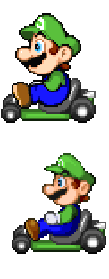
Here's a comparison image of the two Marios:
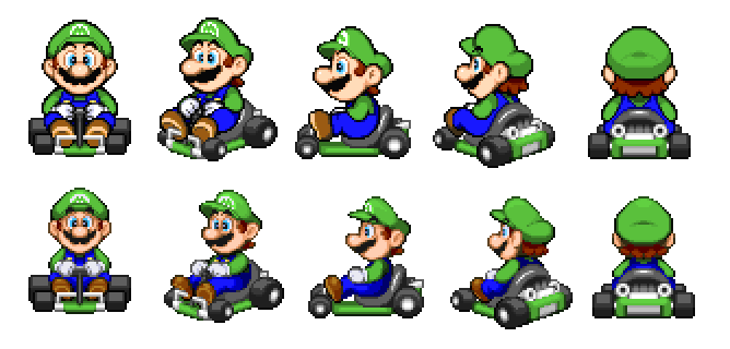
Now, what you notice at first is that the new Mario is more stylized and lends itself more to the promotional 2D artwork of him. Pretty cool! However, this also ends up being a downside, as he no longer matches the artstyle of the kart he's in. I'd recommend redrawing the kart entirely, maybe even make it into the Pipe Frame for bonus cool points?
His mustache is, though, alot more accurate in shape to how it should look. The old one does noticeably have some deforms that makes it lose its shape in the A3 and A4, so it's nice to see that fixed.
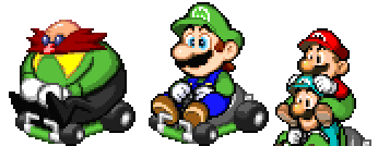
However, that may be part in due to another pretty big problem, him being big. He manages to be bigger than Eggman, and even bigger than himself??
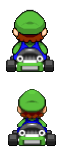
(On a side note, here's a tip: you can use the recolorable greens for Luigi's shirt and hat in M&L if you change the startcolor parameter in properties.txt to something else. 224 for example will make that row of blues recolorable instead. You can use this image as a reference for what numbers make what set of colors recolorable.)
This certainly is a little odd in terms of most times when Mario's size compared to other characters in media. But that's an issue you could easily write off. What's still an issue with his size, however, is that he barely even fits in his kart anymore. He has to be scrunched up to the point where his legs and arms are practically clipping through each other, and he has to lean forward in an extremely awkward position that doesn't look comfortable at all. The old Mario didn't have this problem, and he sits relaxed in the kart the sprite was clearly made for. But again, you could fix this by redrawing the kart. Making it bigger would give Mario more room to breathe and not have to be scrunched up like that. Or you could shrink Mario himself back down to the old size. That could work too.
Now for the actual composition of the sprites.
The A1 looks alot nicer than the old one, with the details being alot clearer and the face overall is alot more on model. The old one has a bit too much shading on the face, which makes the details a little harder to work out. With the new one, the size and "leaning forward" issues aren't nearly as prevalent here, in addition to him covering up most of the kart, which makes the artstyle mismatch not as noticeable. All in all, the new one actually looks better than the old one. Certainly makes me wonder if this was the first rotation you did and you based the others on it.
The A2 is where things start getting iffy. The bottom of his head doesn't seem properly aligned with the rest of him. The feet don't quite line up with the pedals anymore, with the foot on our left seeming to be closer to the pedal than the one on the right. The old one was alot more even than this. The old one had his hat slightly leaning back, but the new one seems to be trying to have it be straight and lean back at the same time? Maybe I'm just bad at explaining things, but that's how it looks to me. The arm/leg clip thing also starts to come into effect here.
In the A3, here's where said issue comes into full effect. His hand and arm are literally connected by three pixels, which is extremely small in comparison to the overall size of the sprite. It seriously does look like Mario turned on no-clip on his body. And again, he's leaning forward a ton, which looks extremely uncomfortable. I get it's tradition for taller characters to do that, but Mario is not what I'd consider a tall character. If you leaned him back, it'd give his arms more room to move around too, which would solve the clipping issue. However, I will state again that I do like how his mustache is alot clearer in this sprite than in the old one. That's one thing that's consistently better on these sprites, the clearer details.
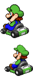
Now with the A4, it's kinda weird. The way his head, body, and legs are angled don't seem to match each other or the kart he's in. And what's up with his ear being angled back so far? In the old one Mario's ears are angled with his head. But in this new one it looks like their being forced to angle the camera? Very odd.
And finally, the A5. Now this is where the increased size becomes a bit more prominent. His body is practically spilling out of his kart because of how the sprites are. And because his overall size increased, his head has seen a big increase too. In gameplay, Mario practically looks like a bobble-head because his body is scrunched up and leaning forward, but his head isn't. Maybe try leaning his head down to make him fully scrunched up? Well, maybe that's not a good idea, because it'd be better to just not scrunch him up at all or simply shrink him down. Again, the old one is smaller, which means it doesn't have these problems.
I think that's really the new Mario's biggest problem. His size. He really doesn't fit within his own kart and it kinda shows. And of course there's the artstyle mismatch which I've mentioned too. I think you'll end up needing to either match Mario to the kart like with the old version, or match the kart to Mario. The latter would certainly allow you to be a bit more creative, so I'd try doing that. It'd just be nice if he didn't have to lean forward as much or look like he has disproportionately large head.
Well, you can take these criticisms or ignore them, I honestly don't mind, but I 100% believe you can make the pack alot better than it already is or ever was.
(On another side note, I think it'd be nice if the new Paper Mario (love how he's TTYD now btw) didn't get darker or lighter as he turns. Yeah, I know the old one had it too, but considering you added alot more shading and made him bigger (which isn't a negative here since he was really small before), it's alot more distracting, and I think it'd be better to just not have it. Anyways, post over! Cheers!)
Now, what you notice at first is that the new Mario is more stylized and lends itself more to the promotional 2D artwork of him. Pretty cool! However, this also ends up being a downside, as he no longer matches the artstyle of the kart he's in. I'd recommend redrawing the kart entirely, maybe even make it into the Pipe Frame for bonus cool points?
His mustache is, though, alot more accurate in shape to how it should look. The old one does noticeably have some deforms that makes it lose its shape in the A3 and A4, so it's nice to see that fixed.
However, that may be part in due to another pretty big problem, him being big. He manages to be bigger than Eggman, and even bigger than himself??
(On a side note, here's a tip: you can use the recolorable greens for Luigi's shirt and hat in M&L if you change the startcolor parameter in properties.txt to something else. 224 for example will make that row of blues recolorable instead. You can use this image as a reference for what numbers make what set of colors recolorable.)
This certainly is a little odd in terms of most times when Mario's size compared to other characters in media. But that's an issue you could easily write off. What's still an issue with his size, however, is that he barely even fits in his kart anymore. He has to be scrunched up to the point where his legs and arms are practically clipping through each other, and he has to lean forward in an extremely awkward position that doesn't look comfortable at all. The old Mario didn't have this problem, and he sits relaxed in the kart the sprite was clearly made for. But again, you could fix this by redrawing the kart. Making it bigger would give Mario more room to breathe and not have to be scrunched up like that. Or you could shrink Mario himself back down to the old size. That could work too.
Now for the actual composition of the sprites.
The A1 looks alot nicer than the old one, with the details being alot clearer and the face overall is alot more on model. The old one has a bit too much shading on the face, which makes the details a little harder to work out. With the new one, the size and "leaning forward" issues aren't nearly as prevalent here, in addition to him covering up most of the kart, which makes the artstyle mismatch not as noticeable. All in all, the new one actually looks better than the old one. Certainly makes me wonder if this was the first rotation you did and you based the others on it.
The A2 is where things start getting iffy. The bottom of his head doesn't seem properly aligned with the rest of him. The feet don't quite line up with the pedals anymore, with the foot on our left seeming to be closer to the pedal than the one on the right. The old one was alot more even than this. The old one had his hat slightly leaning back, but the new one seems to be trying to have it be straight and lean back at the same time? Maybe I'm just bad at explaining things, but that's how it looks to me. The arm/leg clip thing also starts to come into effect here.
In the A3, here's where said issue comes into full effect. His hand and arm are literally connected by three pixels, which is extremely small in comparison to the overall size of the sprite. It seriously does look like Mario turned on no-clip on his body. And again, he's leaning forward a ton, which looks extremely uncomfortable. I get it's tradition for taller characters to do that, but Mario is not what I'd consider a tall character. If you leaned him back, it'd give his arms more room to move around too, which would solve the clipping issue. However, I will state again that I do like how his mustache is alot clearer in this sprite than in the old one. That's one thing that's consistently better on these sprites, the clearer details.
Now with the A4, it's kinda weird. The way his head, body, and legs are angled don't seem to match each other or the kart he's in. And what's up with his ear being angled back so far? In the old one Mario's ears are angled with his head. But in this new one it looks like their being forced to angle the camera? Very odd.
And finally, the A5. Now this is where the increased size becomes a bit more prominent. His body is practically spilling out of his kart because of how the sprites are. And because his overall size increased, his head has seen a big increase too. In gameplay, Mario practically looks like a bobble-head because his body is scrunched up and leaning forward, but his head isn't. Maybe try leaning his head down to make him fully scrunched up? Well, maybe that's not a good idea, because it'd be better to just not scrunch him up at all or simply shrink him down. Again, the old one is smaller, which means it doesn't have these problems.
I think that's really the new Mario's biggest problem. His size. He really doesn't fit within his own kart and it kinda shows. And of course there's the artstyle mismatch which I've mentioned too. I think you'll end up needing to either match Mario to the kart like with the old version, or match the kart to Mario. The latter would certainly allow you to be a bit more creative, so I'd try doing that. It'd just be nice if he didn't have to lean forward as much or look like he has disproportionately large head.
Well, you can take these criticisms or ignore them, I honestly don't mind, but I 100% believe you can make the pack alot better than it already is or ever was.
(On another side note, I think it'd be nice if the new Paper Mario (love how he's TTYD now btw) didn't get darker or lighter as he turns. Yeah, I know the old one had it too, but considering you added alot more shading and made him bigger (which isn't a negative here since he was really small before), it's alot more distracting, and I think it'd be better to just not have it. Anyways, post over! Cheers!)


