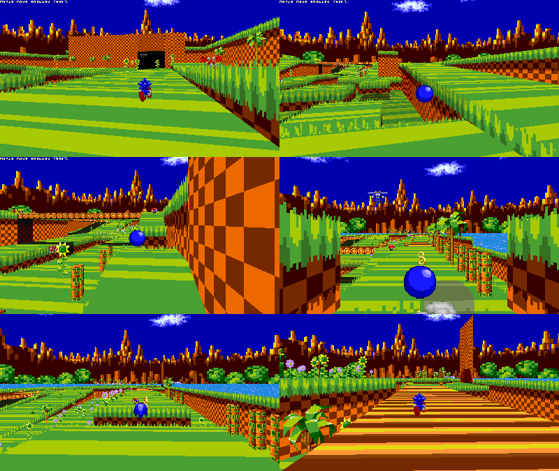
Green Hill Zone

Green Hill Zone V1.2

What permissions do you give others to modify and/or maintain your submission?
Modify: YES - Maintain: YES - I give permission for my entire submission to be modified by others or used in their own work. I give permission for my entire submission to be maintained by others as well.
I made sure my file(s) follow the Submissions Guidelines
  1. Yes
So one day i got bored and decided to make the most overused sonic stage in the entire planet.
The level has an original layout and is sorta short but kind of sorta maybe a little fun
the level starts in a little cave area and progresses through some weird version of green hill that seems lime colored.This level is uh Green hill zone!!11

the level features
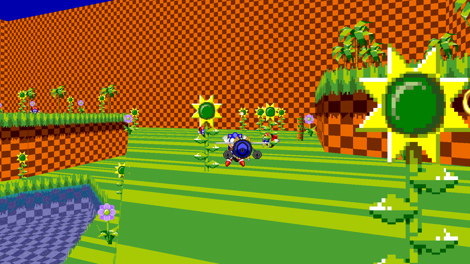
  1. Green grass
  2. Flowers and Vegetation
  3. Badniks from green hill (What a wacky surpri1se!?!??!?11)
srb20411.png

:devastation: Buzz Bomber murder
srb20707.gif

Spriters resource: sonic 1 textures/sprites
Minty: For helping resize the textures
@BadOmenThingy: for the Sonic one badnik pack
Thanks to BadOmenThingy for the Sonic 1 Badnik pack which basically made this green hill more green hill'ish: Sonic 1 Badnik Pack link
Author
dashdahog
Downloads
18,037
Views
27,665
Extension type
pk3
File size
2.8 MB
MD5 Hash
e83bc5e616ac78cdf8ddda966e021be1
First release
Last update

More resources from dashdahog

Share this resource

Latest updates

  1. Fixed: Flicky list, Level Select picture

    Now there is a new little extra marble zone map and the green hill zone flickies are now accurate

Latest reviews

this is so epik cin us git sax folows (this is a joke also great mod)
Upvote 0
Pretty decent stage. That being said, I think it suffers from a weird habit that certain mappers tend to fall into when designing their stages-- it is *holistically* flat and hallway-like. What I mean by that, is that when designing the stage, you kind of divided it up into these little sections of platforming, and connected them with hallways.

This, in itself, isn't a bad thing. The problem is that within those sections of self-contained platforming, the direction that you're *overall* going is straight-forward along a flat plain. There may be plenty of room to move side-to-side, and there may be plenty of small hills, but when you look at it all-together, you're going in a straight line, and you aren't actually gaining or losing any height. You start and end in the same direction, at the same altitude.

Granted, this doesn't apply to the entire map. The third room is a good example to show what the other two rooms are missing. The room's layout makes you travel in a sort of S-curve, and you end up higher than you were at the start. It makes the platforming more interesting because it feels like you're actually going somewhere.

If you applied that sort of design to the first section, it could easily make it feel a lot more natural. Like, first you could make the section overall curve to the right. this, just by itself, would make it feel WAY more natural. Next, you could make the hills in the middle of the section WAY higher, and then make the exit point only a little bit lower than the middle, so that it creates a sort of upside-down checkmark shape. You could even make it so that the hills and stuff on the left side are a little higher than the hills on the right, so that you create this higher-path/lower-path kind of deal, while still allowing the player to freely move between them if they use the slopes right. Finally, I think varying the width of the section could help too. In the current state of the map, if you look from a birds-eye view, section 1 is literally just a rectangle. If you made some parts wider, and some parts thinner, it would help a lot.

Anyway, still a decent map. But it could be better. If you try, you can do anything!
Upvote 1
Angeltails el gato con botas
Upvote 0
honestly i feel like the stage really succeeds in a few niche areas while it falls very flat in some others, but i will say right out the gate that i loved what i played! it was quite fun and could probably be disguised as a hidden secret in the vanilla game to someone who didn't know any better.

right out the gate, though, what i think the stage needs most is separate pathing. it feels almost deceptively big, with the opening area making me think initially that it would split into several different paths, but...no. the opening area is one big path with multiple lanes that funnel you along one direction. that's not a *bad* thing at all, far from it, but it made the stage feel a lot shorter and definitely cuts down the replay value.

the stage's graphics also could be improved slightly. as it is now, it looks great, and i can't stress that enough, but it does definitely have some weird decisions. particularly the opening area, it feels weirdly isolated and boxed off, what with the thok barriers showing the mostly barren skybox instead of the rest of green hill. additionally, there's not a lot of texture variability, making the stage look a little blander than it should. i'd say definitely add a few different wall textures.

marble zone was okay i don't really have much to say about it, it seemed like a cute little bonus and lo and behold that's probably what it is

overall, though, the stage is really cool and honestly quite a fun little trip through, i liked it a lot!
Upvote 2
Back
Top