Wood Asleep by Internet Explorer - 4/10
Welcome to Hilarious Engrish Zone. At Hilarious Engrish Zone, you can enjoy pointless graphic and sound replacements that have nothing to do with the actual level, unfitting custom textures, a confusing maze and of course, a healthy dose of Engrish. And all that for just $5.99!
So yeah, I'm not funny, but neither is this level. I know what you tried to do here, but it didn't work for a number of reasons. BlueZero4 already told you that when you're focusing on atmosphere, you should be focusing on engaging surroundings and you should encourage exploration. Let me add that he knows what he's talking about when it comes to that. Play either Nuclear Sunset or Forever Forest, they should give you a hint at how the style you tried out here should be working. Sure, the visual style itself isn't too bad (and there are some neat colormap and lighting effects like the darkening exit sector), but that's doesn't help if half of your map repeats the same thing ad nauseam.
The problem here is that the whole forest section looks the same. It's just trees over and over and over and over. There aren't exactly too many things hidden here, and even if there were, I would hardly want to try to find them because I don't have any sense of direction. Of course, that also makes finding the exit quite hard, especially since it's tucked away behind a hedge of which I'd never know it's intangible if I hadn't accidentally stumbled through it. The river right next to it is pretty boring to fall into, because you can't escape and have to follow it to the end. I also found another path to the exit, but that was more by accident than anything else. I have no sense of direction when I play your map.
On the positive side, the indoor section wasn't too bad. I mean, the custom textures kinda irked me because they had a very different art style from regular SRB2, but they were pretty unique. The beginning room that you had to flood to break the window was pretty clever, and I liked the secrets in the building. Too bad that was over too soon. Three more things: The same brown texture that you used for the button appears again somewhere on the main path. Please, if you use one texture for a button or anything else that should stand out, don't use it for anything else. It confuses people. The second thing is that the colormap of the water appeared lighter to me than the colormap of the air. That's a bit unrealistic. At last, I want to be able to walk up stairs instead of jumping. Katmint made the same mistake.
The end result is a level that is quite interesting in the beginning, but becomes excessively dull pretty quickly. I wouldn't advise you to try and fix this level. It was more of an experiment, and although it was an interesting one, it ultimately failed. Making the player get lost will only make him lose interest. I hope you learned from it. With the knowledge you gained from this mistake, you can try your hand on something fresh and promising.
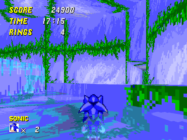
Colossal Castle Zone by Katmint - 3/10
The score is mostly for the effort. Playability or fun is something you have to hunt for in this map. While I appreciate long maps filled with gimmicks, not only do the gimmicks have to work (which they didn't), but the level must make an effort at incorporating them into something cohesive instead of lining them up one after the other (which it didn't). Maybe you hoped it wouldn't be obvious, but we can see that this map is a lazy excuse for all the cool gimmicks you thought up and not something that came from your heart, as they say. If you don't enjoy visual and architectural design, stop making single player maps. You can get away with it in multiplayer maps because you focus more on functionality than anything else there. But for single player maps, you need to put your soul into them.
Let me lose a few words about the visuals first. They're not exactly the most important thing, but they can bump a map up from decent to remarkable. For the most part, yours were pretty basic and in the castle section, they were often downright ugly. BRICK2W was a bad choice, simply because it doesn't harmonize with the CEZ set which is clad in brown and gray. The red carpet should actually be a carpet, it looks strange when the whole floor is like that. The purple stairs made no sense at all, and your red version of the STONEW set looked pretty surrealistic, which is probably not what you intended. Another thing that made me cringe is how you often used a different texture and flat for the same platform. In most cases, if you can see both the sides and the top of a structure, they should look the same (or at least look they're made of the same fabric). There are a few exceptions like grass, but for the most part, you should stick to that rule. DMAFLAT7 and DMAWALL7 for example are a pretty bad mix, and anything mixed with STONEW is terrible by default. But of course, these are pretty small nitpicks.
The main problem is something else. Actually, it's threefold: There's no sense of direction, many gimmicks are confusing or simply suck, and the small size of the player makes everything twice as stretched-out and tedious. For a change, I played through the whole thing with regular scale, and apart from the parts which were obviously impossible with normal size, everything was far more enjoyable. I know this goes against the theme of the level (what with the thing being colossal and all that jazz), but that way, your map would have probably earned a 5. A huge improvement is that both the whole stage and individual sections are much shorter. Take for example the library. As small Sonic, that room is overwhelmingly huge and therefore takes ages to pass. As regular Sonic, it's over pretty quickly, even though it's still too tall. It also helps that when I'm bigger, I can skip most of these really tiny platforms you used in a few section. Those were incredibly annoying because you had to be so accurate, and the increased floatiness of smaller size made matters worse.
The sense of direction is harder to fix. You already know about the confusion the gargoyle puzzle generates, and I think somebody mentioned that it's really hard to find the exit of the dining room (I found it by chance). The library has this annoyingly big staircase (in general, cut out those staircases), which only serves to open a door to the dining room. At first, the player thinks: "Oh, that switch probably opened a new exit in that room.", but then he realizes there is no new exit and the whole button thing wasn't even relevant. Make the real exits of the library more obvious than the useless button back the an old part of the stage. Same thing with the other gargoyle puzzle, where the button that connects both rooms looks like it's mandatory to continue.
Some gimmicks are pretty terrible too. The gargoyle monitor of course is a mystery to everyone who didn't see it before, and even disregarding that, it's not exactly interesting. You could at least have done something cool with the newfound bouncyness of the player. But no, you only toyed with the fact that the player is now a pushable object and therefore triggers the appropriate linedef. Apart from the fact that the player doesn't know that he is pushable now - because nobody else is there to push - that's a wasted gimmick: You pop a monitor, drop into a hole, and a door opens. Woohoo, that's so much fun! And of course, pushing real gargoyles while you're a pushable yourself is fucking annoying, because you bounce off every time you push. Also, why do I have to pass the same obstacle for both gargoyles? And why does this whole puzzle takes so annoyingly long?
The next minute doesn't have much action apart from the confusion I described earlier. It becomes interesting again in that dungeon behind the library with these weird pillars that turn red and hurt the player. They make little sense to me (What exactly are they?), but they're sorta fun. The second gargoyle gimmick is just as wasted and even less intuitive than the other one. And of course, the player doesn't do much here. Then there are a few boring crushers and Brak Eggman... Wait, Brak Eggman? I don't deny that your idea is marvelous, but the execution is kinda problematic. First off, it's not really obvious that the boss is intangible. Therefore, it's not obvious either that you have to go up and press a button to continue. But I did have a lot of fun with that boss after I figured it out.
Then, more crushers and a really weird room with huge swinging spikeballs, a few smaller ones, incredibly stress-inducing Robo-Hoods, and ridiculously small pillars I have to jump over. A fake ending, a flood of Jetty-syns coupled with some more overly tiny platforms, resulting in tons of unfair deaths, a pretty unremarkable but okay indoor section with in-yer-face Vulture attacks and an outside section with falling logs that are curiously enough not used for anything. Well, one of them can crush me to death, but that's it. As you can see from my rushed descriptions, I pretty much lost all remaining nerve by this time because the level is so damn long. The boss is a piece of spam that I can simply outsmart by recollecting my rings every time. Then, no Egg Capsule and off we go.
As you can see, I'm not fond of much of your stage. There were a few enjoyable moments and a few boring but at least not actively bad ones, but there were also tons of rage-inducing awfulness. Please, try to take this advice and spend more time on your next level instead of churning out four half-assed maps for one contest.
Grassy Cliffs by NeroTheArmadillo - 0/10
Of course, I can't give you a point for a map that doesn't even load. But rest assured that if it did, I'd only give you one point anyway. It's not like what you made is even that bad, no, it's quite good for a first effort. The tendency to build small rooms connected by corridors is typical for a beginning mapper. As you continue, you need to find the confidence to stretch your rooms out without making them look empty. But for now, I can't tell you much else. After all, this is just 10 seconds of level and 20 seconds of boss fight. It's like playing a note and then asking me if I like the tune. Well, I dunno, gimme the whole thing in context and I'll tell you. In other words, make more than this, and I'll be able to award you more than one point (and make sure that the map works, so you don't lose that point as well).
Windmill Hill Zone by Ultimate - 5/10
Your concept is nice and you sure have mapping talent. The reason that this map can't get beyond average is that you don't have enough experience yet (and of course that the map is blatantly unfinished). Seeing as you submitted the map in this state because you wanted feedback, I'll not so much concentrate on my opinion of the map but rather on what you should focus on when improving it.
First, the openness. It really kills your level from a purely practical point of view. SRB2's rendering cannot handle maps that are this wide without screwing up. Additionally, it looks makes it look kinda weird, but we're touching another problem here: Your whole stage is designed around a huge pit. I get the impression that you're trying to make a three-dimensional 2D level, if you know what I mean. You only focus on the path that lies ahead of the player, and everything else surrounding that area is just dead space. That's not how SRB2 levels work. Exploration is a big part of this game, and there's only so much I can explore when 60% of the visible territory isn't even used. Even despite all the secrets you hid in your map, I pretty much always had a set path to follow. Sure, there were several paths, but I couldn't deviate from any of them to explore the surroundings, because there were no surroundings.
Other people already mentioned the problem with the texturing, but I wanna address one specific problem with it: The GHZ texture set has this grass growing down the side of the platforms. You used it in numerous spots, but other platforms lack them, for example the bridges in the last area of the shorter path. One problem with that is visibility, because a platform without any type of grass border easily blends in with the surroundings. That effect is especially pronounced in your map because every huge wall has the same texture. Another thing is that it looks unrealistic to have grass without borders. It looks like the grass is an ultra-thin stripe attached to the top of a piece of rock instead of something that's growing out of it. Of course, the most obvious problem with your texturing is that there is no contrast, making it hard for the player to see certain things.
The windmill gimmick and well as that other wind thing that I didn't really understand were pretty cool and you introduced them really well too. You already know that some parts are lacking in content. Overall, the problem with this map was not so much the gameplay that you filled your paths with, it was more about how little there was of it and how little there was aside from it. I'd advise you to rebuild this map from scratch. You can use the same ideas, and you can probably copy a lot of stuff verbatim, but I don't think you'll be able to make the level less open by tweaking what you currently have. Reorganize the parts you have into a more structured form, and make sure you add a bunch of stuff that makes the player go out of their way.
A few small things I noticed: None of the water has a colormap, which is never a good idea. If you press left, right or back at the big windmill in the beginning, you land in the pit. Oh, and in the room with the zig-zag bridges at the end, the spring chain was kinda useless.
Splash Garden Zone Act 1 by Blade - 6/10
Again, BZ4 hit the nail on the head. Yes, this is competent. Yes, this is kinda enjoyable. But you can do so much more than waste your time with something so insubstantial, and the fact that you bothered to make this disappoints me. Okay, so most of it was apparently created a year ago, but I hope you're not gonna make something like this again. You have so many more plans for your pack, but it seems to me like you're hesitating to map them out.
Your map is supposed to be original, but it's really not. There's literally nothing in this map that I haven't seen in S1, S2 or S3&K. The sideways springs were badly drawn and they didn't work correctly when you ran into them, which ruined the gimmick with the two springs that push the player back and forth (not like that was a particularly good gimmick). But what irked me the most about them is how you used them. Finishing a platforming section only to be pushed back to the beginning by some sideways spring that I didn't expect is annoying. The one right before the end sign was even hidden behind a tree. Some of the enemies were also badly placed. I frequently ran into spring robots before I saw them or was hit by missiles that came from off-screen. Yes, the classic games do that too, but I find that really annoying there as well.
There were some alternate paths with power-up items that gave the level some badly needed replay value. But what annoyed me about them was that some of those tiny square blocks looked like they were leaning on the wall, but when I jumped too far, there was a large enough gap to fall down. It's not a problem that there are gaps between the blocks and the wall, it's just that I can't see gap before I jump on them. Speaking of those blocks, I really didn't this lake section where I had to jump across several of them. They're so freakishly tiny that it's hard not to overshoot, and if you fall down, you have to do it all over again. I'm not gonna say much about the fake slope and the stolen zoom tube. Both are cool in the classic games, but in SRB2, they can't be replicated to a point where they are as much fun. The slope was so weak that I almost didn't notice it (and if you made it stronger, the missing slope physics would become apparent) and the zoom tube looked terrible and didn't really speed me up the way the original one does.
On the plus side, the visuals were nice, the aforementioned alternate paths made the level a bit more interesting, the large ring at the end was kinda cool, the enemies are good per se even if the placement was sometimes lacking, and the main path, while not remarkable, is fun to play through. The level is not bad, but there's not enough in it to hold my interest when I compare it to a full-blown 3D level (even one that doesn't have many obstacles, like Sapphire Coast). That extra dimension is really missing when it comes to exploration. And of course, you fell into the typical 2D mode trap: The player isn't able to see in front of him, but you sometimes required him to do just that.