September/October 2011 Voting

Status
Not open for further replies.
It's almost as if the leftover evils from last contest are here to strangle us or something.Anyway...

Single Player:

Mario Land 1-1 by Simsmagic: 3/10

Eh, I can tolerate a good little map if it's fun, but this was TOO little for it's own good. 15 seconds and BAM! Done. This idea would have had a little chance to actually rise into something decent if it was longer, but even that is a small possibility since 2D Mario maps just don't translate well.

Chemical Facility Zone by KO.T.E : 10/10

I....oh wow.This is certainly brilliant. I loved every single moment of it. The alternate paths, the gimmicks, the platforming that was fun, that "race against time" section in one area, the custom enemies, EVERY.SINGLE.ONE OF THEM. Keep up the good work.I'm totally disappoint with that secret and I will haunt you for the rest of the voting

Multi Player coming when I actually get a chance to play a netgame....and survive.
 
---------------------
SINGLE PLAYER:
---------------------


Mario Land 1-1 by Simsmagic - 3/10
Under normal circumstances this map might be worth more like a 4/10. And by "normal", I mean "I didn't release a map that had all this and more in the previous contest". It's really not possible for me to point out how derivative this map is without coming off looking like an arrogant jackass, but that is exactly what it is. You're quite entitled to make a Mario level just after someone else does the same, of course, and I positively welcome the possibility that my work could inspire other levels, but little details in this stage make it painfully obvious that you had no unique ideas for how to take things in an original direction.

First off, you used precisely the same combinations of textures that I used for much of the background scenery in Pipe Towers Zone. Using things like GRASS2 and SHROOM1 in a Mario level was a highly unusual move when I did it, since they look nothing like what you'd find in a classic Mario stage. Why you would parrot something like that is a mystery to me.

I'll concede that you did invent those hills with eyes in the background. That was all you. But here's the thing: I actually considered doing that in PTZ, and decided not to for precisely the reason that is vividly demonstrated in this level: the lack of slopes in SRB2 makes them ugly as hell.

Besides that, most of the scenery and gameplay was pretty underwhelming. The pipes were squarish, and the black centers were ugly. The whole level consists of jumping around from platform to platform. When I saw the brick block above all those springs, I thought maybe it was going to be a Spin Bust Block...I considered but rejected doing that in PTZ, and sort of regret it, so I thought you might have beaten me to the punch with that concept, which would have slightly redeemed this level. Unfortunately, it was just a disguised ? Block, which I don't find impressive, especially since the flats remain brick even when the block's true nature is revealed.

Let me finish with some more general flaws. The level is too short, it fails to use 2D mode in any interesting way, and the extra sound effects don't really add anything to the experience. Oh, and nice job not forcing the skin to Sonic; I first tried it as Knuckles and couldn't jump high enough to hit the blocks.

What happened to that nifty jungle level you were planning to submit to the previous contest? I would have been eager to try that one out.

Chemical Facility Zone by KO.T.E
- 8/10
In general, I like what I see. This level has a lot of original ideas and challenging puzzles wrapped up in a sweet, crunchy coating of great visuals. Nevertheless, there are a few things that I have to complain about.

First of all, a lot of places felt a little too compact. It wasn't cramped enough to seriously hinder gameplay, but it made the level feel a tad restrictive. In general, I'd widen a lot of the hallways and make certain rooms slightly larger, or perhaps shift around some of the scenery to create more room to breathe.

Second of all, you ought to present your gimmicks in a more intuitive manner. I get the feeling that some gimmicks get introduced on path splits in such a manner that "tutorial" rooms can be skipped over, and the player doesn't see the gimmicks until later, when they present more of a challenge. Don't let there be a golden path of discovery interspersed with avenues that deprive the player of crucial information...make it easy for players to discover what to do no matter what path or combination of paths they take. It's absolutely essential in a level like this, which relies so heavily on differently-colored chemicals that exhibit a multitude of behaviors when the player is submerged in them.

Another thing: the blue spheres. Sometimes they're clever, sometimes they're just a nuisance. I like the complex structures in the middle of hallways which emit little chains of orbs; they're good because they force the player to plan ahead, while giving him enough warning so that it's not an unfair challenge. They also have the added effect of breaking up what would otherwise be stretches of monotonous running. On the other hand, I really didn't care for the outdoor section of blue goop that sprayed massive player-seeking swarms of spheres; it may not have been that dangerous, but it was visually distracting.

And while we're on the subject of that particular room, it's very easy to get confused on how to proceed. I ran right past the mechanism that opens the door at the far end, and found myself at a loss for how to get into the next area. Finally, I backtracked and discovered that it was controlled by a glorified button-push all the way back at the start of the room. If you have to use a button at all, you ought to place it in some part of the room that isn't too far away from where the player will be when he really wants it...or at least in a location that will be obvious to the player at that time.

Now, the custom enemies. The squat little things with caution stripes were...okay, I guess. But they really didn't seem to be anything other than Crawlas with a fresh coat of paint. If I'm wrong, and they do exhibit some form of unique behavior that I didn't pick up on, I apologize, but to me they seemed totally generic. I actively disliked the tall, skinny, green things...or more specifically, the way you chose to place them. It seemed as though they were always lying in wait on the edge of a platform to push me back off, which I found annoying.

Finally, I see that you paid attention to my furious rant about file names and typed out the whole name of the level. Thank you so much.

----------
MATCH:
----------


Magma Temple Zone by blahblahbal - 6/10
I was kind of surprised, actually...this isn't half bad. The differing sky heights are visually unpleasant, and that one staircase that uses a different texture for each riser was pretty awful-looking, but the level itself has a pretty competent layout and plays decently.

Eggmatchsion Zone by KO.T.E - 8/10
I don't know why, but I kinda assumed it was a collaboration map while I was playing it. In a good way, I guess. The level is rather large, but it has a nice layout and a vibrant theme. I would recommend that you lower the ceiling height of that big outdoor area, as it makes the giant outer wall of stone slabs look oppressively monolithic and ugly.

--------------------------
CAPTURE THE FLAG:
--------------------------


Arctic Facility by Kuba11 - 6/10
Another level with a well-executed theme, and it has a solid layout to boot. The side paths were a mite too cramped, but that's my only real complaint here.

Uninspired Name Zone by Scizor300, KO.T.E, and Simsmagic - 0/10
Interesting. Apparently, three collaborators does not make it three times as likely that they won't forget to place Player Starts in the map.

by Charybdizs - 3/10
I adore this level visually, but it just doesn't work. I didn't really have any sense of direction, which is a death knell for a CTF level. If I were you, I'd repurpose it as another gametype...literally any other gametype would be more appropriate.

------------
CIRCUIT:
------------

Dread Valley Zone by Blade
- 8/10
Oh my, what a creepy level this is! I love it. The only thing I might change would be the fences; I don't think the player has enough time to avoid them once he sees them.

Spring Factory Zone by KO.T.E
- 4/10
I hopped around the blue grids for a while before realizing that they weren't dangerous. In general, the level is pretty to look at, but it makes for a poor race. There are too many sharp turns, and like CFZ, it feels too enclosed in places.

obnoioxies mym litltle pnony refenrence znone by RedEnchilada - 0/10
what the shit
 
Last edited:
Reviews pending...

---------------------
SINGLE PLAYER:
---------------------


Mario Land 1-1 by Simsmagic

Chemical Facility Zone by KO.T.E


----------
MATCH:
----------


Magma Temple Zone by blahblahbal

Eggmatchsion Zone by KO.T.E

--------------------------
CAPTURE THE FLAG:
--------------------------


Arctic Facility by Kuba11

Uninspired Name Zone by Scizor300, KO.T.E, and Simsmagic

The Map With No Name by Charybdizs

------------
CIRCUIT:
------------

Dread Valley Zone by Blade


Spring Factory Zone by KO.T.E


obnoioxies mym litltle pnony refenrence znone by RedEnchilada

BEHOLD

Possibly THE GREATEST POST OF OUR GENERATION

Anyways, I may vote later. I dunno. this contest is pretty shitty, so these 0s and 1s gotta go somewhere.
 
I just noticed something, Spring Factory is missing a author. It was a collab of me and ThunderNova, might want to fix that.

Anyways,

Single Player

Mario Land 1-1 - 3/10

Not much to talk about here. It's too small, nothing but jumping, and no real challenge. The sound effects save this from being a 2.

Chemical Facility Zone - 10/10

My favorite part was where I died at the beginning my first time through and then I saw the
Pinkie Pie ending screen
.

Match
Magma Temple Zone - 6/10

One section of this map seems like a Singe-player section. Also, some textures need to be aligned, and aforementioned SP-esque section has a texture problem with it's Sky. Otherwise it's cool bro

Eggmatchsion Zone - 10/10

Oh god this map


Capture the Flag

Arctic Facility - 8/10

The only problem I have with this map is that it's much too small, otherwise great fun

Uninspired Name Zone - 9/10

Not enough player starts in this map!

The Map With No Name - 7/10

Too dark, too hard to navigate with Sonic or Knuckles, and broken with Tails.


Circuit
Dread Valley Zone - 6/10

Beautiful map. It really is. If we were judging solely on look, I would give this a 10/10. But that's only half of the score, the other half is gameplay. No interesting gimmicks, not much varying difficulty, and one almost useless secret path for Tails/Knuckles brings the score down to 6.

Spring Factory Zone - N/A

Did I mention I also made this?
Anyways you guys should totally check out the groovy Knuckles' shortcuts.

obnoxiuos pnoy referinse Zone - 3/10

You can't even complete a lap as Sonic sadface

Other than that, no comment.
 
Last edited:
It's really not possible for me to point out how pathetically derivative this map is without coming off looking like an arrogant jackass
Don't worry, "Your level is a ripoff of mine and mine is so much better!" doesn't come across as arrogant at all.

So he used the same textures as you did. I don't see why that's so bad. Mystic's texturing job for Aerial Garden has become a staple in this community, and I never saw him complain about people ripping him off. When somebody rips you off in this community, it's a sign that you did something fundamentally right, and as long as it's only a texturing scheme and not some elaborate gimmick, I see no reason to complain.

As far as I see it, Simsmagic only ripped off your texturing because it was good. In fact, it looked so natural that it probably didn't even occur to him that you invented the texturing scheme. So I doubt he was consciously trying to steal your texturing, he just used what he thought looked good. Maybe your map planted this idea in his head, but that's something you should be proud of.

And I don't see how he ripped you off beyond that. The only other things you mentioned were things you considered doing in PTZ but ultimately didn't. It's not a ripoff if he does these, is it?
 
Don't worry, "Your level is a ripoff of mine and mine is so much better!" doesn't come across as arrogant at all.
That's what I was afraid of. I'm not pleased with myself at this moment. Please stand by while I tinker with my review to make it a little fairer.

As far as I see it, Simsmagic only ripped off your texturing because it was good. In fact, it looked so natural that it probably didn't even occur to him that you invented the texturing scheme. So I doubt he was consciously trying to steal your texturing, he just used what he thought looked good. Maybe your map planted this idea in his head, but that's something you should be proud of.
The real problem here is not necessarily that he copied the texturing, but that he did so without inserting anything original at all. I'm perfectly happy with my level ideas being used as a springboard (as you said, I would be proud), but it strikes me as lame that there wouldn't be any original creativity in it.

And I don't see how he ripped you off beyond that. The only other things you mentioned were things you considered doing in PTZ but ultimately didn't. It's not a ripoff if he does these, is it?
I didn't say those were ripoffs. They're not. The only reason I mentioned that I considered using the hills was to point out that there was a good reason they didn't make the cut in PTZ.
 
Last edited:
The real problem here is not necessarily that he copied the texturing, but that he did so without inserting anything original at all. I'm perfectly happy with my level ideas being used as a springboard (as you said, I would be proud), but it strikes me as lame that there wouldn't be any original creativity in it.
Okay, that's a much fairer stance (and one I can agree on). But I wouldn't even call your texturing much of a springboard. It's not like he really based the level on it.
 
obnoxiuos pnoy referinse Zone - 3/10
this rating is TOO HIGH, FIX IT

Anyway, I guess I should explain myself. There was a discussion about driving off mappers that might have had potential in the IRC channel (spoilers: we don't do it) and the discussion eventually turned to my maps. SpiritCrusher said I never made an extremely terrible map... which I took as a challenge. Sorry.

Also, there are invisible platforms in the obnioxoius tiwlihgt srpakel rfenencre section, so it's not as annoying as you think it is.
 
I'm not sure if I should hate you forever for submitting that level, hate myself for giving you the idea or start a huge conspiracy where everybody gives this a 10 so you win the division.
 
No, don't start a huge conspiracy. It will just cause a mass disqualification with people making similar maps, on purpose.
 
No, don't listen to glaber. START THE CONSPIRACY. I would love it.

Failing that, blame yourself. I'm never the one at fault.
 
I, the great genius Doctor Ivo Robotnik have decided to grace this OLDC with my magnificent presence to give my verdict on the creations you aspiring level designers have brought forth this contest.

With my stunning portfolio consisting of 20 years of original base designs and arbitrary traps placed in naturally formed ruins, I am fully qualified to make the insightful and informative comments I am about to grace you with.

Single player

Mario Land 1-1 - 3
While I appreciate the gesture in placing the accursed blue hedgehog in the territory of his rival from the 1990’s, a Mario stage is simply not designed to accommodate the style of Sonic game and as a result the level suffered.

Flawed concept pushed to one side, the effort put into executing the visuals of this level is certainly commendable, but it isn’t enough to rescue what is otherwise an uninteresting port of a level from an old game.

But I suppose with all these time travel antics since the Time Eater went on a rampage, I should expect more old levels being ported to SRB2 in the following months. Confound this Sonic Generations; it will drive designers to make terrible ports of my failed base designs!

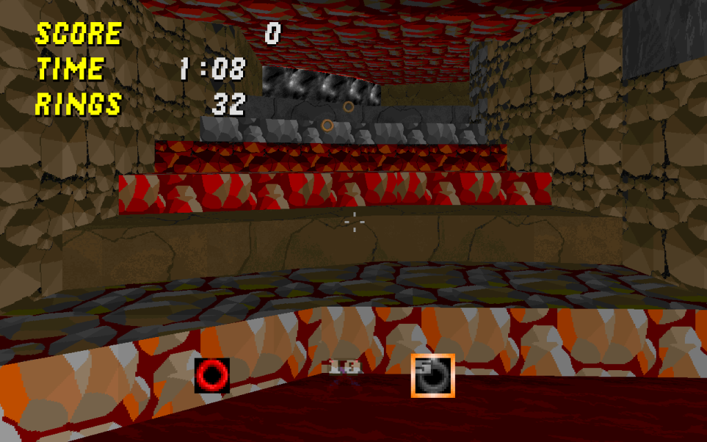
Chemical Facility Zone – 8
This concept is relevant to my interests, I do quite enjoy to see bases constructed using the examples and techniques I provide. I am also very pleased to see that certain areas of the factory had my beautiful face on, an excellent touch indeed. However, I am truly baffled to hear the music I placed in Chemical Plant Zone in Sonic Generations is being used here. The adventure hasn’t even happened yet! How in the name of ‘the planet’ did you steal the music before I installed the speakers that would play the music throughout Chemical Plant Zone Modern? Oh, wait, time travel. Confound it.

The various different chemicals used in the facility amused me greatly, however the light blue chemical functions exactly like water. For the sake of clarity, replacing this chemical with water is a good idea. You may argue that letting the hedgehog know exactly what the liquid will do before he touches it is helping him, but water is his weakness and it will strike terror and fear into his very soul!

At the mid-point of the facility, the path splits two ways. There is a problem here as one path is vastly more interesting than the other. To be more specific, the path with creeper-bots is both more varied and enjoyable than the alternate path which only has a short waterslide to keep it fresh and original. In future iterations of this stage, you may want to expand on the path with a waterslide in.

I found the mice badniks in this stage to be excellent pieces of handiwork, especially the way the green mouse works in conjunction with other robots. Good job there, good job indeed. Similarly, the creepers were a great addition to the facility as well. However the placement of the first creeper needs to be changed, it often runs directly into the player instead of pausing and giving them time to react before exploding.

Oh, by the way. I found your little Pony secret room. I hate ponies.

Match

Magma Temple Zone - 2
srb20043.png
I am not sure how I should respond to stairs that crazy.

I must say, I found it most peculiar to see that in many cases you had no problems in harming the player with lakes of lava. But many of the lava falls had see through rock barriers in place to keep the confounded animals from burning themselves? How odd and inconsistent.

Some of the areas in this stage are gigantic, while this isn’t a problem in of itself, I found there was a frequent issue where the empty spaces made it almost impossible to hit other players. For example, it is possible for a Sonic player to thok with reckless abandon and be almost impossible to hit, without any obstacles for him to avoid in the process.

Oh, and sometimes players spawn in the lava. I have no words to describe how absurd that is, but part of me is also jealous that I have never done that before and roasted the pesky hedgehog on the spot.

Eggmatchsion Zone - 8

Meanwhile, in Mystic Mansion.
The visuals in this stage are nothing short of fantastic, I am quite the fan of the effort you put into making this place appear to be a haunted house. Oh, of course, I also like the statues erected in my honour. That is a nice touch indeed.

The vertical variation in the outside areas of this map were very appealing to me. Giving Tails and Knuckles users a distinct way of approaching the room and travelling that is separate from their spikes and thok happy partner.

You know, I would say this map is nothing short of fantastic! If it wasn’t for one little detail… MORE PONY REFERENCES! Confound it!

CTF

Arctic Facility – 4
In this map, the detail is tightly packed to the point of it being quite a significant problem. The wide girth of your lord and master, Robotnik, was unable to fit through some of the cramped corridors to be found here and I frequently found myself getting caught on the various crammed together computers and pipes. On the topic of those pipes, some of them block the players path by being ever so slightly too high to step over, when they appear to be fine to simply walk over.

I also found it very difficult to see where I was going when surveying this map and participating in the game. As a result of the blue colourmap casting a dark hue on everything and the blinding use of textures.

This map also contains various nooks and crannies that make it extremely easy for the flag carrier to camp in and be very difficult to take the flag from. For example, behind the decorative water tubes near the conveyor belts.

Uninspired Name Zone - 0
Manualderpcopy.png
It crashes, genius! A spectacular feat by only the most advanced super villain! Sonic dies as soon as he arrives!

The Map With No Name – 5
What immediately strikes me, is that while your presentation is unique by placing the player an empty void without identity or any unique characteristics. You also rob the stage of any interesting theme beyond “It’s in a void without description.” Using one of the special stage skies and a choice of music that fits the theme could have averted this problem; even something simplistic such as the outer space theme improved the map vastly for the esteemed Doctor.

The concept behind the map is certainly interesting, but it is also incredibly confusing for a new player and takes several minutes of painful trial and error to understand. While I fully endorse the demise of these red and blue furry recolours, I am unable to enjoy the gladiatorial sport CTF mode provides if they keep dying before they get to fight each other!

Another problem that needs to be addressed is that as the players must climb upwards to reach the flag, but drop down to return it. It makes escaping with the flag trivially easy as the other team have no choice of chasing the flag carrier down, and in terms of reaching the flag the balance is vastly tipped in favour of that accursed two tailed fox thanks to his ability to fly up the level.

This was entertaining after the player learned how the map works, but before that, there was a horrible brick wall learning curve that impeded my experience.

Race

Dread Valley Zone - 7
The use of frequent but small obstacles such as the fences that Sonic must go around while Tails and Knuckles can go over them, along with the use of a shortcut that only Tails or Knuckles can take did a decent job at balancing out the different characters in race mode for this map.

The use of hazards is good, as it succeeds in forcing the participants of the race to be on their toes at all times without becoming cheap. So when they are hurt, it is entirely their fault. Which makes watching a pesky echidna be smacked in the face by a swinging mace all the more satisfying.

I couldn’t help but notice the Nightmare Moon insignia used as a decorate object as well. I find myself forced to begrudgingly acknowledge that this is a nice touch that fits the festive Halloween theme, even if I hate these confounded colourful equines.

Spring Factory Zone - 6
At first glance, the blue floors appear harmful to the player and while I appreciate electrocuting or frying those numerous woodland critters invading my factories and facilities, you have made parts of the race course appear harmful when they are not.

The first Knuckles/Tails shortcut in this map needs to be immediately obvious for the racers to notice, it is hidden around a corner when the players attention is focused on the springs and rings directly ahead of them instead.

Ideally, the map should naturally loop around. However, when teleports are used like in this map, you should at least make the teleports appear seamless (for example, a fall similar to the seamless teleport in ERZ2’s vents or the infinite falling sections in Ice Cap Zone)

obnoioxies mym litltle pnony refenrence znone - 0
Eggman_Facepalm_by_jigenxlupin.jpg
 
Last edited:
Fawfulfan said:
by Charybdizs - 3/10
I adore this level visually, but it just doesn't work as a CTF level. I didn't really have any sense of direction, which for a . If I were you, I'd repurpose it as another gametype...literally any other gametype would be more appropriate.

Well, I am certainly happy you got the name right. :p

But after reading that last sentence... I'm given to the opinion that you didn't play the level with other real players.

You obviously don't know what the gimmick is if you think it would work better in any different gametype. The only reasons you would not know it, are these.
#1: Because you didn't spend any amount of significant time in a game.
#2: Because you didn't play it with other people.

The gimmick is entirely team based, and without people to play against, you're not getting the point.

Still confused? Let me tell you this:
Blue Team is always right side up.
Red Team is always up side down.
The map is the same for both.
 
I'm giving it a 10 until I see my name next to KOT.E.'s on the side of Spring Factory Zone.

How did I know it would be there before I posted this
 
I'm giving it a 10 until I see my name next to KOT.E.'s on the side of Spring Factory Zone.

How did I know it would be there before I posted this

Well, it's been fixed now, so off to give it a zero or one I guess? :P
 
Well... time for me to vote...

> Video < *Features both maps due to how short it was.*

Single Player
*Mario Land 1-1 by Simsmagic - 3/10*
While as Mario level is fine for some, I think it doesn't fit that well as it ends very quickly. And the visuals... while nice, doesn't really do much.

*Chemical Facility Zone by KO.T.E - 7/10*

Well... a fun & decent map although there was a few things that bothered me in a way.

In the video at 0:59, that rising Red Water Room which... can be a dead end if you happen to jump back through the doorway before it fully closes, thus you have to take another route. Seeing how it takes away 10 Rings upon contact with the water can make this room annoying to bypass if you have lots of rings. While "there" are springs in the water to escape, it doesn't help when your near the surface only to get damaged in the air and send you back into the lower area due to the Red Water. Tackle this room with 0 rings and you don't have to worry about that, just don't let a turret snipe you.

At 2:35 in the video, the floor in the water here is uneven, and being that the water is not clear enough to see... you can't really tell of how far you are from the gap where you have to jump over a pit. I lost a good 3 lives there mainly due to ether being too late, or jumping too early. *Not shown in video* If only it was like the DSZ water slides... at least with those you know when to jump at the right time.

Oh, and I found that secret room... which of course scares me... and the Game Over staring into my soul and such.

Overall... it's a fun map, although it still needs some work. I'm sure others can explain it better than me, anyway.
-----
I'm tempted to do the Mutiplayer division as well, mainly due to one map that just had me go... "What were you thinking?" I'll give you a hint... it's has a lot of misspelled words and it's a race map.
 
Last edited:
Status
Not open for further replies.

Who is viewing this thread (Total: 2, Members: 0, Guests: 2)

Back
Top