-
Do not use Works in Progress as a way of avoiding the releases system! Works in Progress can be used for sharing early betas and for getting suggestions for improvement. Releases of finished content are not allowed in this forum! If you would like to submit a finished addon, click here for instructions on how to do so.
You are using an out of date browser. It may not display this or other websites correctly.
You should upgrade or use an alternative browser.
You should upgrade or use an alternative browser.
Chronicles' GHZ - Stage, Models, etc WIP thread
- Thread starter Rabosion
- Start date
Update 14:
This short update, i want to show off the animated skybox in action.
Here's how i made it:
1) make a separate room with the front row of rocks, and put a skybox viewpoint in it.
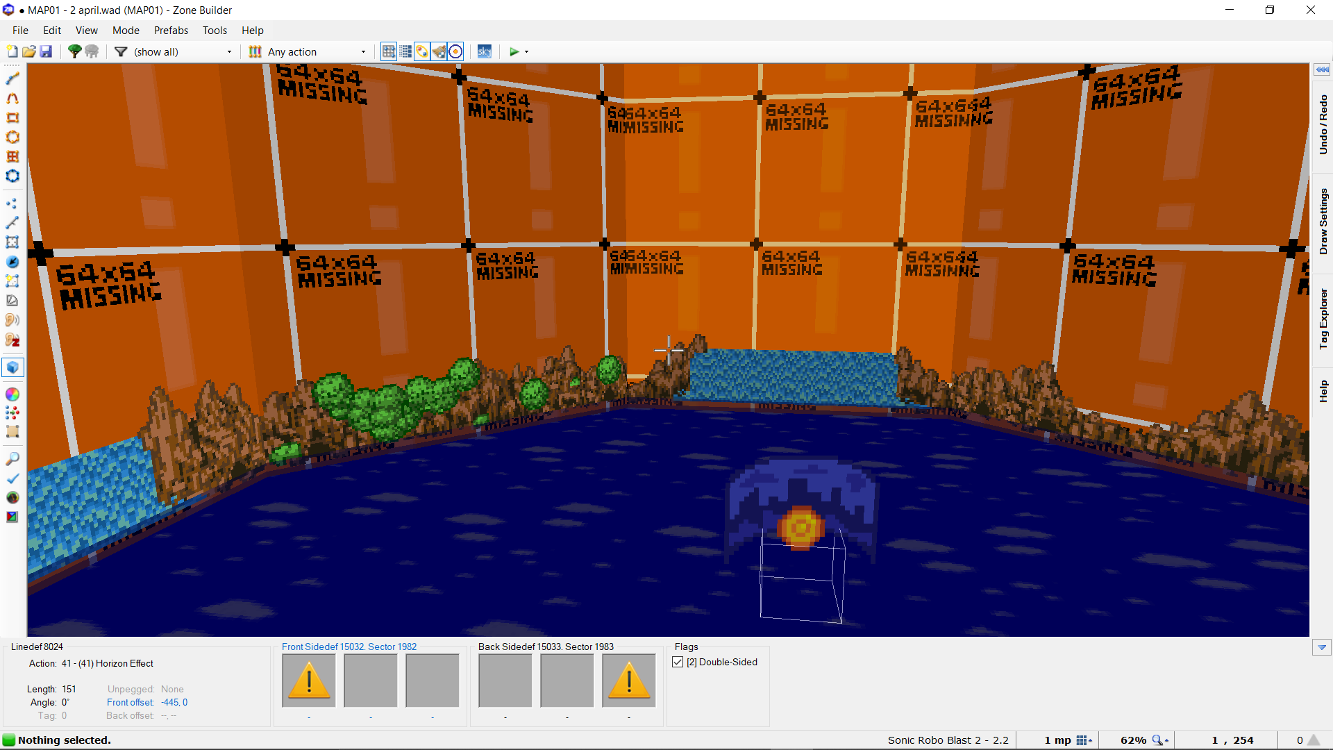
I left a little bit of room to add more layers of rock if i feel like it.
2) Make the rest of the background in Slade:
I used GFZ's sky palette as inspiration for my own palette texture. Then i added in my second layer of Sonic 1/Mania rocks. Lastly, i added GFZ's clouds. With the way Slade works, i can always add references of Generations and Chronicles at a later time. For now, this looks detailed enough.
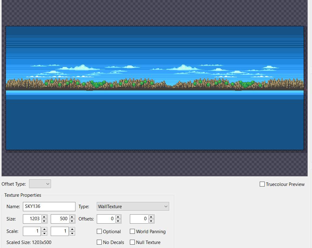
Tried to have multiple layers of clouds, but scrapped it. I used the tint function in slade to make the farthest clouds blend with the blue background, but sadly the tint change isn't visualised in game. So i kept it to 1 cloud layer. (If there is a way to make it work, please tell me)
3) Rework the slade texture to fit a width of 1024 pixels.
4) Add ripple effect to the water.
5) Result:
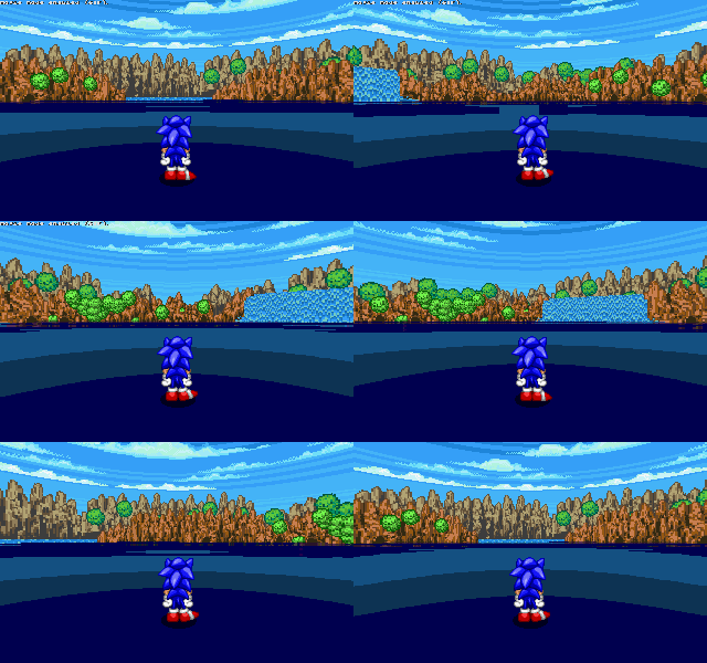
The water below sonic's feet is a temporary flat color, to align with GFZ's base water textures. The color scheme of the level's water will match that of the background's in the final result.
Thank you for reading!
This short update, i want to show off the animated skybox in action.
Here's how i made it:
1) make a separate room with the front row of rocks, and put a skybox viewpoint in it.
I left a little bit of room to add more layers of rock if i feel like it.
2) Make the rest of the background in Slade:
I used GFZ's sky palette as inspiration for my own palette texture. Then i added in my second layer of Sonic 1/Mania rocks. Lastly, i added GFZ's clouds. With the way Slade works, i can always add references of Generations and Chronicles at a later time. For now, this looks detailed enough.
Tried to have multiple layers of clouds, but scrapped it. I used the tint function in slade to make the farthest clouds blend with the blue background, but sadly the tint change isn't visualised in game. So i kept it to 1 cloud layer. (If there is a way to make it work, please tell me)
3) Rework the slade texture to fit a width of 1024 pixels.
4) Add ripple effect to the water.
5) Result:
The water below sonic's feet is a temporary flat color, to align with GFZ's base water textures. The color scheme of the level's water will match that of the background's in the final result.
Thank you for reading!
Attachments
CloneFighter
Mediocre Lua scripter
You uploaded the same gif two times. Fsr.
Not like it matters or anything. Cool!
Not like it matters or anything. Cool!
Haha, i didn't notice i uploaded it twice. My bad.
Update 15:
Today i have 2 things in store:
1) Musical update
Luckily there is a point i can loop at, so i could use it to try and make the June deadline.
2) New graphics:
Thank you for reading!
Update 15:
Today i have 2 things in store:
1) Musical update
ArJr gave me an intro class in Deflemask. I am practicing to get the hang out of the program. Because i lack skill in this program, i decided to keep mixing Chronicles GHZ track in FL Studio 20 Demo while practicing with Deflemask. I rearranged my fl piece to be more accurate to the Genesis hardware. I kept track of 5 instrument channels (using VOPM), 1 sample channel, 2 SN esque channels (which use magical8bitplugin), 1 noise/ hihats channel. Upon exporting, it sadly crashed. I noted down my general changes and settings, so i can redo all of it at a later date. As FL Studio allows me to make a midi afterwards, i'll stick to the Demo and practice more Deflemask later. Either way, here is my current progress with the track:
GHZ Remix - WIP 2
GHZ Remix - WIP 2
Luckily there is a point i can loop at, so i could use it to try and make the June deadline.
2) New graphics:
Next, i want to show off a WIP totem pole. Made as a reference to Generation's giant totem poles, these totem poles will observe Sonic and co as they progress in the level. So far i've made 4 front faces of the top of the totem pole. I made them using these 16x 16 patches:
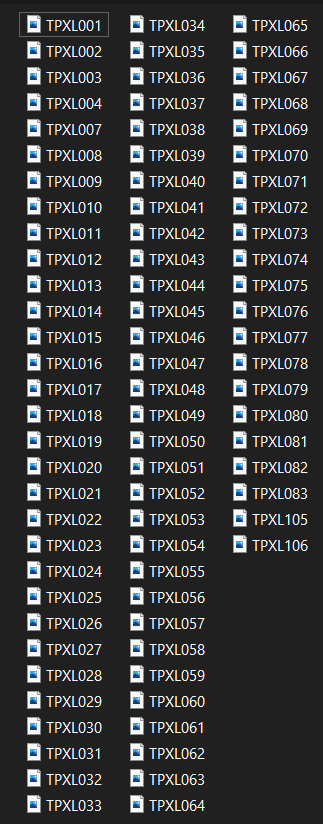
They took up about 30 kb standalone, and each face about 10 kb in the textures lump. Without patches, the faces would be 100 kb each. For the 4 faces below, 70kb of space was used in total. Each face is 384x256, 3 or 4 will be stacked on top of eachother like in Generations. Have a pic:
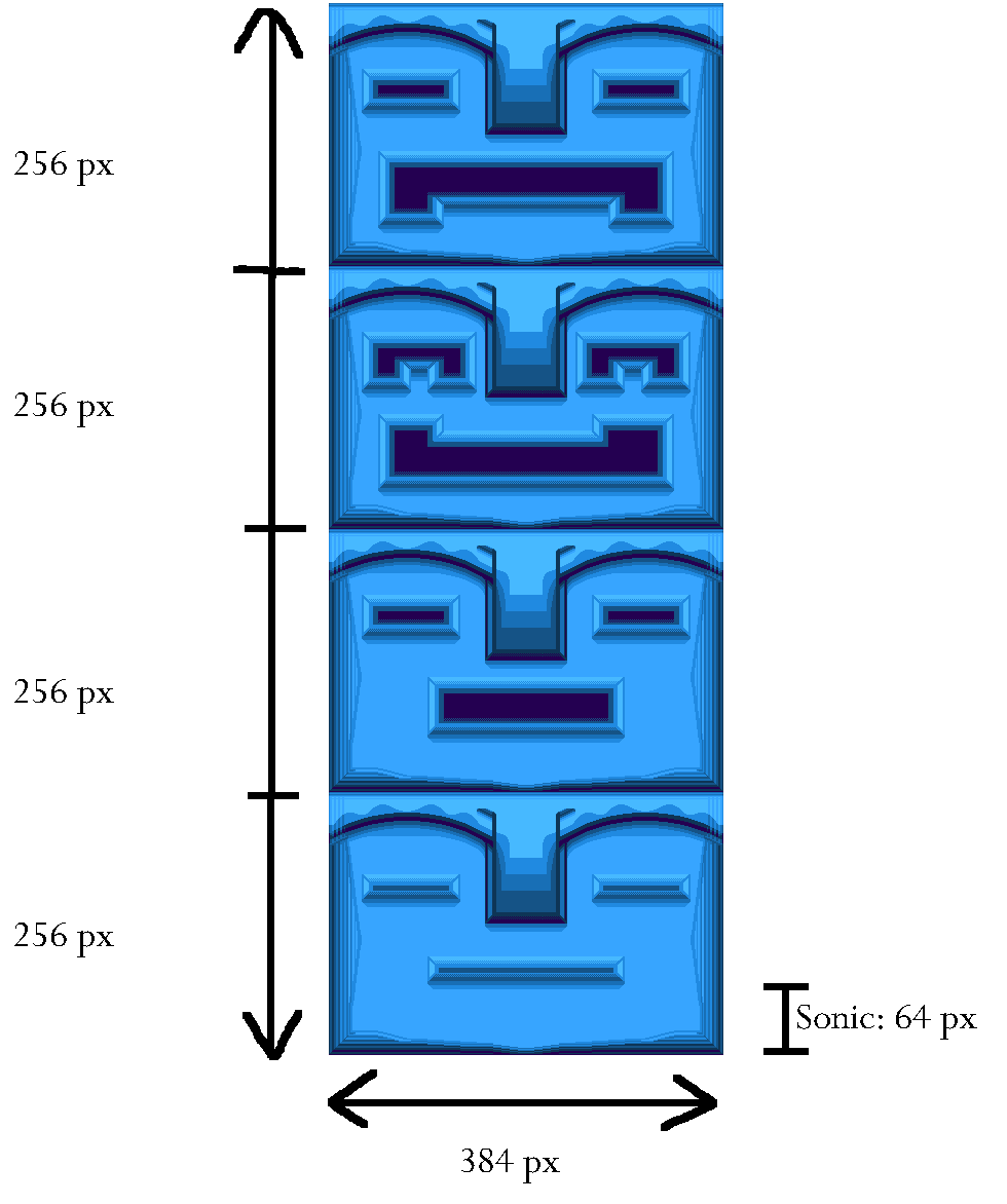
With a couple more patches, i can make the sides and the lower totems next time as well. For this giant totem pole, i must make:
-the sides
-the front face for the scared totem (who blocks its eyes with its hands)
-a hand texture that can serve as a flat/ wall texture
When that's done, i have a functional giant totem pole i can decorate the level with. With enough inspiration for gimmicks, i can also make other totem poles found throughout the GHZ variations. But that will be on another day.
They took up about 30 kb standalone, and each face about 10 kb in the textures lump. Without patches, the faces would be 100 kb each. For the 4 faces below, 70kb of space was used in total. Each face is 384x256, 3 or 4 will be stacked on top of eachother like in Generations. Have a pic:
With a couple more patches, i can make the sides and the lower totems next time as well. For this giant totem pole, i must make:
-the sides
-the front face for the scared totem (who blocks its eyes with its hands)
-a hand texture that can serve as a flat/ wall texture
When that's done, i have a functional giant totem pole i can decorate the level with. With enough inspiration for gimmicks, i can also make other totem poles found throughout the GHZ variations. But that will be on another day.
Thank you for reading!
Morphized
Member
Just a suggestion, but I think it would look a lot better and much closer to the original if the textures made more extensive use of pastel colors all around. Just some more bright greens and browns, with some bright sky blues, used sparingly could really make the paths pop out a lot more and make the level look closer to Chronicles' GHZ.
Just a suggestion, but I think it would look a lot better and much closer to the original if the textures made more extensive use of pastel colors all around. Just some more bright greens and browns, with some bright sky blues, used sparingly could really make the paths pop out a lot more and make the level look closer to Chronicles' GHZ.
Thank you for the suggestion. I went with the current colours from SRB2's palette because of a few reasons:
-i wanted the pixelart to be consistent with SRB2's style and its GHZ resources
-i lack the knowledge to use a custom palette
-i wanted a mix of aspects from the different versions of GHZ into this level
Admittedly, Chronicles' GHZ has a very different colour feel than the other versions, with a lot more softer colours. Maybe i can reach a compromise. I'll try using more bright greens and browns in my tiles. To reach a more pastel look, i'll also experiment more with the white/ greys/ soft yellows from the palette.
I'll post my attempt in an upcoming update. Thanks again for the suggestion
Update 16:
Today i want to show off a new asset for the level. I made a custom palm tree from scratch. For reference, please check the GHZ map from sonic chronicles in a post earlier in the thread.
I'm also experimenting with the colour scheme of my wall texture to incorporate the suggested 'pastel' look more, by using lighter browns etc more. That will be shown another time.
Thank you for reading!
Today i want to show off a new asset for the level. I made a custom palm tree from scratch. For reference, please check the GHZ map from sonic chronicles in a post earlier in the thread.
For this asset, i kept Morphised's advice in mind: i used more shades of blue, green and brown.

Have a look at it in action. I added in my totem pole as well (apparently Zone Builder doesn't allow me using textures in a lump that reference other textures of said lump, so some parts have to be reworked):
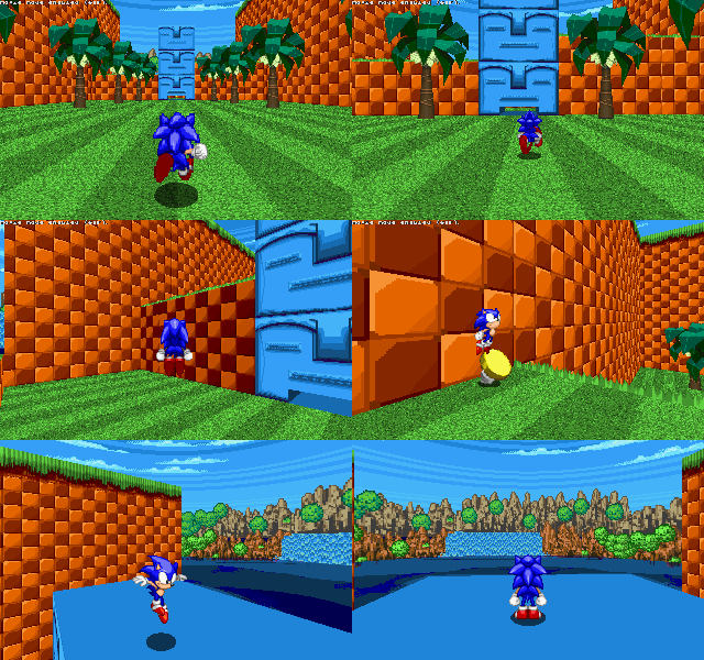
While they are set as linedef textures for now, i plan to make Things out of them.
Have a look at it in action. I added in my totem pole as well (apparently Zone Builder doesn't allow me using textures in a lump that reference other textures of said lump, so some parts have to be reworked):
While they are set as linedef textures for now, i plan to make Things out of them.
I'm also experimenting with the colour scheme of my wall texture to incorporate the suggested 'pastel' look more, by using lighter browns etc more. That will be shown another time.
Thank you for reading!
Chezi
Co-Lead Ardent Rush Dev
That tree makes me go unga bungaUpdate 16:
Today i want to show off a new asset for the level. I made a custom palm tree from scratch. For reference, please check the GHZ map from sonic chronicles in a post earlier in the thread.
For this asset, i kept Morphised's advice in mind: i used more shades of blue, green and brown.
View attachment 45460
Have a look at it in action. I added in my totem pole as well (apparently Zone Builder doesn't allow me using textures in a lump that reference other textures of said lump, so some parts have to be reworked):View attachment 45461
While they are set as linedef textures for now, i plan to make Things out of them.
I'm also experimenting with the colour scheme of my wall texture to incorporate the suggested 'pastel' look more, by using lighter browns etc more. That will be shown another time.
Thank you for reading!
GamerLuna2020
The one and only!
(confused unga bunga)That tree makes me go unga bunga
Update 17:
Today, i'm happy to show my second palm tree is complete!
Meanwhile, my experiments with the rock textures are still ongoing. I'm trying to find a balance between the battle scene's and the zone map 's colour schemes. The result of that comes on another day.
Thank you for reading.
Today, i'm happy to show my second palm tree is complete!
Have a pic of trees from the source material. The orange arrows point to the trees i remade:
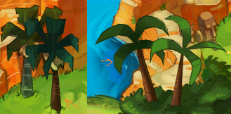
Here are my remakes. The new one is for the dark green variation of the palmtree (nr 2). I added some lines and edges to my interpretation to make it more consistent with my first tree.
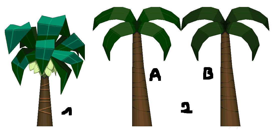
I am a little bit uncertain for the colour choice of the leaves for the second tree. Which one looks better for 2, A or B?
Next on my palm tree list are the variations of these trees, like in the source material pic. For tree 1's variation, i'll make a more blueish, 'hairier' trunk and greener leaves. For tree 2 i'll make the trunk either more tilted or more bent, and use lighter greens for its leaves.
Here are my remakes. The new one is for the dark green variation of the palmtree (nr 2). I added some lines and edges to my interpretation to make it more consistent with my first tree.
I am a little bit uncertain for the colour choice of the leaves for the second tree. Which one looks better for 2, A or B?
Next on my palm tree list are the variations of these trees, like in the source material pic. For tree 1's variation, i'll make a more blueish, 'hairier' trunk and greener leaves. For tree 2 i'll make the trunk either more tilted or more bent, and use lighter greens for its leaves.
Meanwhile, my experiments with the rock textures are still ongoing. I'm trying to find a balance between the battle scene's and the zone map 's colour schemes. The result of that comes on another day.
Thank you for reading.
romineblox0
Member
amazing work
Update 18
With exam month behind me, i made some more progress. Let's go over my additions:
1) new structures
I mapped out some more structures to get some inspiration for its implementation in the level. These are made with default assets and my current assets. These are put in a test zone. Their final look is thus subject to change.
2) new asset
Instead of the usual palm tree,i decided to remake one of the pillars.
I don't have a definitive remake of my rock textures, but that'll come sooner or later.
Thank you for reading!
Edit: clarification on structures' assets
With exam month behind me, i made some more progress. Let's go over my additions:
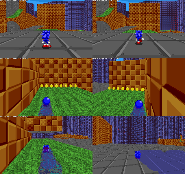
1) new structures
I mapped out some more structures to get some inspiration for its implementation in the level. These are made with default assets and my current assets. These are put in a test zone. Their final look is thus subject to change.
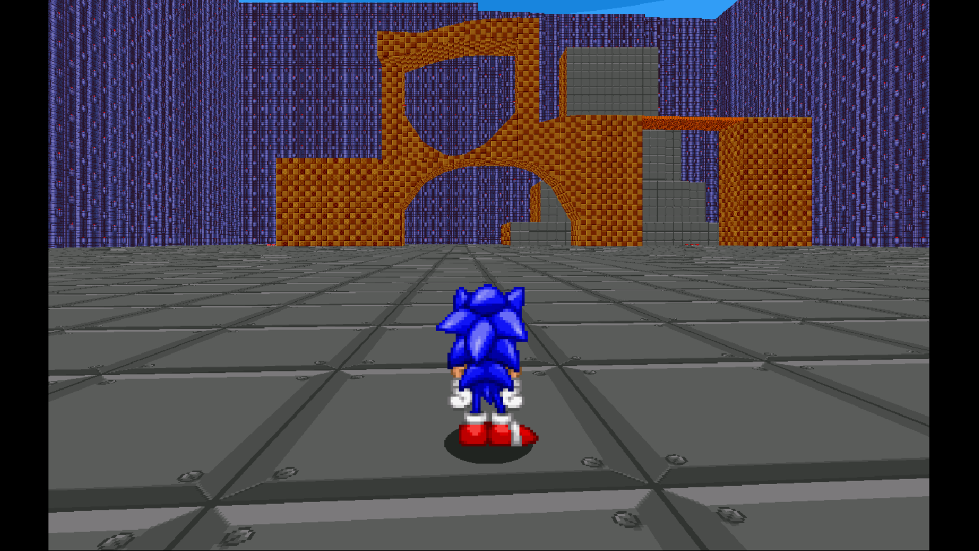
This is meant to be a possible high route featuring wacky paths. So i figured i could make a dangerous looking loop that has little structural support. This 'loop' will have springs to bring you upwards and atop the loop, so the player won't have to struggle with scripted events.
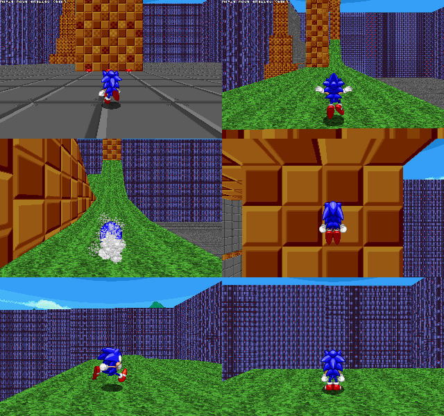
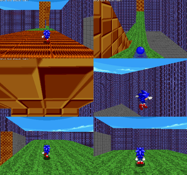
This section was made for spindash characters to test their jumping skills. The rocks in the cave get slightly taller the further you go. This would force the player to use different strategies with different characters. The cave can be exited by rolling. I also kept it open on one side so players could enjoy the view. This could allow me to tease other characters' pathways.
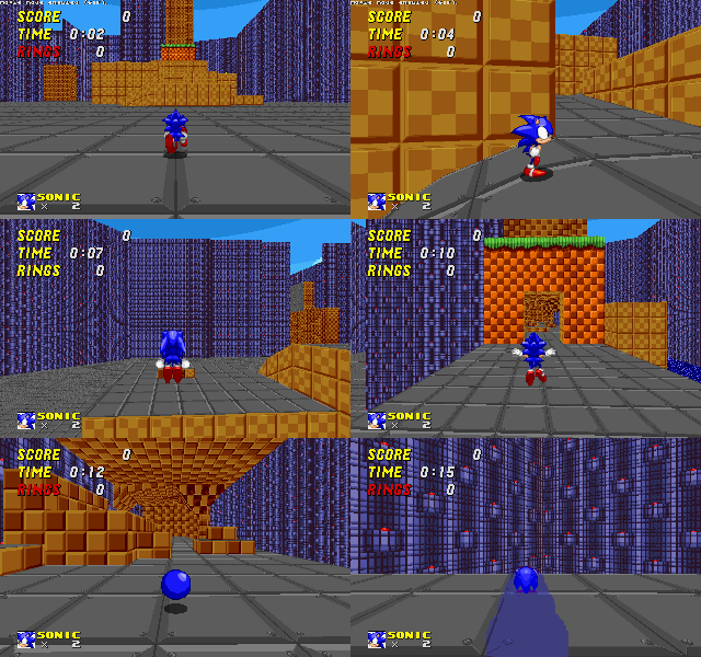
This section serves to bring players to a lower part of the level. It was a little hard to make the flow between springs seamless, but i'm glad i made it work in the end. It also works in reverse, you can roll back up by touching the right springs.
2) new asset
Instead of the usual palm tree,i decided to remake one of the pillars.
Here is the inspiration from the source material:

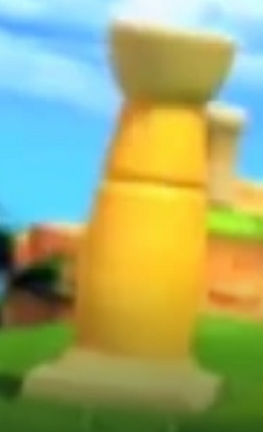
And here is the resulting sprite:

And here is the resulting sprite:
I don't have a definitive remake of my rock textures, but that'll come sooner or later.
Thank you for reading!
Edit: clarification on structures' assets
Attachments
Update 19
It's been a while since i've last updated the thread. Let's go over what i've updated:
To finish off, i'm glad to announce i could restore an area into the level:
That's all for this update! Thank you for reading!
Edit: spelling and numbers
It's been a while since i've last updated the thread. Let's go over what i've updated:
Firstly, i've updated my treeline to make the forest background much richer. Last time i brought up this forest, i attempted to make it through Slade's patch color function. As this didn't work, i recolored the vanilla GFZ Tree 4 times and inserted those, plus the original one, into this background texture. The result is a dense forest:
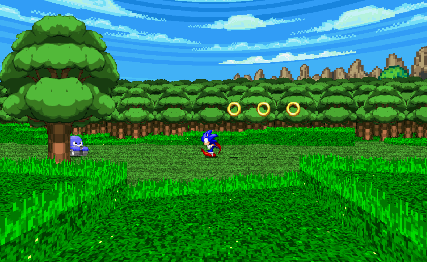
I learned to make my first SOC objects, and thus all palm trees i made are in the game:
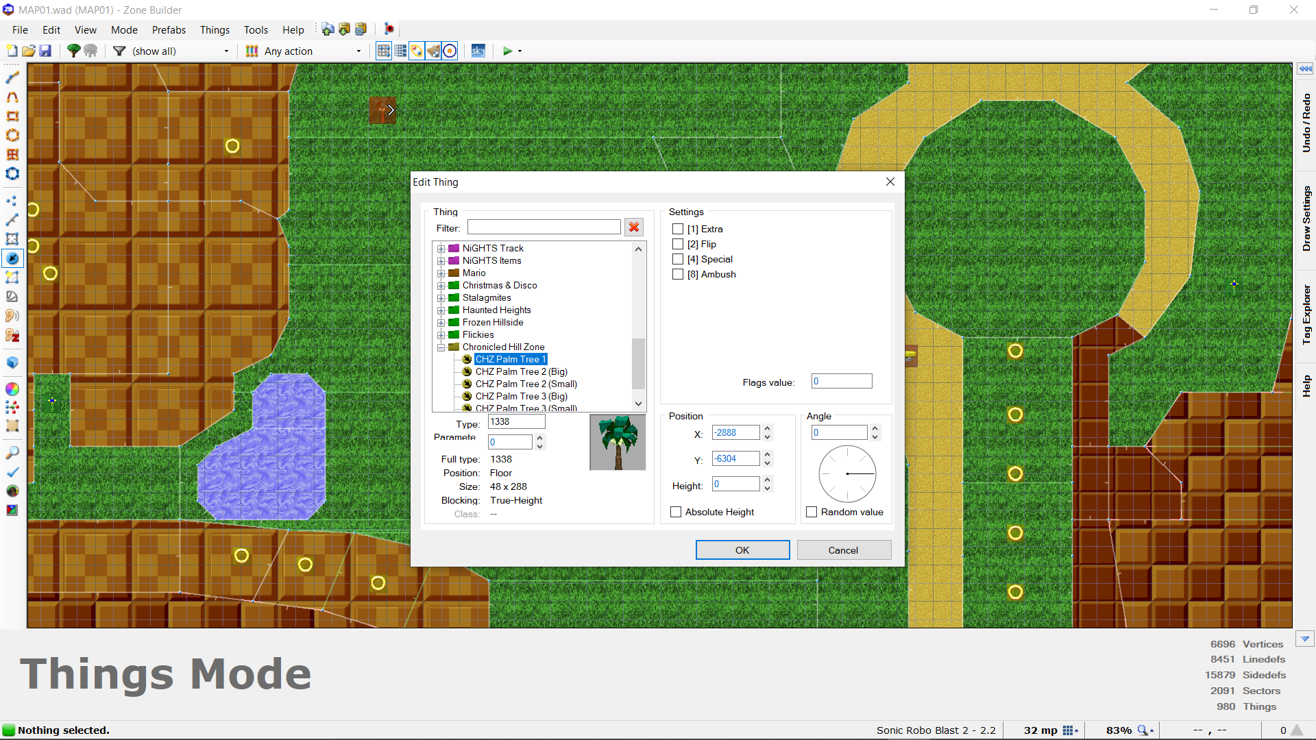
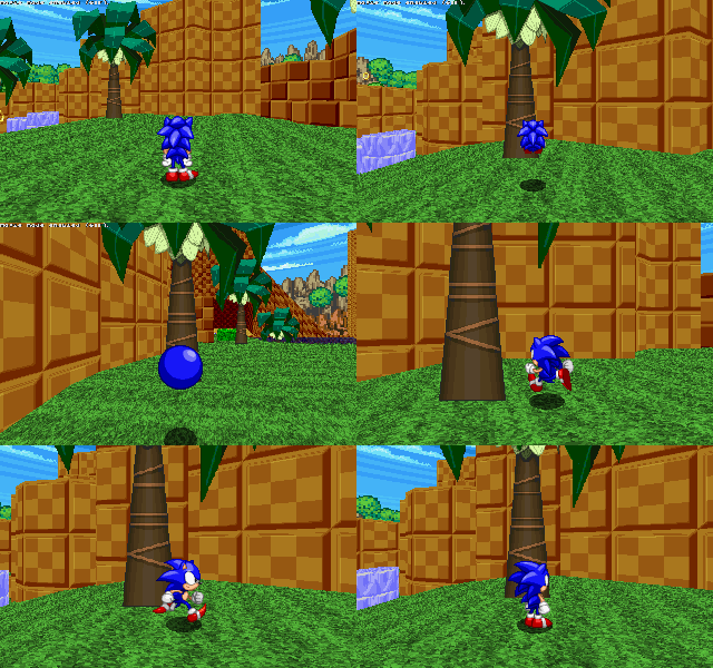
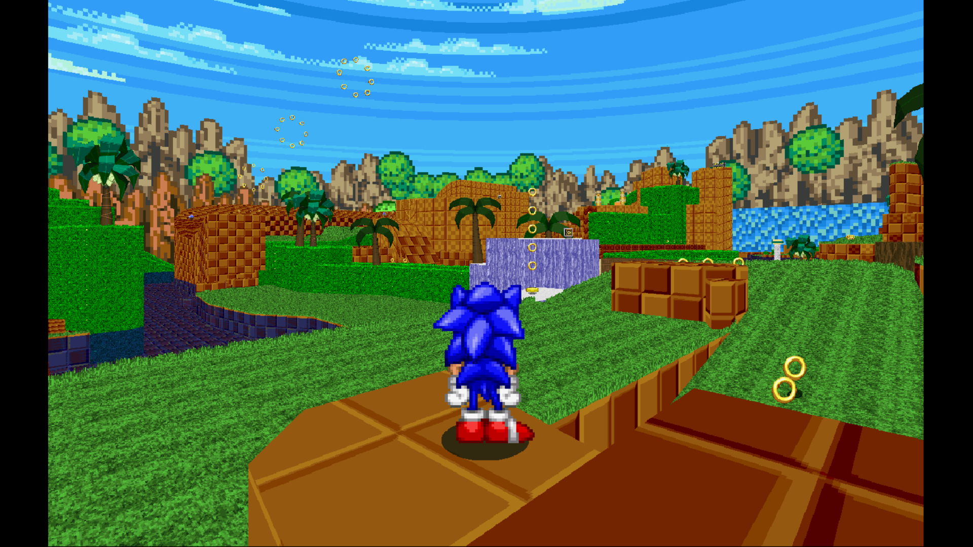
I also added one of the pillars as a soc object, removing 30-ish fofs and lots of lag in one swoop. You can also stand on them:
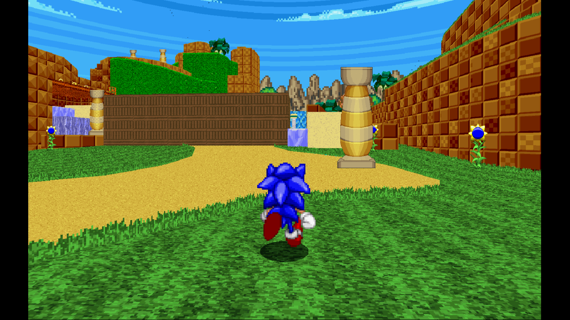
I also added one of the pillars as a soc object, removing 30-ish fofs and lots of lag in one swoop. You can also stand on them:
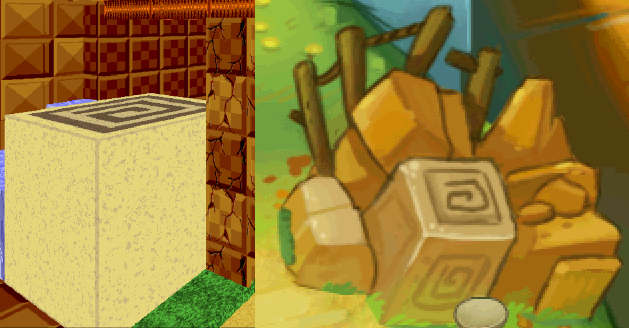
As a new asset, i made the cinnamon roll logo from chronicles' mysterious stone. Heavily inspired by CEZ's rock texture, I transformed a yellow square into a believeable rock.:
Lastly, I'm working on a bridge texture. This is what i have atm for the flat texture:
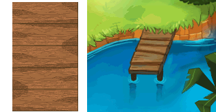
Naturally, i'll try and make textures for it's sides.
Lastly, I'm working on a bridge texture. This is what i have atm for the flat texture:
Naturally, i'll try and make textures for it's sides.
To finish off, i'm glad to announce i could restore an area into the level:
Previously, i had to remove this part of the level, as traversing it - and coming out of that area, back into the main world, would cause major lag. With update 2.9, i am happy to say that this lag is drastically reduced - to the point where it is nearly non-existant. Thus, i am restoring this area back into the level:
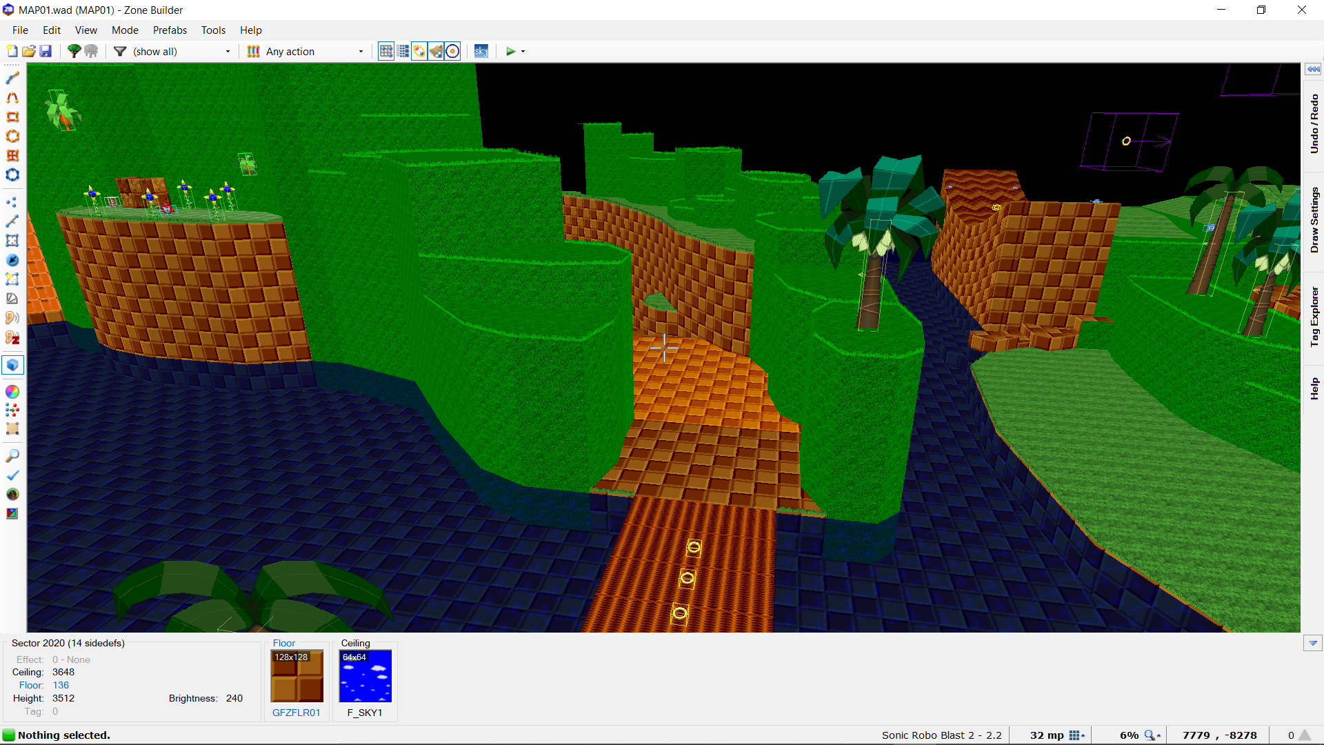
Now you'll be able to cross the bridge safely and explore the level a little more.
Now you'll be able to cross the bridge safely and explore the level a little more.
That's all for this update! Thank you for reading!
Edit: spelling and numbers
Attachments
Update 20
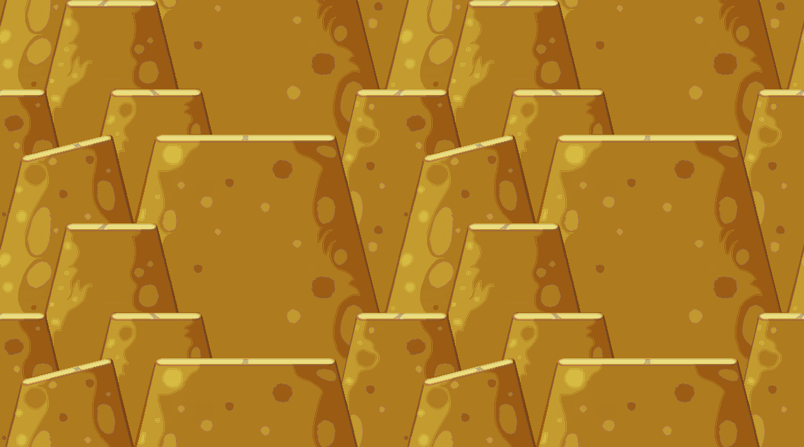
This week i've worked on updating the colour scheme of the rock structures. I tried to keep Morphised's suggestion in mind - more use of bright browns to make it closer to Chronicles. The following textures follow the more brownish & yellowish designs found at the bottom of the GHZ world map in the original game.
Firstly, i made a rock texture for use with pillar-like terrain:
Secondly, i made an entire new rock complex. This was inspired by Sonic 1's rock tiles. Compared to my earlier classically orange and yellow rock designs, i think this new version will fit the Chronicles aesthetic much better:
I will continue to make textures inspired by the GHZ from chronicles throughout different media, including grass / rocks/ etc... There is still a lot i can sprite, so i want to gauge what you guys and gals think about this new art direction for the main rock textures. Do you think these new textures align better with Chronicles? Or do you think they should different in some way? All suggestions are welcome and appreciated.
Thank you for reading!
This week i've worked on updating the colour scheme of the rock structures. I tried to keep Morphised's suggestion in mind - more use of bright browns to make it closer to Chronicles. The following textures follow the more brownish & yellowish designs found at the bottom of the GHZ world map in the original game.
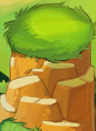
Firstly, i made a rock texture for use with pillar-like terrain:
This is the source reference:
Here is the texture looped once horizontally and once vertically:
In-game, it looks like this:
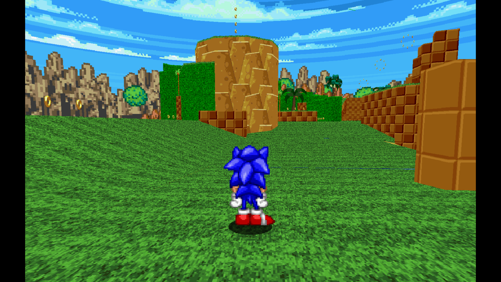
Here is the texture looped once horizontally and once vertically:
In-game, it looks like this:
Secondly, i made an entire new rock complex. This was inspired by Sonic 1's rock tiles. Compared to my earlier classically orange and yellow rock designs, i think this new version will fit the Chronicles aesthetic much better:
My previous version:
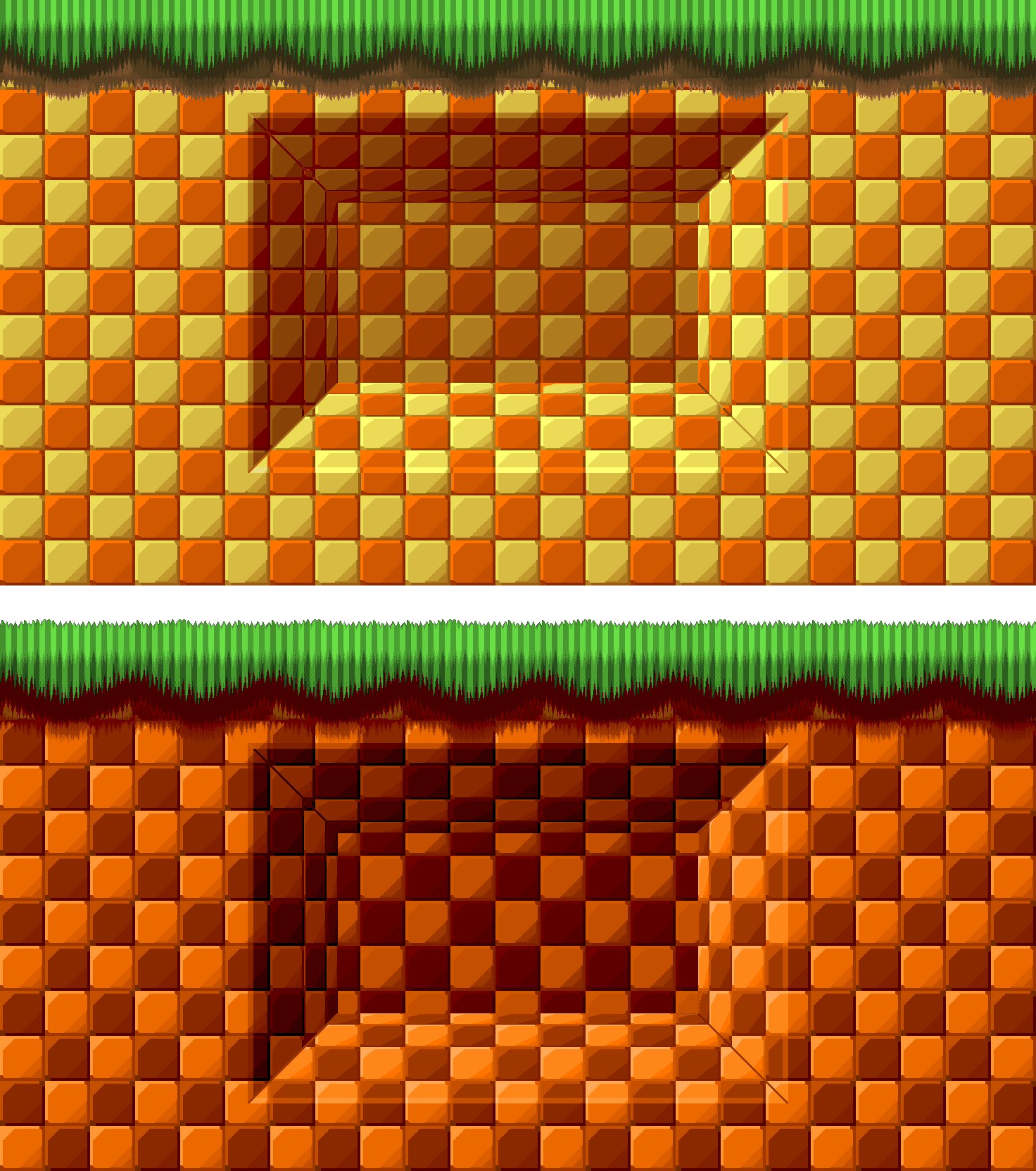
The new version:
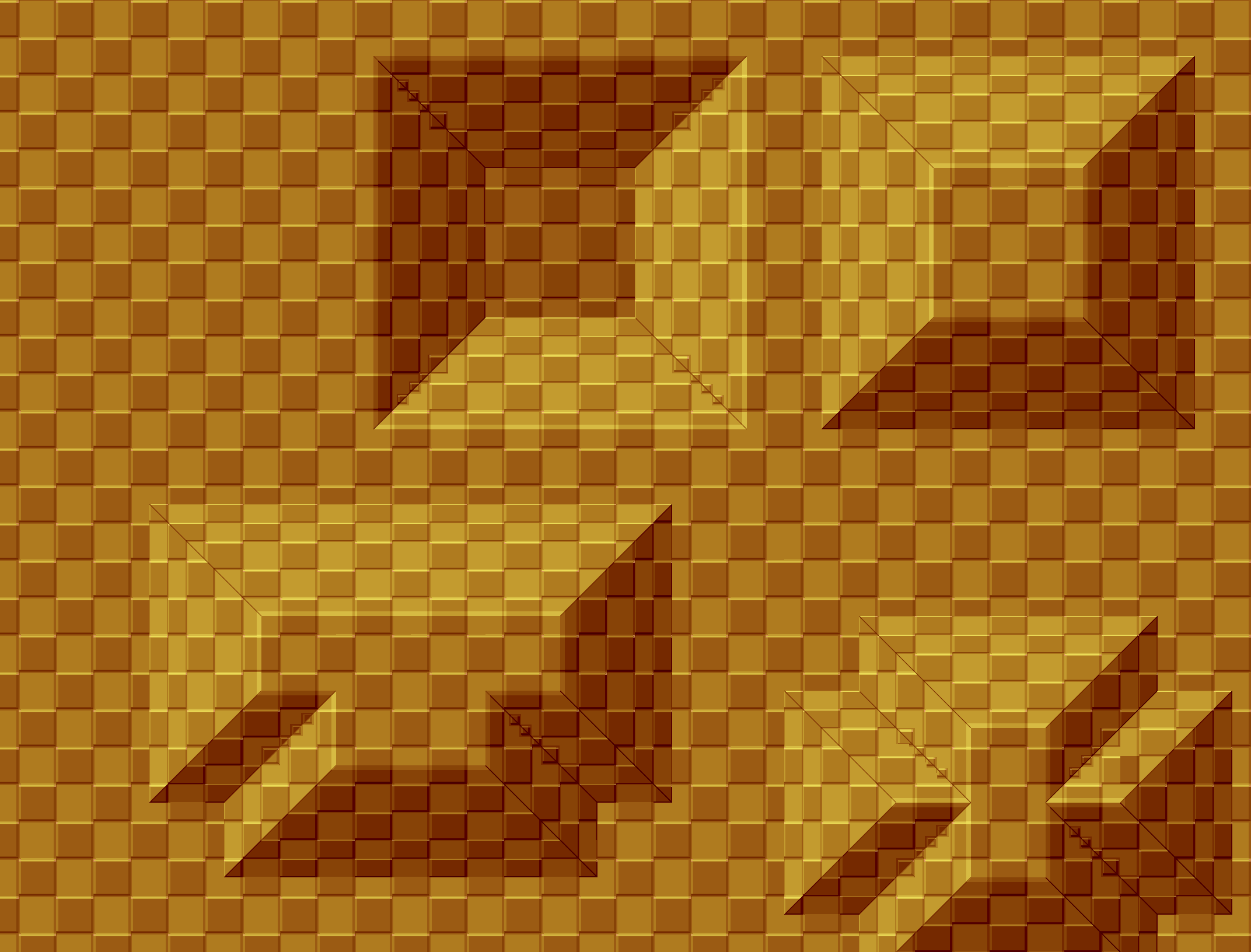
All shapes shown here can be made through patches.
An example of reference, taken from the GHZ map:
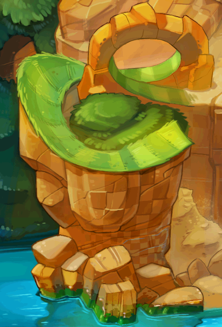
An example of in-game use:
The new version:
All shapes shown here can be made through patches.
An example of reference, taken from the GHZ map:
An example of in-game use:
I will continue to make textures inspired by the GHZ from chronicles throughout different media, including grass / rocks/ etc... There is still a lot i can sprite, so i want to gauge what you guys and gals think about this new art direction for the main rock textures. Do you think these new textures align better with Chronicles? Or do you think they should different in some way? All suggestions are welcome and appreciated.
Thank you for reading!
Othius
[A person in a place]
Sonic Team Junior
Judge
Update 20
This week i've worked on updating the colour scheme of the rock structures. I tried to keep Morphised's suggestion in mind - more use of bright browns to make it closer to Chronicles. The following textures follow the more brownish & yellowish designs found at the bottom of the GHZ world map in the original game.
Firstly, i made a rock texture for use with pillar-like terrain:
This is the source reference:
View attachment 48939
Here is the texture looped once horizontally and once vertically:
View attachment 48967
In-game, it looks like this:
View attachment 48968
Secondly, i made an entire new rock complex. This was inspired by Sonic 1's rock tiles. Compared to my earlier classically orange and yellow rock designs, i think this new version will fit the Chronicles aesthetic much better:
My previous version:
View attachment 48970
The new version:
View attachment 48969
All shapes shown here can be made through patches.
An example of reference, taken from the GHZ map:
View attachment 48972
An example of in-game use:
View attachment 48971
I will continue to make textures inspired by the GHZ from chronicles throughout different media, including grass / rocks/ etc... There is still a lot i can sprite, so i want to gauge what you guys and gals think about this new art direction for the main rock textures. Do you think these new textures align better with Chronicles? Or do you think they should different in some way? All suggestions are welcome and appreciated.
Thank you for reading!
Oooh I like these textures. I definitely like the shapes in the new version, although I gotta say I think the colors are nicer in the old version.
Also, something I have to point out. The water you're using does not match up with the water in Chronicles, nor does it the water in your skybox, you should figure out something more teal so that it fits in. Otherwise I'm loving this! Good job!
Update 21
It's been a while since the last update. But i think the wait will be worth it with the new stuff i can show. This update, i'll focus on the main areas from Sonic Chronicles.
Thanks to Othius' suggestion i realise that with the more yellow/brown rock color scheme, the balance between orange and other colors was getting favoured heavily towards the latter. As this game has so many different color schemes and styles, it's hard to find that right balance. And because i did like the colors scheme of the orange rock version, i went and dug up the different styles of the game again to figure out what i should pick.
In conclusion, the balance between yellow, brown and orange is important. So i created new assets to help me in this quest.
The result of the tiles is shown here:
Next, the new area - The Chao Garden (wip)
Next, i have sent out an early access version to a small handful of test volunteers for private testing on Discord. This includes the "port" part of the Sonic Chonicles level. Jim, Particle, LeWisp and Fireball have helped me find some bugs and gameplay hiccups. Most of them are fixed. They include:
-2d softlock through the secret passage (fixed)
-visual bugs in areas like the forest area (still 1 big bug, but others are fixed)
-the big ramp near the waterfall not being intuitive enough (fixed). This one is drastically different, so here is an updated pic of it:
And other small visual bugs.
Some testers are still looking out for more bugs and glitches. All helpers will be credited when the Zone releases. If you wish to participate in private testing, let me know on the MB or on Discord (Rabosion#1272).
What are your thoughts about these updates? Is the Zone going into the right direction? Do the new textures work well with the others? Does something need to be changed or updated? What Chao do you hope to see in the Chao Garden, and what would you like to see in the next update? Any and all criticisms and suggestions are welcome.
Thank you for reading!
It's been a while since the last update. But i think the wait will be worth it with the new stuff i can show. This update, i'll focus on the main areas from Sonic Chronicles.
Thanks to Othius' suggestion i realise that with the more yellow/brown rock color scheme, the balance between orange and other colors was getting favoured heavily towards the latter. As this game has so many different color schemes and styles, it's hard to find that right balance. And because i did like the colors scheme of the orange rock version, i went and dug up the different styles of the game again to figure out what i should pick.
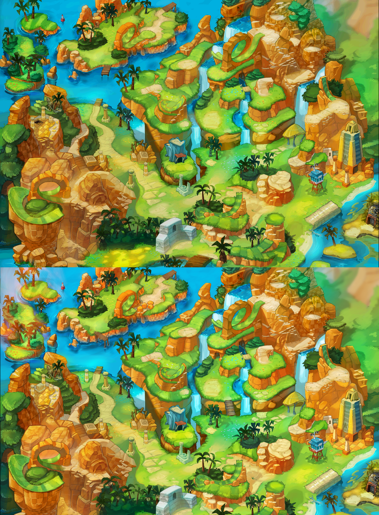
Green Hill Zone Map - the upper version gives a more brownish yellow vibe, with some orange tints
Paletting it through slade turns most of the rocks towards yellowish browns
The bottom version is under a bright orange sunlight with some small differences, this accentuates the orange way more above the yellow
Paletting it through Slade reveals much more orange tints before turning towards yellow
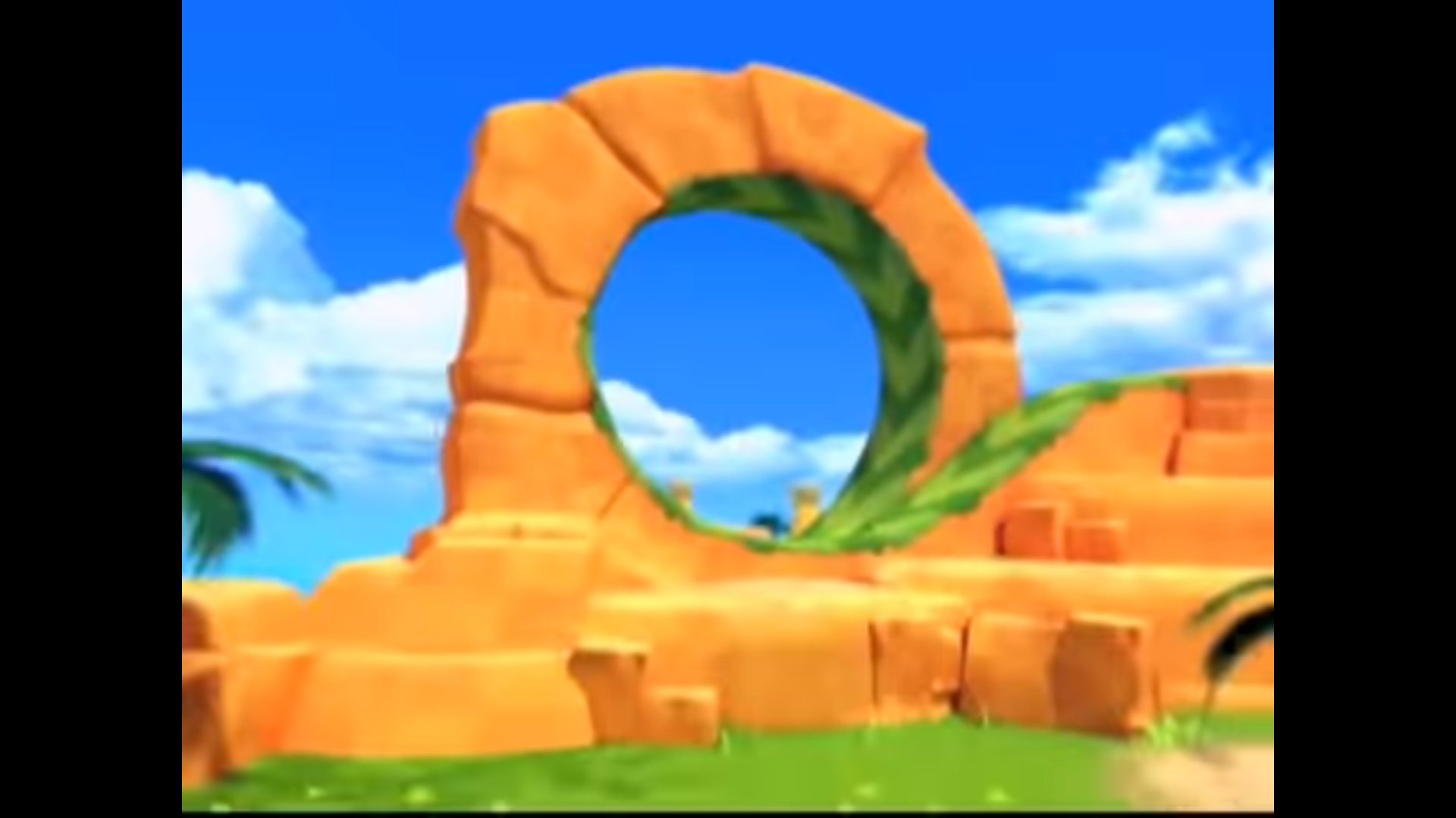
The Sonic Chronicles Trailer has overwhelmingly bright orange tints
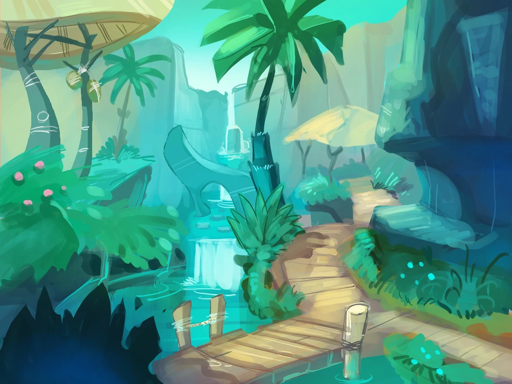
The GHZ Concept art from Chonicles is radically different, sporting mostly a blue-teal-grey look:
The Green Hill cutscenes also have some bluer tints, they primarily use light browns and pinkish tints for their rocks:
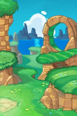
Next up, we also have the Chao Garden. Though its location is not specifically stated, from the color scheme it can be deducted that this is located in Green Hill as well:

The background makes more heavy use of the teal and yellow tints to accentuate its serenity and feel of paradise. Meanwhile the actual terrain uses a combination of yellow and orange tints.
Paletting it through slade turns most of the rocks towards yellowish browns
The bottom version is under a bright orange sunlight with some small differences, this accentuates the orange way more above the yellow
Paletting it through Slade reveals much more orange tints before turning towards yellow
The Sonic Chronicles Trailer has overwhelmingly bright orange tints
The GHZ Concept art from Chonicles is radically different, sporting mostly a blue-teal-grey look:
The Green Hill cutscenes also have some bluer tints, they primarily use light browns and pinkish tints for their rocks:
Next up, we also have the Chao Garden. Though its location is not specifically stated, from the color scheme it can be deducted that this is located in Green Hill as well:
The background makes more heavy use of the teal and yellow tints to accentuate its serenity and feel of paradise. Meanwhile the actual terrain uses a combination of yellow and orange tints.
In conclusion, the balance between yellow, brown and orange is important. So i created new assets to help me in this quest.
The rocks contain a more orangey color scheme. I also made the Chao garden tiles with a combination of orange and yellow/ brown colours to help bring that balance. Next i made the main bushes, with a floral variation. Rock tiles featuring the style of the concept art/ cutscenes will be made for background elements at a later date. The grass tiles shown here are used solely for the Chao Garden. A rework of my earlier striped grass tile is in the works.
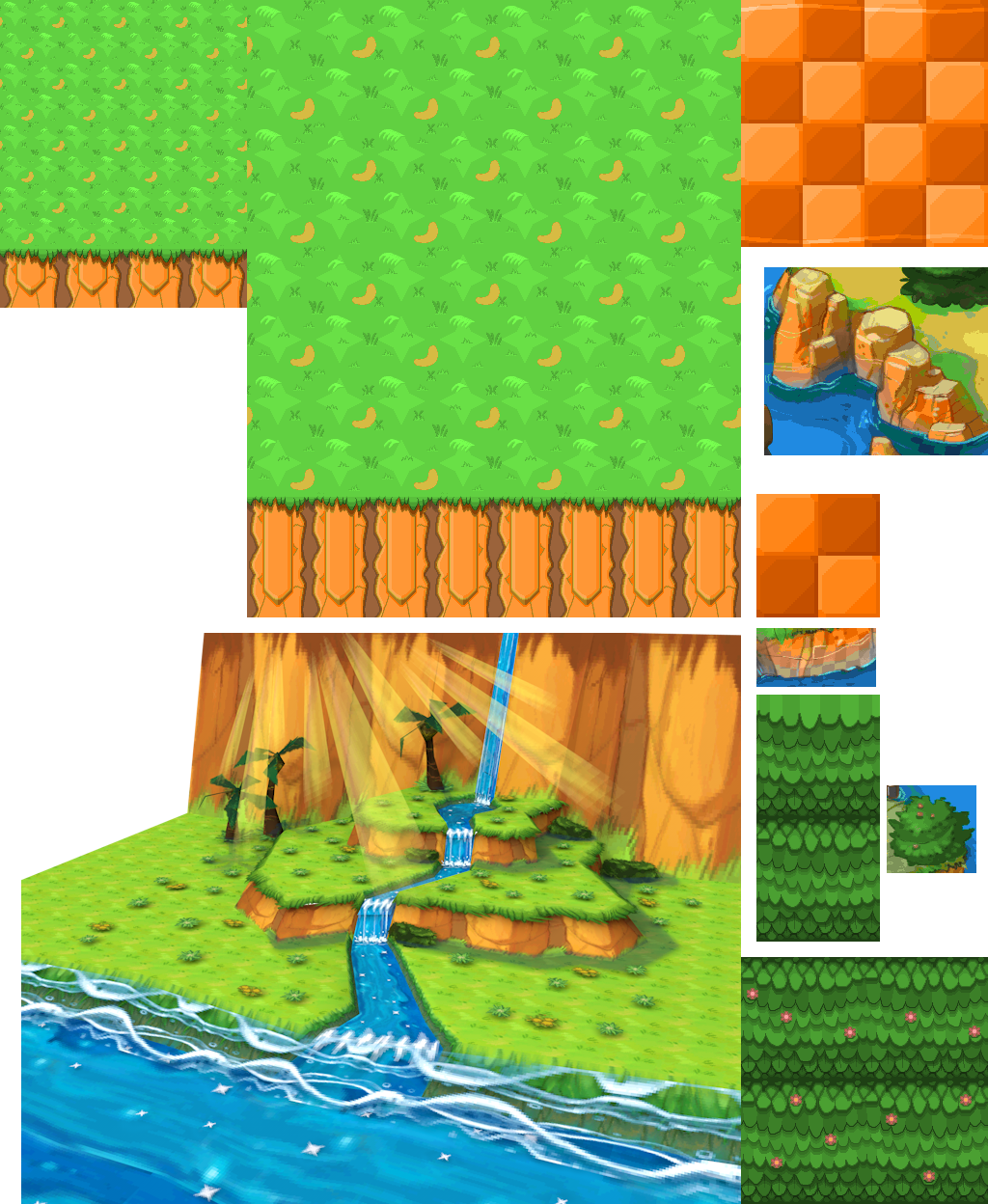
The result of the tiles is shown here:
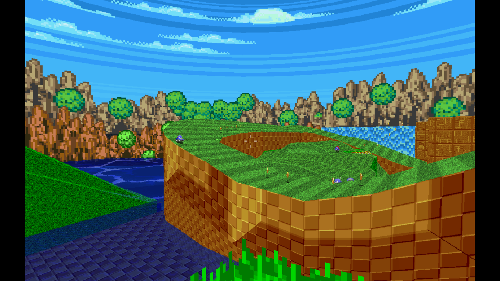
GHZ Starting area:
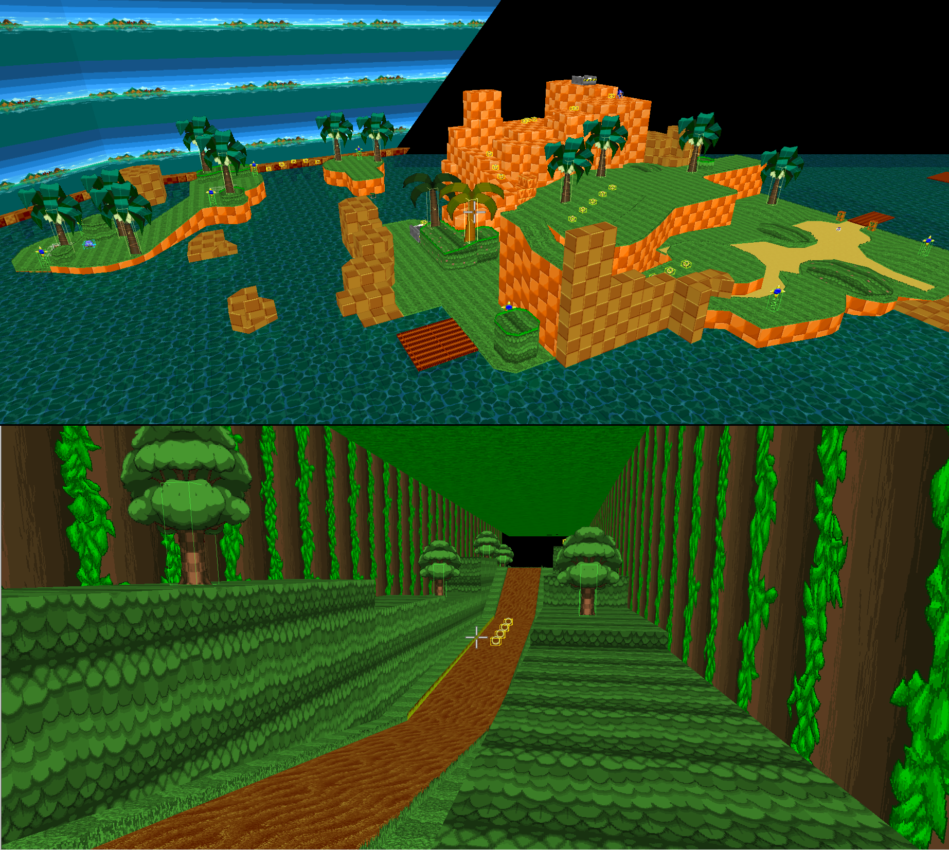
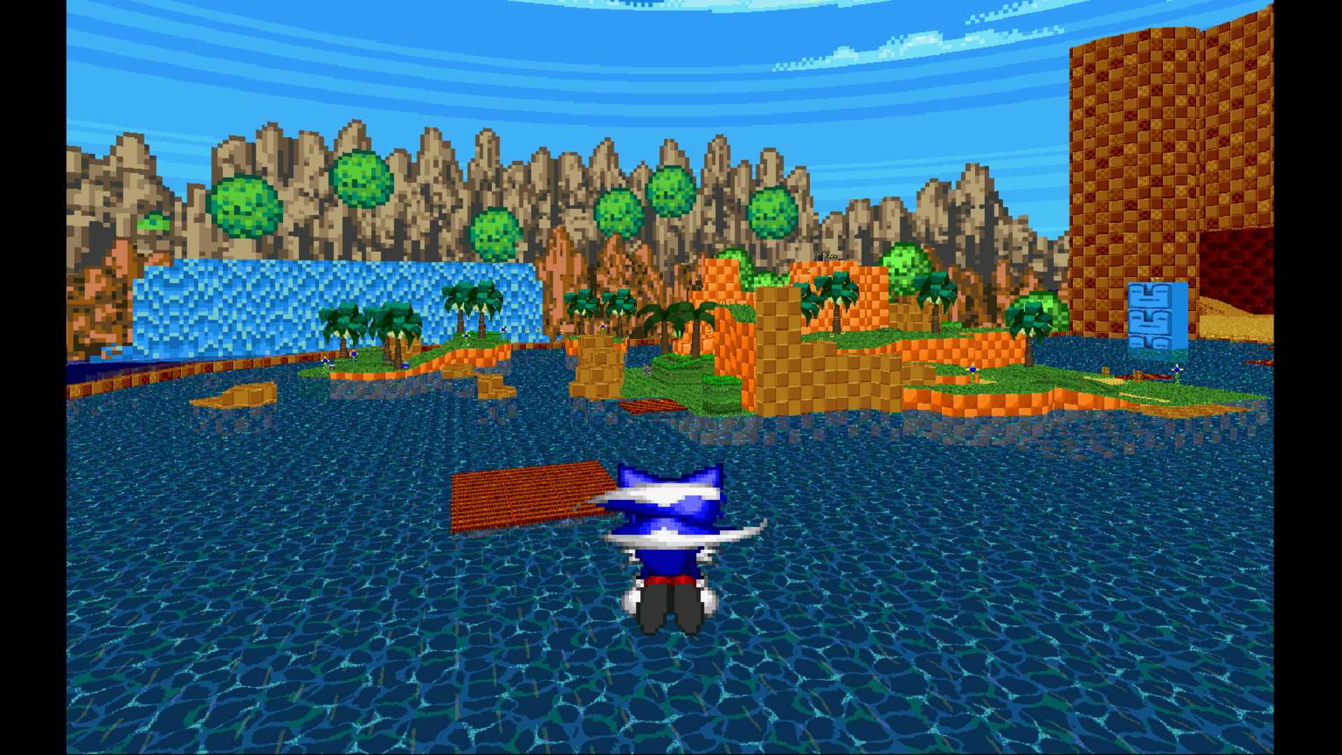
Note: I used Deep Sea Zone's water temporarily to study how to make the right kind of water for this level. While Deep Sea Zone's water looks much better than the previous water, I'm not sure if this is the right colour scheme for the water. Perhaps this could be used for the background? Please let me know what you think in the comments.
The later areas are being worked on and its tiles will get more hints of orange later on.
Next, the new area - The Chao Garden (wip)
Using the tiles shown before, this little area will fill your heart with joy and Chao.
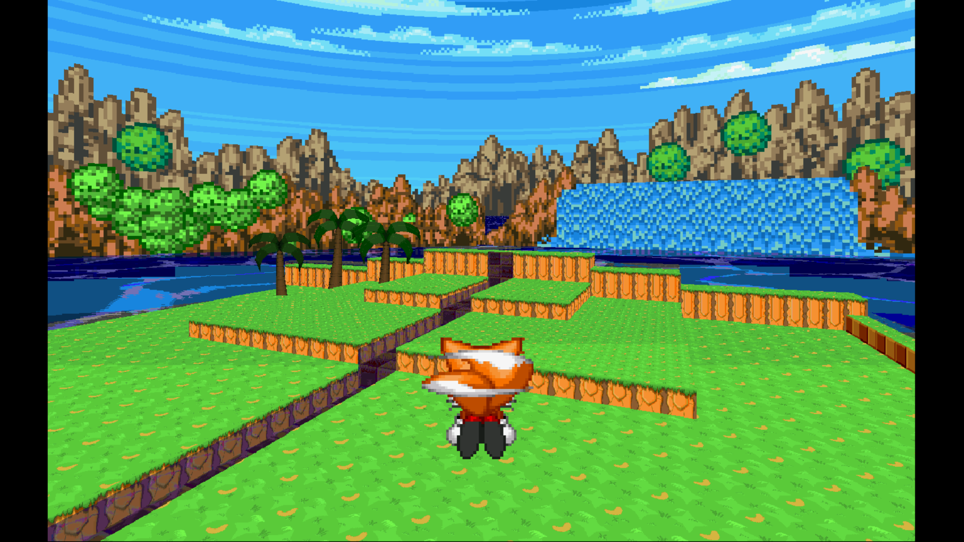
With the little areaa from chronicles complete, i plan to enhance this place with custom chao and more geometry so it becomes more like a real garden and a hangout place for Chao. The water and background are being (re)worked on.
With the Chao garden, i hope to have at least 5 Chao ready by release time.
Next, i have sent out an early access version to a small handful of test volunteers for private testing on Discord. This includes the "port" part of the Sonic Chonicles level. Jim, Particle, LeWisp and Fireball have helped me find some bugs and gameplay hiccups. Most of them are fixed. They include:
-2d softlock through the secret passage (fixed)
-visual bugs in areas like the forest area (still 1 big bug, but others are fixed)
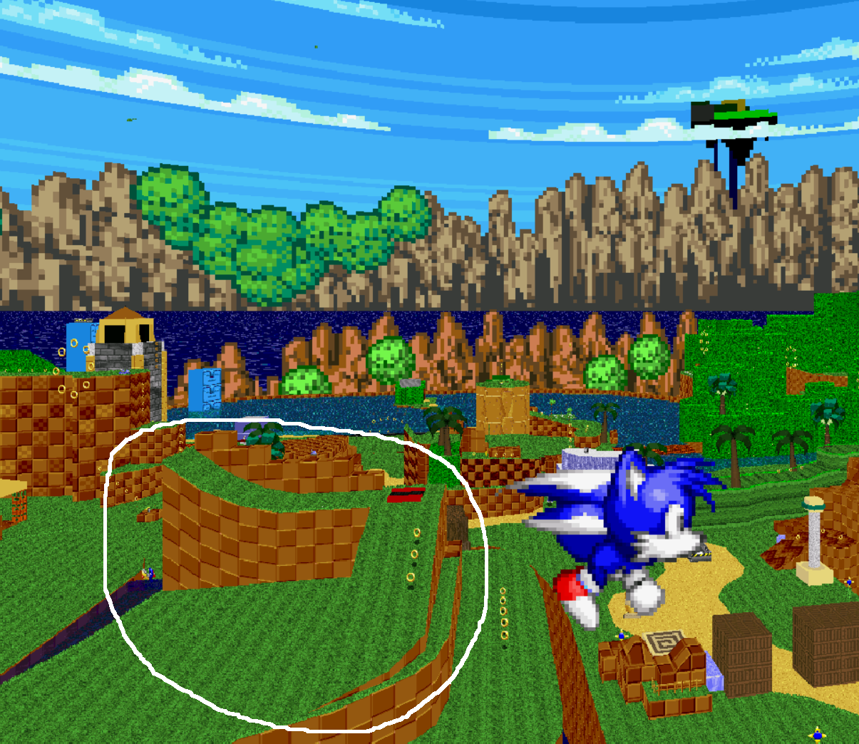
-the big ramp near the waterfall not being intuitive enough (fixed). This one is drastically different, so here is an updated pic of it:
The setup with the vertex slopes has been removed and replaced with a more straightforward, lower hanging ramp. This should allow for faster gameplay for pros and a more carrying support structure for newer players. In this pic, you can also see a foreshadowing of Angel Island Zone (prototype) in the background.
Some testers are still looking out for more bugs and glitches. All helpers will be credited when the Zone releases. If you wish to participate in private testing, let me know on the MB or on Discord (Rabosion#1272).
What are your thoughts about these updates? Is the Zone going into the right direction? Do the new textures work well with the others? Does something need to be changed or updated? What Chao do you hope to see in the Chao Garden, and what would you like to see in the next update? Any and all criticisms and suggestions are welcome.
Thank you for reading!
Update 22
With exams being over, i can post another update to the map. For this update, i want to put everything i currently have together. There are a lot of updates, some in small ways while others are pretty huge.
With the last few updates, i've come to the conclusion that i tried to make stuff graphically without considering the 'fun factor' of the level. What i've tried to do because of that, is put more effort in the mechanical aspect of the level. This is the current outlook of the map:
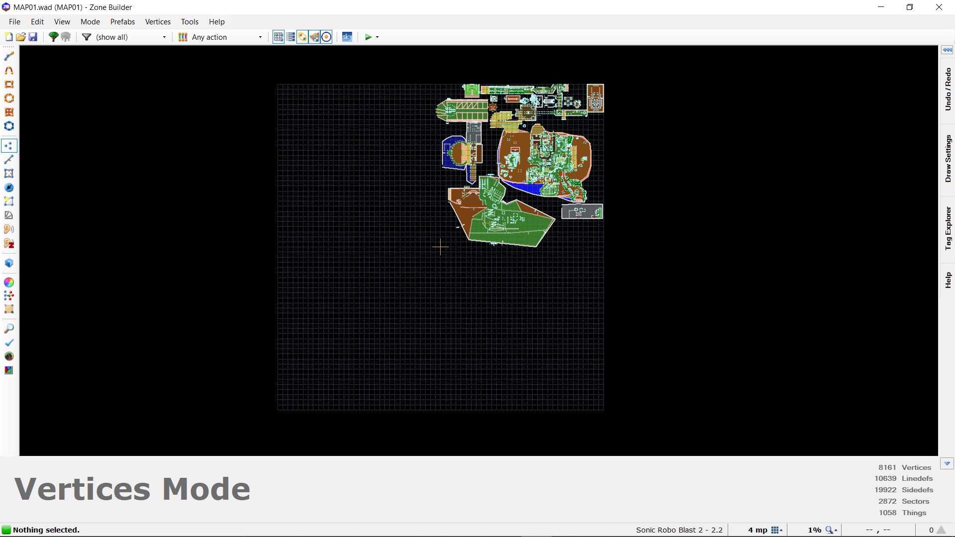
The map now has some disconnected sections created in previous updates and a giant new section. While they are fine to run through by themselves, they don't feel like a natural expansion to the chronicles part yet. I have to think more on how i want to make it connect well.
Here are some screenshots for some new section concepts. With these sections i'm trying to expand the world outside, but are not indicative of the final map.
Keeping all the mechanical stuff in mind, i did make some new art developments. For the chao garden, i went ahead and made this:
Lastly, i heard back from Particle, who reviewed the first part of the level. He gave me some pointers to improve on with level flow and the like. Taking his feedback in mind, i'll try to work on that first part of the level to be in better quality. I'm eager to hear his feedback on the rest of the level in the future.
That is all for now. Development is kind of all over the place, which is normal in the last few months of development. And with so much to possibly expand upon before my promised December deadline, i will focus on some mechanical aspects to improve on level flow and level quality firstly to ensure a fun level will be playable by then.
Thank you for reading!
With exams being over, i can post another update to the map. For this update, i want to put everything i currently have together. There are a lot of updates, some in small ways while others are pretty huge.
With the last few updates, i've come to the conclusion that i tried to make stuff graphically without considering the 'fun factor' of the level. What i've tried to do because of that, is put more effort in the mechanical aspect of the level. This is the current outlook of the map:
The map now has some disconnected sections created in previous updates and a giant new section. While they are fine to run through by themselves, they don't feel like a natural expansion to the chronicles part yet. I have to think more on how i want to make it connect well.
Here are some screenshots for some new section concepts. With these sections i'm trying to expand the world outside, but are not indicative of the final map.
1)Callback to the sonic chronicles trailers:
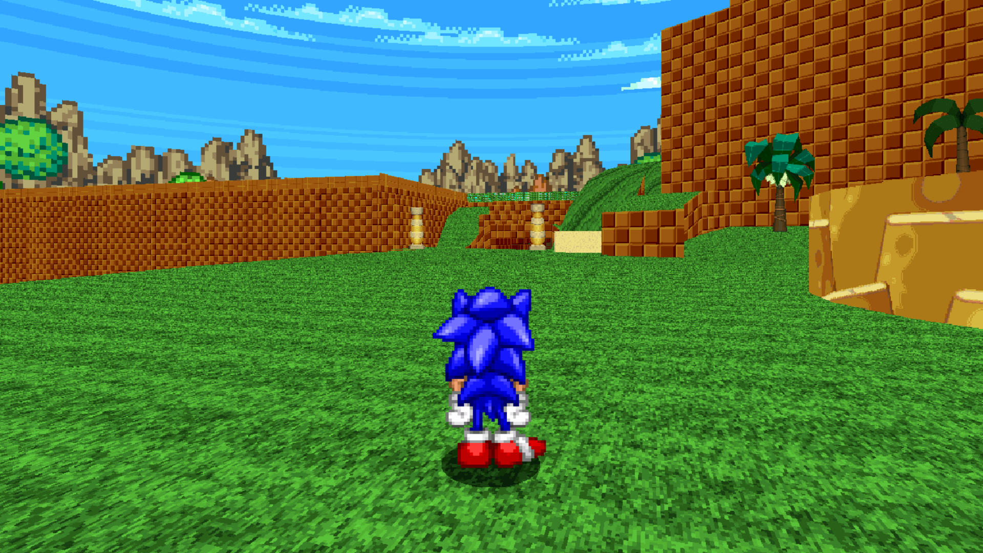
2)Possible Generations-esque ending station, needs more waterfalls:
3) More areas
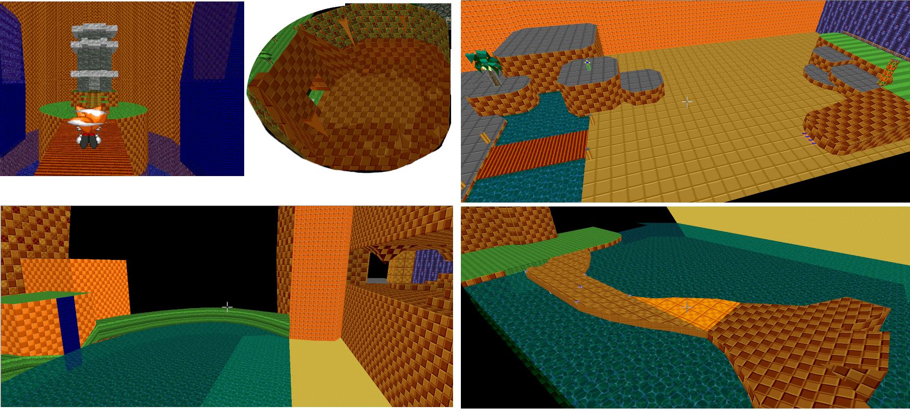 From L to R, top to bottom:
top:Unleashed esque temple, the cave area from chronicles, small bridge with some hills
bottom: waterfall pond expansion to a cave area, remade half-corkscrew over a river
While not everything i made is in the same map yet, it becomes clear to me that the map is filling up super fast with one-off gimmicks, concepts and scenery. To have a good level, i need to find a way to connect all my ideas better. So what i want to do going forward is keep building things mechanically and try to find a way to make it stick together. My art asset focus for level assets can then follow afterwards.
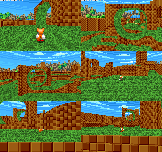
An example of mechanically putting things nicely is this example of loops referencing the chronicles trailers:
2)Possible Generations-esque ending station, needs more waterfalls:
3) More areas
top:Unleashed esque temple, the cave area from chronicles, small bridge with some hills
bottom: waterfall pond expansion to a cave area, remade half-corkscrew over a river
While not everything i made is in the same map yet, it becomes clear to me that the map is filling up super fast with one-off gimmicks, concepts and scenery. To have a good level, i need to find a way to connect all my ideas better. So what i want to do going forward is keep building things mechanically and try to find a way to make it stick together. My art asset focus for level assets can then follow afterwards.
An example of mechanically putting things nicely is this example of loops referencing the chronicles trailers:
Keeping all the mechanical stuff in mind, i did make some new art developments. For the chao garden, i went ahead and made this:
1) chao egg hatching animation
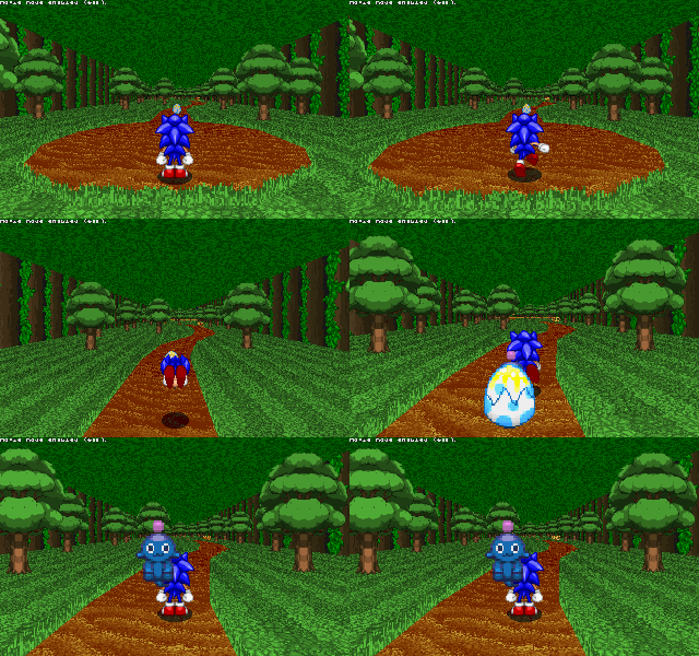
2)default chao walking sprites
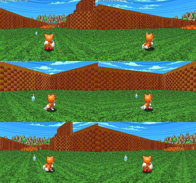
NOTE: they are made with stylistic consistency with chao art from Cyron's Pets Addon, (which was reusable )
(Link: https://mb.srb2.org/threads/pets-personal-followers-community-update.28607/)
I added new limbs and edited the head+torso slightly to make the animation, so i will credit the authors and artists from the pets mod as well in the credits for the level.
More facial expresions and walking/running animations are being worked on.
2)default chao walking sprites
NOTE: they are made with stylistic consistency with chao art from Cyron's Pets Addon, (which was reusable )
(Link: https://mb.srb2.org/threads/pets-personal-followers-community-update.28607/)
I added new limbs and edited the head+torso slightly to make the animation, so i will credit the authors and artists from the pets mod as well in the credits for the level.
More facial expresions and walking/running animations are being worked on.
Lastly, i heard back from Particle, who reviewed the first part of the level. He gave me some pointers to improve on with level flow and the like. Taking his feedback in mind, i'll try to work on that first part of the level to be in better quality. I'm eager to hear his feedback on the rest of the level in the future.
That is all for now. Development is kind of all over the place, which is normal in the last few months of development. And with so much to possibly expand upon before my promised December deadline, i will focus on some mechanical aspects to improve on level flow and level quality firstly to ensure a fun level will be playable by then.
Thank you for reading!
Mahier
I don't get on the message board often
Update 22
With exams being over, i can post another update to the map. For this update, i want to put everything i currently have together. There are a lot of updates, some in small ways while others are pretty huge.
With the last few updates, i've come to the conclusion that i tried to make stuff graphically without considering the 'fun factor' of the level. What i've tried to do because of that, is put more effort in the mechanical aspect of the level. This is the current outlook of the map:
The map now has some disconnected sections created in previous updates and a giant new section. While they are fine to run through by themselves, they don't feel like a natural expansion to the chronicles part yet. I have to think more on how i want to make it connect well.
Here are some screenshots for some new section concepts. With these sections i'm trying to expand the world outside, but are not indicative of the final map.
1)Callback to the sonic chronicles trailers:
View attachment 53370
2)Possible Generations-esque ending station, needs more waterfalls:
View attachment 53371
3) More areas
View attachment 53372From L to R, top to bottom:
top:Unleashed esque temple, the cave area from chronicles, small bridge with some hills
bottom: waterfall pond expansion to a cave area, remade half-corkscrew over a river
While not everything i made is in the same map yet, it becomes clear to me that the map is filling up super fast with one-off gimmicks, concepts and scenery. To have a good level, i need to find a way to connect all my ideas better. So what i want to do going forward is keep building things mechanically and try to find a way to make it stick together. My art asset focus for level assets can then follow afterwards.
An example of mechanically putting things nicely is this example of loops referencing the chronicles trailers:
View attachment 53373
Keeping all the mechanical stuff in mind, i did make some new art developments. For the chao garden, i went ahead and made this:1) chao egg hatching animation
View attachment 53374
2)default chao walking sprites
View attachment 53375
NOTE: they are made with stylistic consistency with chao art from Cyron's Pets Addon, (which was reusable )
(Link: https://mb.srb2.org/threads/pets-personal-followers-community-update.28607/)
I added new limbs and edited the head+torso slightly to make the animation, so i will credit the authors and artists from the pets mod as well in the credits for the level.
More facial expresions and walking/running animations are being worked on.
Lastly, i heard back from Particle, who reviewed the first part of the level. He gave me some pointers to improve on with level flow and the like. Taking his feedback in mind, i'll try to work on that first part of the level to be in better quality. I'm eager to hear his feedback on the rest of the level in the future.
That is all for now. Development is kind of all over the place, which is normal in the last few months of development. And with so much to possibly expand upon before my promised December deadline, i will focus on some mechanical aspects to improve on level flow and level quality firstly to ensure a fun level will be playable by then.
Thank you for reading!

Void Animates
Just a guy who loves... EVERYTHING!
This looks so amazing!!! I'm so excited! Good luck on this!Update 22
With exams being over, i can post another update to the map. For this update, i want to put everything i currently have together. There are a lot of updates, some in small ways while others are pretty huge.
With the last few updates, i've come to the conclusion that i tried to make stuff graphically without considering the 'fun factor' of the level. What i've tried to do because of that, is put more effort in the mechanical aspect of the level. This is the current outlook of the map:
The map now has some disconnected sections created in previous updates and a giant new section. While they are fine to run through by themselves, they don't feel like a natural expansion to the chronicles part yet. I have to think more on how i want to make it connect well.
Here are some screenshots for some new section concepts. With these sections i'm trying to expand the world outside, but are not indicative of the final map.
1)Callback to the sonic chronicles trailers:
View attachment 53370
2)Possible Generations-esque ending station, needs more waterfalls:
View attachment 53371
3) More areas
View attachment 53372From L to R, top to bottom:
top:Unleashed esque temple, the cave area from chronicles, small bridge with some hills
bottom: waterfall pond expansion to a cave area, remade half-corkscrew over a river
While not everything i made is in the same map yet, it becomes clear to me that the map is filling up super fast with one-off gimmicks, concepts and scenery. To have a good level, i need to find a way to connect all my ideas better. So what i want to do going forward is keep building things mechanically and try to find a way to make it stick together. My art asset focus for level assets can then follow afterwards.
An example of mechanically putting things nicely is this example of loops referencing the chronicles trailers:
View attachment 53373
Keeping all the mechanical stuff in mind, i did make some new art developments. For the chao garden, i went ahead and made this:1) chao egg hatching animation
View attachment 53374
2)default chao walking sprites
View attachment 53375
NOTE: they are made with stylistic consistency with chao art from Cyron's Pets Addon, (which was reusable )
(Link: https://mb.srb2.org/threads/pets-personal-followers-community-update.28607/)
I added new limbs and edited the head+torso slightly to make the animation, so i will credit the authors and artists from the pets mod as well in the credits for the level.
More facial expresions and walking/running animations are being worked on.
Lastly, i heard back from Particle, who reviewed the first part of the level. He gave me some pointers to improve on with level flow and the like. Taking his feedback in mind, i'll try to work on that first part of the level to be in better quality. I'm eager to hear his feedback on the rest of the level in the future.
That is all for now. Development is kind of all over the place, which is normal in the last few months of development. And with so much to possibly expand upon before my promised December deadline, i will focus on some mechanical aspects to improve on level flow and level quality firstly to ensure a fun level will be playable by then.
Thank you for reading!
Who is viewing this thread (Total: 1, Members: 0, Guests: 1)
Share:


