Monster Iestyn said:
Blue Warrior said:
Well, you'll want to fix the medium shade, because all I see is a light pink and a dark pink. Otherwise, the animation looks brilliant.
That won't work, because then it would appear to merge into the brightest shade rather than the darker shade. Instead I've darkened the darker shade, as well as the medium shade of red on the thing on her head (I don't know what it's called, and I'm definitely not talking about her hair).
I've said this before, but you should be using an entirely different color range. If you are using a program into which you can import the SRB2 palette, then look for the range of reds from color index 16 to 47. If you are just looking at the palette to find the colors then its the first bright color to show up after white and looks like a (pastel?) reddish color. If you use that then you will have more shades than you need, and you will then have to figure out which shades to use and how many which is (in my humble opinion) a major part of graphical artwork along with doodling and planning.
I'd also make another version in the 1.1 palette, because then you will be able to use a more extensive range of purple shades to make her look more like the original. (Don't even try the v1.09.4 purple)
Also work with the spines a bit, I'm not sure if it was I'll Begin or Light Dasher, but they had a version of it that had shorter spines. I still like the way you are going with it, while I personally like the SA look better for Amy better (where the spines look like hair), I'm surprised this community has not yet completed a WAD with her old-school look.
Anyways, I'm not as good with pixel art with some people, and don't have the patience to finish a character WAD, I have at least one wip that I'm probably never going to finish. However I do have a couple things handy to show off... I'd like to show off a level with my own custom textures at some point though...
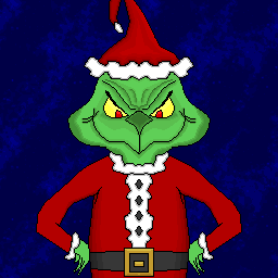
I made this for XMAS.wad a while back... was the Christmas version of the BRAK patch in Zero Ring zone, chances are most of you never saw it. (Background is one of the GIMP background options, I didn't make that)
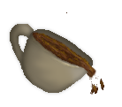
I made this just recently on request for a logo on another forum. I had originally made a smaller version (pure pixel art). I went to enlarge it by expanding it to a pixellated mess and then drew another one over it. I had a little bit of difficulty because it relied a little more on freeform drawing than lines and tiny pixel curves. I treated the whole thing like a giant work of pixel art and then blended it with various filters while giving the coffee a bit of dodge-burn treatment.
Looking back on the both of them, I could've been more accurate on the Grinch if I had more to go off of than one or two google images and vague memories, and I could have used the dodge to define the handle a bit more like I did with the rim, and burn the other side of the rim. I'm positive there are many other ways to improve on both (even if I keep the SRB2 palette limitations for the Grinch) but I'm quite satisfied with these.


