• Do not use Works in Progress as a way of avoiding the releases system! Works in Progress can be used for sharing early betas and for getting suggestions for improvement. Releases of finished content are not allowed in this forum! If you would like to submit a finished addon, click here for instructions on how to do so.

Underground Disco Palace

Status
Not open for further replies.
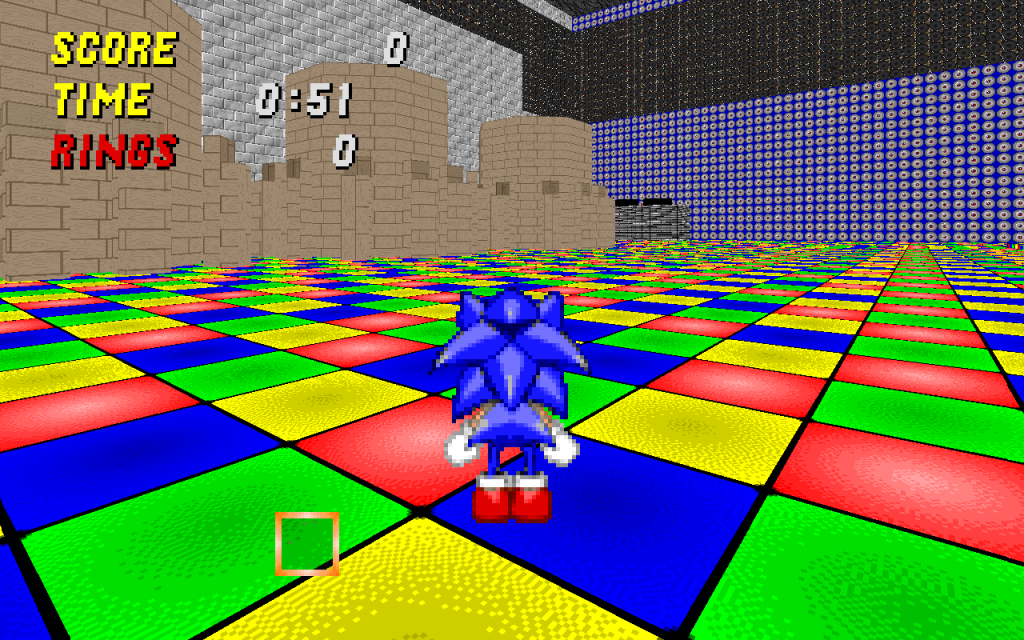
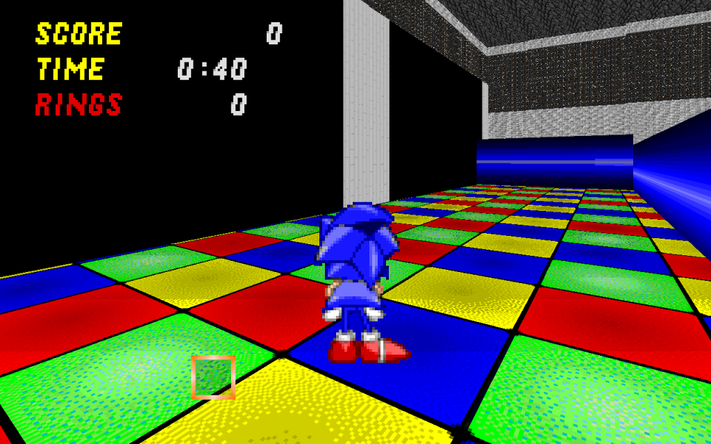
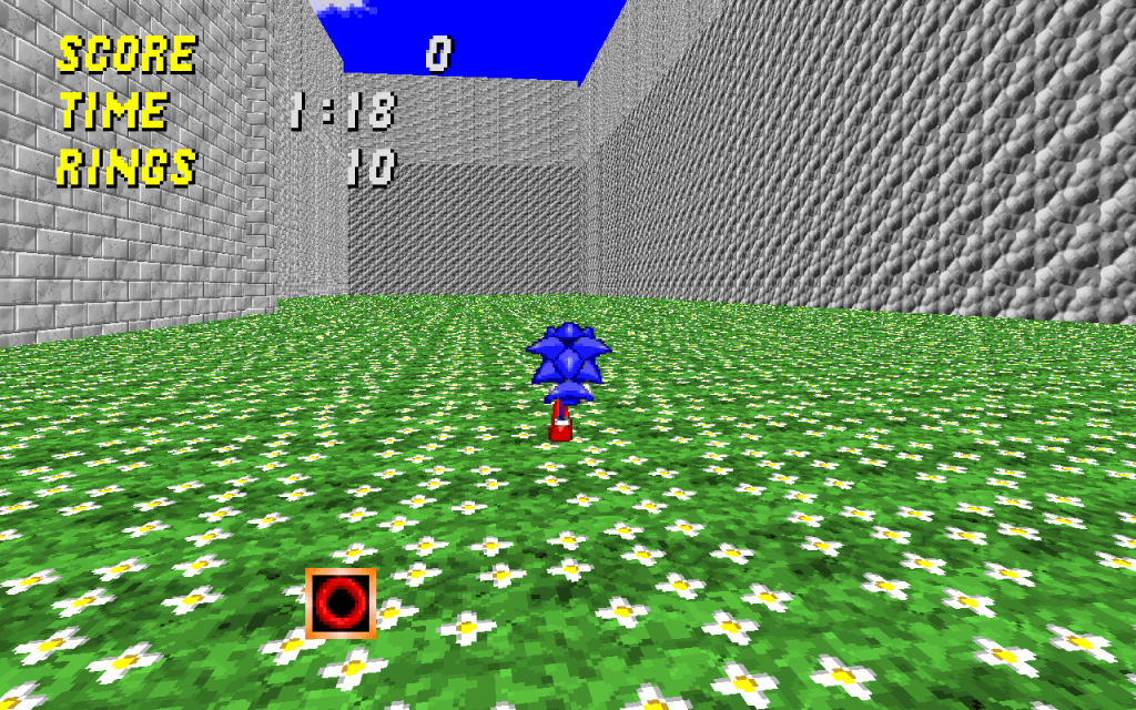
Just looking at those pictures, your stage feels really big and empty. The Disco Room in ERZ2 was fairly cramped, so it felt like you were actually inside a disco hall. Still, I'm not sure if that would work with multiplayer...

I'll be interested to see what you do with this.
 
Funnily enough, a Disco-themed level was the one kind of level I would've expected to be extremely cramped, not the other way around. You learn something new everyday I guess.

Frankly, I can't really see this kind of layout working well at all, least of all with the theme. Try something much tighter, for starters - I can't say I know the basics of decent level design well, but the very least I'd expect the level to reflect some elements of an actual disco (a designated dancefloor, for example).

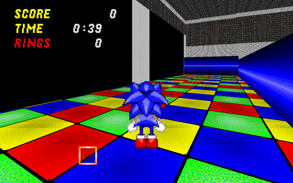
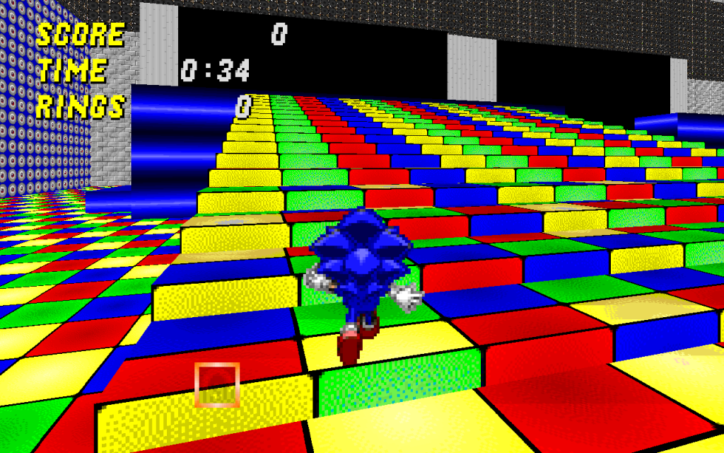
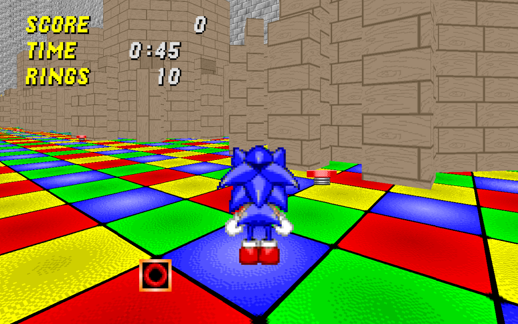
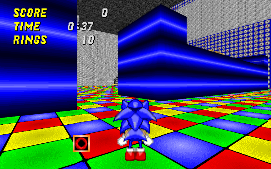
Also, whenever I think of "disco" the first thing that comes to mind is flashing lights, and to be perfectly blunt, simply plastering multicoloured textures all over the floor doesn't really deliver that impression appropriately. I'd expect plenty of reasonably dark (read: not pitch black for playability reasons, players should still be able to see each other and have a decent firefight) areas with patches of bright or alternating lights about the place. I dunno what exactly Legacy is capable of in this regard, but my suggestion is to study SRB2's more special lighting effects and see how they compare to real-life disco/danceclub light props.

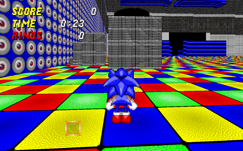
And come to think of it, your texture choice in general is pretty horrible - the red brick walls are bad enough to look at, but then you have wood walls and white circles plastered seemingly randomly in unfitting contexts, and if only due to the ridiculous open-ness of this level at this point they stretch badly at a distance and just reduces everything to a blurry pixellated mess.

All in all, I know a decent level can come of this concept, but this kind of approach simply isn't going to work in more ways than one. I'd recommend either a complete restart or a theme switch.
 
I fixed up the place alot. The level is now smaller and I added some stuff. But I still don't know how to add rings.
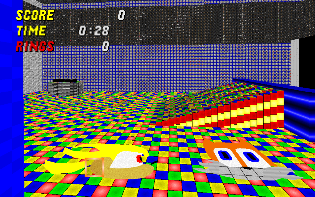
New Screenies
srb20032-1.png
srb20031-1.png
srb20030-1.png
srb20029-1.png
srb20028-1.png
srb20027-1.png

Edit: More Screenies
srb20034-1.png

srb20035-1.png
 
Last edited:

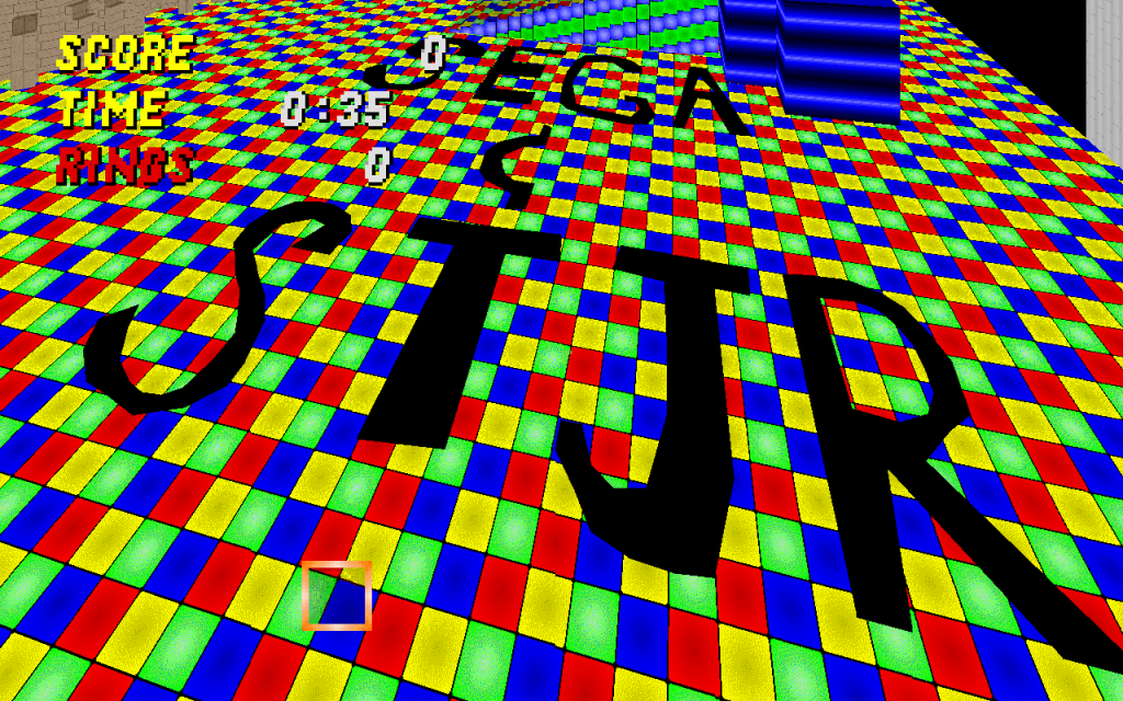
I really don't like that texture artwork at all. The same goes for the "SEGA & STJR" screenshot. I don't imagine that would work at all, because more experienced designers haven't tried to do that in any of the levels I've played...


I like the disco textures as much as anyone else, but anything good can overdone. I'd reduce the multicolored dancefloor to a much smaller area, preferably, as Blacklightning said, to a designated area. You could fill up the rest of the space with a lounge, a bar, a DJ's area, ect. ect.

Also, the above picture does a good job of illustrating your inconsistant use of textures. Why are the two walls in the background different? Unless there's a specific purpose behind that, it strikes me as unnecessary work for you.


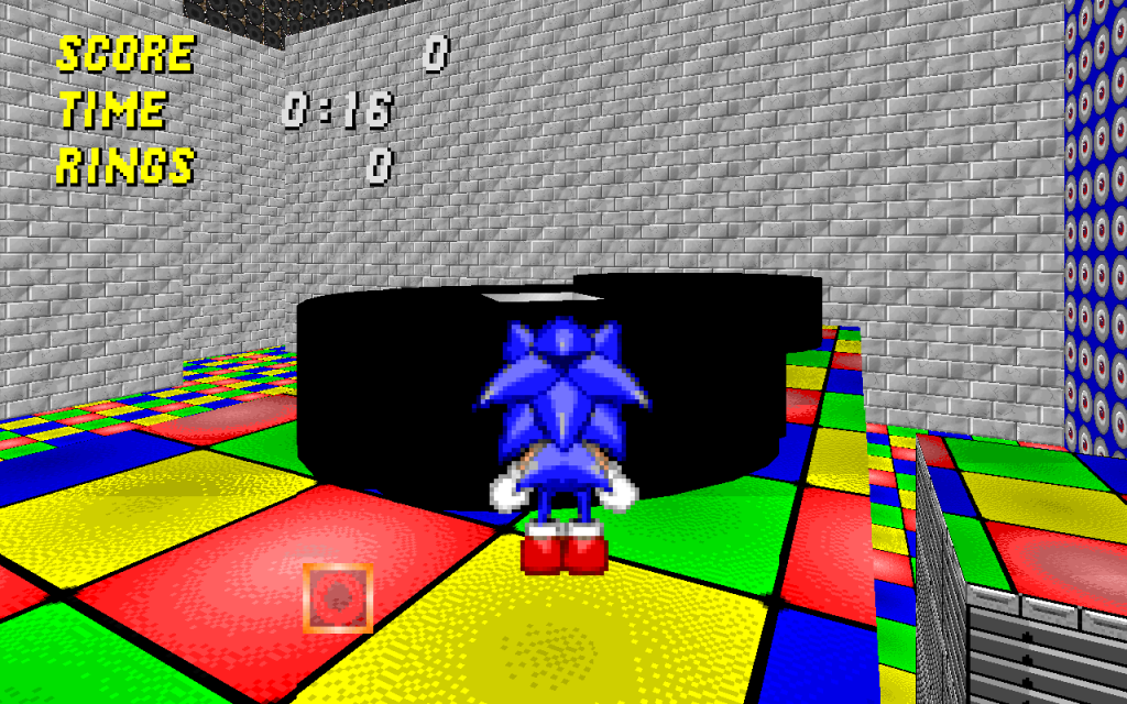
What are these I'm looking at? Switches? Interesting...


Again, why the widely diseperate textures? I don't even know why you have eyes on the walls. They could be used for good stereo speakers though.

Needs more work, dude. And for future reference, I'd appreciate it if you explained what was going on in your screenshots.
 
Last edited:
Then I suggest that you don't cover entire walls with them. That's not how it is in real life and it's somewhat disorienting. I was thinking something smaller, like this...

Disco_SPEAKERS.JPG
 
Ok. I just played the wad. It seems like it has some potential, but I feel that you need to do somethings.

First, and I know it's been mentioned before, you should reduce the multi colored floors. Just move it to a smaller area.

Second, add more areas to the map. The level is too small.

Third, too many rings close together. And most of them seem to be in areas Sonic can't get to easily.
 
I will add some more stuff soon. I have winter break untill january 5th so I will add an outside and a hotel.
 
I came expecting a scene involving a baby dinosaur hopping around a castle to a stupid song that ended up in 9001 YouTube poops.

I left disappointed.
 
Status
Not open for further replies.

Who is viewing this thread (Total: 0, Members: 0, Guests: 0)

Back
Top