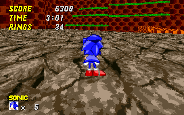
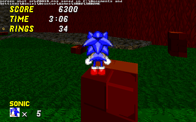
Scr_Neocanyon.wad

Status
Not open for further replies.

Chromatian

KartKrew™
Kart Krew™️
I've released act one quite a few times, and I was going to release act 2 in the contest this month, but I missed my chance, so I thought I would release it here.

Please comment on act 2 as if it were in the contest, I want the best critisism possible.

Download: http://www.sendspace.com/file/8nujb7
 

Attachments

  • srb20098.jpg
    srb20098.jpg
    21.6 KB · Views: 906
  • srb20099.jpg
    srb20099.jpg
    20.9 KB · Views: 815
  • Neo Canyon.zip
    511.4 KB · Views: 1,142
Act 1 is very good. It has seceret areas. It has lots of decoration.
Act 2 is like act 1. Make it a little more compatible for knuckles.
Act 3 is so cool. You start where you left off. It has good detail.

Here are number results.
8/10
7/10
8/10
 
Act 1 2/10
This level is:
  • Very bland and wide.
  • Very ugly.
  • Gimmickless and has a lack of enemy variation.
  • Plain and monotonous.
There is really nothing to this level. It's bland, has nothing interesting about it, and there is no reason to replay it.

Act 2 2/10
This level has the same flaws as the first level. Instead of having a lack of gimmicks, there's an abuse of builders falling of cliffs. The water section is cramped and has an abuse of enemies. The part to the right of it is very short, and has an abuse of rocks falling. You overdid the jumping fish detail. The part behind the starpost is the longest, yet is has no redeeming value whatsoever. That part is straightforward running.

I don't rate bosses unless it's original.
 
Ignore Luminous; he's a hater.

In act 1 you got really 2.0-texture-happy. I know I've played the level before, and I liked it better when it was only 100% GFZROCK. The new 2.0 textures aren't bad, but you're using them rather randomly. If you wanted to use the bee-hive texture only on inside caves and GFZROCK2 on the outside areas, that would be the kind of logical texturing that I could get behind. But that's just an example.

Act 2 rather irritated me after going in circles twice because the backwards route was more appetizing than the room with the exit sector. I also dislike non-level-geometry-based difficulty, but that's a personal thing. However, I did like the texture usage in act 2, so you may want to go back and retexture act 1 to match.

Also, import GFZROCK2 as a flat. You'll be glad you did!
 
What do you mean by Non-Level-geometry based difficulty?

Luminous doesn't like SRB2 at all, save for match, so I didn't expect him to like this level much. As for the holes in the rock above the start, it was meant to drop you back down there, because if you were Sonic and and wanted to get those rings, you couldn't reach them unless you fell through that hole.

As for texture useage in the first act, I'll use some of your suggestions and change the textures around, as it didn't come out quite like I planned it to.

More Reveiws please!
 
I feel like there's some pretty repetitive jumping in Act 1. Some of the areas would be better off with a yellow/red spring instead of just a series of platforms to jump up. I'm thinking specifically of that one "staircase" of platforms that you have to jump about 10 times to get up.
 
So, here's my impressions of your level pack

Act 1 - For the most part, I like the level design in this act, especially the presence of large multiple paths. I'll agree with Luminous, though, that some parts were too wide. And while I appreciate you filling in those areas with things for the player to do, it does feel a bit overwhelming at times. And the river full of SDUR's is a bit gaudy. Maybe you could reduce their number and intead add some rows of spikes instead?

But by far and away, the biggest problem was textures. The inappropriate mixing of various GFZ-style textures stood out like a sore thumb. There were fairly somber checkerboard patterns mixed in with bright and happy checkerboards. It just doesn't look good. Also, the green flower texture has to go. The usual white flowers would be much better. Otherwise than that, good job.

Act 2 - Absolutely gorgeous scenery here. Your areas were more compact than in Act 1, but every single available inch is dedicated to platforming, so it feels as if nothing is lost. You enemy placement was superb. Two complaints, though: First, there were some mismatched wall textures as in Act 1, but the problem was far less noticeable this time. Secondly, the rock-slide areas were too long and dense to be skillfully weaved through, so it feels a little cheap getting hit by a rock and rushing through while temporarily invincible.

Act 3 - Heh... It's kind of nice to see the old CEZ boss back in v2.0... Anyways, there's nothing really special to write about here, except that it's all too easy to trap Eggman against the opening to the big tower thing. I like how you included references to the end of Act 2 here (the unreachable but visible rock-slide area).

So, yeah, that was great. Streamline Act 1 a bit and tidy up the textures and I'd say that this might be the best custom zone for v2.0 I've yet to play.
 
Last edited:
Ignore Luminous; he's a hater.

He's not a hater at all. He just happens to not like these levels.
And, neither did I.

The first two Acts are very monotonous and unnecessarily wide and empty. The detail is "meh" to "good" and the gameplay just isn't fun.
Act 1 is just wide and empty and doesn't look very nice.
Act 2 is fairly linear and there aren't many bonuses to look for.
Act 3 just isn't fun, but that's because the boss AI is lousy.

Anyways, I'd give the whole Zone a 5/10. It's not terrible or bad, but it's just not good or fun.
 
He's not a hater at all. He just happens to not like these levels.
And, neither did I.
And he just happens to not like any level at all. The fact that he still rates them all makes him a hater. Also, you said they're mediocre and he said they're terrible. That's a difference, y'know?

Regarding the levels:
Act 1 is a 1.09.4 map and it feels like it. The room are too wide, the platforming is really generic and uninteresting, the old textures are basically EVERYWHERE and the new ones look out of place. Also, crawlas are everywhere. But still, not too terrible, just uninteresting.

Act 2 hurt my eyes. It looked like you randomly threw together all avaible textures and called it a day. The gameplay is also generic, but it's not as open. However, the layout could be quite confusing at times, it wasn't always clear where I had to go next. The falling rock gimmick didn't work out very well, because that area was just too cramped. The same goes for the underwater path. That one was also very confusing.

Act 3 is, well... a generic boss level. If you use a boss from the game, please try to make an interesting setting.

I have to agree with Kyasarin. Nothing too bad, but could also be way better.
 
And he just happens to not like any level at all. The fact that he still rates them all makes him a hater. Also, you said they're mediocre and he said they're terrible. That's a difference, y'know?

In case you guys ever noticed, I do like SRB2 levels. It's just that there are more I dislike than like.

One thing I didn't point out in my review is the lack of texture variation in both levels.
 
One thing I didn't point out in my review is the lack of texture variation in both levels.

Wha-? If anything, there are too many textures. I counted three GFZ-style textures on the walls alone. And it didn't help that they were plastered up in almost a haphazard fashion. I'd prefer one primary wall texture for each act.

After replaying this zone, I've also realized that I really don't like the music tracks selected for the first two acts. They're too depressing for the environment. I'd suggest the GFZ tracks, myself.
 
Last edited:
While there may be a lot of textures, it felt like I was seeing the same ones again and again.
What do you expect? 20 different textures? Of course the texures are used more than once, but don't you think 4 wall and 4 floor textures are enough for a level as short as this one? That doesn't seem too little variation ata ll to me.
 
Review

This would really be good for a first zone in a pack. The zone has that feel of simplicity that many first zones should have.

Some comments on Acts 1 and 2.

1. A small texture problem here (Act 1):


2. I'll have to agree with SpiritCrusher for this issue. Many places were open and wide, which is a good thing generally for Sonic levels. However, I thought that went overboard, particularly in Act 1. Perhaps you can add some more scenery in these places to provide more interest:


3. For the streams that flow from waterfalls, I thought those areas would look better if the water had some current flowing. There does have to be real current if you don't want there to be, but at least make the water texture scroll in a reasonable direction. This is in regards to both Acts 1 and 2. Make the zone, especially Act 1, more alive! You mainly used jumping fish to accomplish this, but it can get boring.


4. I also have to agree with FuriousFox about the staircase in Act 1. The jumping from one stair to the next more than about 5 times was really repetitious. Though, the main thing in Act 1 was jumping from a step to another. I just thought it could be more interesting, or it was probably the blandness that was bugging me. Find other ways to allow Sonic to scale that wall.


5. The fencing in Act 2 was not consistent. One had the invisible FOF, others didn't.
(starting area)
(right above the starting area: the FOF can be of greater height just so that you can stand over the entire fence)
(route where you fall into the water)


6. In Act 2, I thought you went overboard with the falling rocks. It was hard the first time to try to get through those narrow canyons without getting hit by one of them.


7. Also in Act 2, the first time I went down the water pool that contained a multitude of air bubbles and fishes, and a few Minuses, I wasn't able to find a way out and restarted the level. You can: 1) add some springs where you fall into the pool so you can easily get out if you don't want to take this path, and 2) do something, like add an arrow sign, play around with the rings, or even changing the textures, just so that the way out is more obvious, especially if you've taken the left fork in the path.


8. For the zone in general, I liked how there were many routes a player can take to get to the end of each act. However, there could've been routes that would take a player to a secret area. Many of your secret areas were basic: fall down a hole to find some useful, or not useful, monitors. This zone would go very well with some bustable walls, since this is a canyon. So I suggest you to add some.


9. There were some very nice places I would like to point out that I admire a lot:

I really liked the tunnel entrance. I kind of done that in Oceanic Cove Zone 1 (obsolete, very ancient beta few will remember), but not so well. But it really looked great in your level.


This was very beautiful, but where are the waterfalls? I feel there could be waterfalls, or at least, like in Arid Canyon, make the walls look as if they're "dried out" from the lack of a waterfall where there should be one.


When I first arrived here, I was able to hear the choir sing. Looks very pretty for me. Finally I found some of the interesting rocks I could've used in my recent Oceanic Cove Zone 1. Thanks for recalling me that sort of scenery.


This was beautiful. I loved how you used those tall, jungle grass textures up there on the walls, and this was used throughout the entire zone, which relieved the "blandness" a simple, high wall can provide.


Act 3

I won't comment as much on the boss only because it was generic. But it was interesting how you used the end area of Act 2 as the playing field for Act 3. Though, it may be a waste of memory space to have the entire rest of the Act, where you can't even return to due to the invisible FOF, in the boss act.


Ratings
Act 1: 6/10
Act 2: 7/10
Act 3: 5/10

It's hard to give a first zone, or something that seems like one, a high score, only because such a zone merely introduces the designer's skills and tactics for making a level. Refer to Greenflower Zone. It doesn't receive high ratings only because it is simple, but it's simple enough to be the first zone. However, it's the scenery and gimmicks that can add or subtract numbers in a rating. There could've been better scenery for this zone or less boring gimmicks, like climbing stairs or running at full speed through open areas, but if those were greatly improved upon, then this zone could turn out to be too "complex" for a first zone. Though, this could be argued.


That's all from me! Great work with this, but many aspects could've been better.
 
Last edited:
All I can say is... WOW times WOW. This is the BEST SP level I have ever played. I really like the transition from act 2 to act 3.
However, I noticed a disappearing HOM in the very first part of the first level, but I don't know what exactly that's caused by.
I will be posting a screenshot of this maybe tomorrow, as my parents are telling me to get off the computer.
 
Last edited:
All I can say is... WOW times WOW. This is the BEST SP level I have ever played. I really like the transition from act 2 to act 3.
Is that all? The transition is really not THAT creative. Acid Missile did it exclusively. This really isn't the best SP level ever, even if it's quite solid. It's still pretty uninteresting though.
 
Status
Not open for further replies.

Who is viewing this thread (Total: 1, Members: 0, Guests: 1)

Back
Top