Hidden Sanctuary Zone (scr_HiddenSanctuaryZone.wad)

Status
Not open for further replies.

Ice

Pretty chill guy
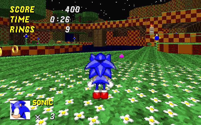
This was the very first stage I ever created. I didn't bother adding a boss act, because those kinda tend to suck. And although it can be fairly ugly or incompetently designed at times, I am very proud of my creation. It still makes me smile to see the kinds of ideas I had in my head at the time I created this. Act 2 was released to the last OLDC of 1.09.4, and there it made it to the now-extinct Wiki's Top Ten Leaderboard.

The stage is fairly easy and linear throughout, with act 1 being more of a compact, forested, grassy daytime stage, while act 2 is more of an open, nighttime, waterfall-y stage. I've made very (VERY) minor adjustments to scenery and object placement this time around, as well as revived the dead link. Enjoy!

Screenshots:
Beginning area (HSZ1)
srb20003-7.png

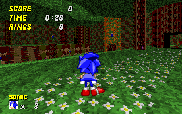
An area near a lake. (HSZ2)
srb20002-10.png
 

Attachments

  • scr_hiddensanctuary.rar
    458.2 KB · Views: 1,142
Last edited:
Alright, this looked good, so I downloaded it.


I was not amazed.


It was boring, and basic in terms of level design. It had no style, nor interesting secrets, nor... ANYTHING. It didn't even have good music choices! It was just a good looker, and nothing else. I ran through, did just a few jumps, never anything tricky or interesting, ran through some CRAMPED rooms and halls, and I was at the finish before I knew it.

Frankly, it seemed like all you cared about were the visuals. The useless bouncing Gargoyles could have been USED for SOMETHING, and the pool of Jello Water was used only for the end! Why let such good gimmick potential go to waste? Heck, why let such a gorgeous level become a total snorefest after the first playthrough? It's like you go to a bar, and you find this hot chick, and then you start talking to her, and you see she's completely shallow. This is a boring level with some eyecandy to cover it up.

Now, I'm no expert, and my levels arn't that good either, but I know that a designer should think more about the LEVEL ITSELF then the looks of it.
 
This is a amazing single player level. The visuals are great i really like the water feature to get to the end of the level. Great going keep it up.
 
Unsupported game version, kTHXBAY.

Look if you are using v2.03, or have loaded right wad version.
 
Ezer.Arch said:
or have loaded right wad version.

Yeah, thats it. I still had an old version of that level in another map, and the game loaded up that version. Heh, my bad.
Other than that, great WAD! Especially act 2 is my favorite, and that fountain at the end totally makes it worthwhile!
 
D00D64 said:
Alright, this looked good, so I downloaded it.


I was not amazed.


It was boring, and basic in terms of level design. It had no style, nor interesting secrets, nor... ANYTHING. It didn't even have good music choices! It was just a good looker, and nothing else. I ran through, did just a few jumps, never anything tricky or interesting, ran through some CRAMPED rooms and halls, and I was at the finish before I knew it.

Frankly, it seemed like all you cared about were the visuals. The useless bouncing Gargoyles could have been USED for SOMETHING, and the pool of Jello Water was used only for the end! Why let such good gimmick potential go to waste? Heck, why let such a gorgeous level become a total snorefest after the first playthrough? It's like you go to a bar, and you find this hot chick, and then you start talking to her, and you see she's completely shallow. This is a boring level with some eyecandy to cover it up.

Now, I'm no expert, and my levels arn't that good either, but I know that a designer should think more about the LEVEL ITSELF then the looks of it.

Any suggestions on how to make it better? Really, aside from saying "it looks great but it sucks, make it better", how about some ideas here? I'd like to improve my mapping abilities so that I could better please all of my audience, but that's almost impossible if you don't specifically tell me what I did wrong.
Look, I wasn't aiming for this to be the gimmickfest of the century, or a celestial explosion of cleverness and ingenuity. Maybe my design goals are different from yours, I don't know. Quite frankly, aside from a select few instances, this is the first time I've received such direct negative criticism, so it's pretty understandable that I've been pretty blindsided by your post.
 
Alright, this looked good, so I downloaded it.


I was not amazed.


It was boring, and basic in terms of level design. It had no style, nor interesting secrets, nor... ANYTHING. It didn't even have good music choices! It was just a good looker, and nothing else. I ran through, did just a few jumps, never anything tricky or interesting, ran through some CRAMPED rooms and halls, and I was at the finish before I knew it.

Frankly, it seemed like all you cared about were the visuals. The useless bouncing Gargoyles could have been USED for SOMETHING, and the pool of Jello Water was used only for the end! Why let such good gimmick potential go to waste? Heck, why let such a gorgeous level become a total snorefest after the first playthrough? It's like you go to a bar, and you find this hot chick, and then you start talking to her, and you see she's completely shallow. This is a boring level with some eyecandy to cover it up.

Now, I'm no expert, and my levels arn't that good either, but I know that a designer should think more about the LEVEL ITSELF then the looks of it.

Ice

don't worry about this post, i'ts looks like envy for me.
this map rulezzz definitely...
so, you are a great mapper, "full hand" continue making maps like this one, I am sure that the comunity will enjoy.
 
Ice said:
Any suggestions on how to make it better? Really, aside from saying "it looks great but it sucks, make it better", how about some ideas here? I'd like to improve my mapping abilities so that I could better please all of my audience, but that's almost impossible if you don't specifically tell me what I did wrong.

Well, it just seems really basic and easy. It feels plain underneath the choice visuals. I dunno, I was just hoping for a little more... Not a Gimmick crammed thing, just something... Interesting, aside from the visuals, like that jello pool I pointed out; not only did it LOOK great, but it was actually USED for something. You know, make the visuals APART of the level, not just slapped on, if you know what I mean. Get your visual talents to good use and make some interesting challenges out of them. Nothing good ever came out of being just good LOOKING, it has to be good FEELING too.

...Orrrrrrrr I could just be overthinking this. I dunno, I'm just tired of things like modern games being all pretty and whatnot, but being so shallow underneath it all, you know? I don't just choice visuals for the level, I want choice USE of the level visuals as well.
 
Every level designer has thier own style of mapping. Just because you don't like Ice's levels doesn't mean other people won't. While I admit that I'm not too fond of the overused grassy theme, the overall design of the level was great. Instead of looking at the level in terms of design and gimmicks only, try to look at the level the same way the designer does.

I feel like this is a totaly unessary or stupid post. >_>
 
Having a level with little or no in the way of gimmicks is generally acceptable in a first level. Any gimmicks used should generally be easy to figure out because this is the player's introduction to the game. Now if the entire mod lacked gimmicks or if this was a standalone wad this may be more of a problem for some. However, layout can also lend originality to the level. I don't believe I've played Act 1 yet, but Act 2's contest version was quite excellent in terms of layout and had many interesting set pieces that did just what d00d described: make the level look nice and function as part of the level.

I'll try to provide feedback when I run through the level, but it does look solid overall.

Every level designer has thier own style of mapping. Just because you don't like Ice's levels doesn't mean other people won't. While I admit that I'm not too fond of the overused grassy theme, the overall design of the level was great. Instead of looking at the level in terms of design and gimmicks only, try to look at the level the same way the designer does.

Looking at the level from the designers' standpoint is insight, which is helpful but should not replace one's own opinion on the level. Criticism is important to improve the level, insight does not render it invalid but helps you apply the criticism... for example you can say "all this level has are turrets, it needs more enemy", which is valid criticism, or "the turrets don't work well by themselves, I can see you don't want to use crawlas but you need more enemies that aren't stationary" which tries to take into account the "whys" you mentioned, and while it still says the same thing, it is a better spring point for suggestions to improve the problem because it gets you thinking along the lines of how you can achieve what the designer wants to accomplish while addressing your complaint instead of simply pointing it out.
 
Good looking is good feeling!
D00D64 said:
Frankly, it seemed like all you cared about were the visuals...It's like you go to a bar, and you find this hot chick, and then you start talking to her, and you see she's completely shallow. This is a boring level with some eyecandy to cover it up.
Firstly, you're just being stingy. SRB2, like every other videogame, is all about engaging the player. Ice is simply choosing to engage the player through visuals, not gameplay! By being "bored" with the level, you are consciously choosing to avoid the area in which Ice put in his effort.

D00D64 said:
Now, I'm no expert, and my levels aren't that good either, but I know that a designer should think more about the LEVEL ITSELF then the looks of it.
Then go away! Critique of levels is based from personal experience. Before you say something so assertive, think about how helpful your comments are. By commenting, you should be helping Ice, not hurting him!
 
BlueZero4 said:
Good looking is good feeling!

[spoiler:c3c343de19]
Sonic_the_Hedgehog_xbox360.jpg
[/spoiler:c3c343de19]

BlueZero4 said:
D00D64 said:
Frankly, it seemed like all you cared about were the visuals...It's like you go to a bar, and you find this hot chick, and then you start talking to her, and you see she's completely shallow. This is a boring level with some eyecandy to cover it up.
Firstly, you're just being stingy. SRB2, like every other videogame, is all about engaging the player. Ice is simply choosing to engage the player through visuals, not gameplay! By being "bored" with the level, you are consciously choosing to avoid the area in which Ice put in his effort.

The Game & Watch games had little visuals. Tetris had little visuals. Super Mario Bros. had little visuals. MANY OTHER GAMES had little visuals, yet were GREAT, and ENGAGING. You don't need to be the supermodel amongst levels to impress anyone; It's all int he personality, and by hat, I mean level design and gameplay. when I played this level, I just felt like I was going through the motions, while all the good looking parts of the level just didn't feel like they were PART of the level DESIGN, as in they were just kinda there to be there. I felt like the design could have USED some of these beautiful pieces as apart of the level. But it felt more like a museum; look, but don't touch. Not exactly literal, but the point stands: The level REALLY needed to get the visuals more into the design of the level. It just felt flat, and bland on the main road, because the visuals didn't really LEND anything to the level directly. It was just kinda propped on the side.

BlueZero4 said:
D00D64 said:
Now, I'm no expert, and my levels aren't that good either, but I know that a designer should think more about the LEVEL ITSELF then the looks of it.
Then go away! Critique of levels is based from personal experience. Before you say something so assertive, think about how helpful your comments are. By commenting, you should be helping Ice, not hurting him!

True, I could have been less harsh in my post, BUT that does NOT mean I have no idea what makes a good level. I know that gameplay comes first. I just think of games more so for how they play rather than appear. Toss out the visuals before entering, and look at what the level is underneath. Unless the visuals are apart of the level (Like that jello pool thing. THAT was neat.), it should only thought of after the layout is done. Design and layout first, visuals second.

(Insert someone commenting on my post here)
 
May want to put that image in spoiler tags, its kinda large and some people may be prone to convulsions at the sight of it.

Overall, you usually don't want to go too all-out for the first level. Don't get me wrong, it is a legitimate opinion... I'm not trying to write it off because you seem to be more or less experienced. I'm just saying how I feel about that issue. You'd probably get fewer users acting defensive if you didn't emphasize your opinions.

I know what you are complaining about, and I'm quite partial to levels robust in gameplay, but perhaps you can come up with a few specific areas Ice could improve instead of defending your opinion.

---

Now I played through the levels, as usual the layout was quite good, but I think you could use quite a few more powerups. I didn't feel like I was being rewarded for my exploration and this may have been the same vibe that D00D was getting.

An even bigger problem though is that you have pretty much every enemy from 1.09.4 in here. This has become a nasty habit due to the poor selection of enemies, and while its still not exactly got much better to boast you should try to give this stage specific enemies that fit with the context of the level. Soc a recolored enemy if you have to, but as long as it fits the level and doesn't feel put there just for the sake of being a hazard, then it should work.

For example, you have a very effective forest theme used here, so how about a buzz colored to look more homely that flies around in preset circles. It could buzz around some of those platforms Sonic needs to pass.
Additionally, given that the level has a fair amount of simplistic areas, perhaps you should make a robot that bounces toward the player instead of chasing him.
And then, remove everything else. Crawlas are fairly generic, Jetty-syns are only good for harassing the players and feel pointless here, Crawla Commanders don't work in open spaces, etc etc.

Also, the water room near the end stands out, but perhaps you should use a few more fountains... nothing that works the same way as that, but just so that the player doesn't feel like you took a break from the usual forest design for that one room.

Lastly, try to use teleporters as sparingly as possible. The many teleporters in the first act are blatant and feel cheap... furthermore they segment the level making it feel much less solid than your second act. Try to remove them entirely if you can, this theme especially would benefit from it.
 
Well, I played and these are my thoughts:

Act I

When going in, I felt that the textures were very well chosen. They represented the forest theme quite well and gave the level its personality. There was also excellent flow, as I was able to run around portions of the level without running into a randomly placed wall. However, I think I agree with JEV3; teleportation is used a bit too much. Maybe you would try removing the doors and allowing the player to walk straight in?

Act II

This was my favorite. The layout was put together nicely and doesn't feel like there could have been more in terms of placement. Every corner seemed to have been given the same amount of detail. The springing gargoyles seemed like they were just there; was it a test that wasn't removed from the level or something that would just raise an eyebrow? The fountain at the end of the stage is awesome and is a nice way to end an otherwise solid romp.

Overall, I really like this zone. It's very inviting and gives that "welcome" feel. I do agree with JEV3 on the enemy placement though; I think that there should be more "wood-themed" enemies here, but otherwise great job and I'm looking forward to any other SP maps that you make.

-Djermy
 
D00D64 said:
You claim to be a level designer, so understand this:

When I start a room, I spend twenty minutes just resizing the basic rectangle trying to get the basic sense of scale to match what I want to do with the room. It's only until the basic sense of scale feels right that I start fleshing out the room. Equally, I get that same feeling of "This level FEELS right" when I play Ice's levels.

Sonic 2k6 didn't have that kind of attention. It was rushed, underdeveloped, and unloved.

D00D64 said:
It's all int he personality, and by hat, I mean level design and gameplay.
I don't know about you, but personality is given off by how the level looks more than how it kills you. The visuals shape the mood and atmosphere, which in turn shape the experience whatever happens in the level, it's colored by how it looks. Much like Egg Rock's sheer difficulty is colored by it's vibrant, living world, Hidden Sanctuary's serene peacefulness is colored by the arching trees and rocks. Hidden Sanctuary has personality to spare.

Trying to single out personality into design and gameplay can't limit horizons because design can be found in visuals and gameplay can be found in loosing one's self in the flowers.

Dood said:
I know that gameplay comes first.
No, what comes first is the satisfaction of the level designer. If he isn't happy with what he made, no one will.
 
BlueZero4 said:
You claim to be a level designer, so understand this:

When I start a room, I spend twenty minutes just resizing the basic rectangle trying to get the basic sense of scale to match what I want to do with the room. It's only until the basic sense of scale feels right that I start fleshing out the room. Equally, I get that same feeling of "This level FEELS right" when I play Ice's levels.

Sonic 2k6 didn't have that kind of attention. It was rushed, underdeveloped, and unloved.

Really, all I felt was "ruins in forest" pasted on the walls of a level. It felt lacking. Like it was just... There. There's barely any integration of the theme with the level. I felt more like stuff could have been happening WITH the level.

Take the gargoyles for example. It could have been that placing one out-of-place gargoyle in a spot would activate a mechanism, making the gargoyle formation, opening a door. Sure, Gargoyle puzzles tend to be boring, but seeing it all come to place to activate something makes it feel more like some BG piece, but as APART of the level. I don't want stuff just being there for the sake of being there, I want it to BE THERE WITH A PURPOSE. A meaning. A part of the level.

BlueZero4 said:
D00D64 said:
It's all int he personality, and by hat, I mean level design and gameplay.
I don't know about you, but personality is given off by how the level looks more than how it kills you. The visuals shape the mood and atmosphere, which in turn shape the experience whatever happens in the level, it's colored by how it looks. Much like Egg Rock's sheer difficulty is colored by it's vibrant, living world, Hidden Sanctuary's serene peacefulness is colored by the arching trees and rocks. Hidden Sanctuary has personality to spare.

Trying to single out personality into design and gameplay can't limit horizons because design can be found in visuals and gameplay can be found in loosing one's self in the flowers.

Personally, I ignore visuals because I care about what's within; the level. The level doesn't have to KILL ME for me to like it, but having a nice sense of completion and acomplishment is what I look forward to in a level, or just those little bits and gimmicks that make me think how cool it was or what a great idea it was. I'm not saying visuals arn't IMPORTANT, because they are, but they shouldn't be the focus.

I just can't look at a levels visuals and base it off those; modern games taught me that. Hell, modern games seem more visual than anything else: they have ALL this power, and ALL this muscle, and ALL of these possibilities... And they make the same thing with different textures, with a space theme or a war theme because they just had it to have it.

This is kind of what I felt in the level: the visuals were just a background piece: The design of the level was just kind of the same ol' stuff. It felt more like Green Flower Zone was given a makeover. Infact, the textures ARE just basically slightly different GFZ textures, but with more trees. It really felt like it was "just there" and not immersive at all. It felt like a retexture of stuff I've already been through, because the level's theme wasn't integrated more. As I said several times: it felt just "there" to me. Perhaps I'm just not getting something, or maybe I just need to play through the level again, but I just didn't feel much unique.

Sometimes, the level design isn't always a test for the player: it's a test for the LEVEL too.

BlueZero4 said:
D00D64 said:
I know that gameplay comes first.
No, what comes first is the satisfaction of the level designer. If he isn't happy with what he made, no one will.

I could compare SO MUCH with that idea, but I don't want to start some flamewar.

Anyways, yes, the builder themself must be satisfied too, but I don't speak of their opinion, I speak of MINE. and I say it was just a bland level sugar coated with beauty that just felt like a mask hiding something underneath: Potential. But frankly, if the BUILDER is satisfied, why must they care about the opinions of others? It's their world, let them live in it. But if they post and people can talk back, I shall say what I truly mean, what I truly feel, and what I truly believe, in my honest opinion. Whether you take it or leave it is up to you.
 
Personally, I ignore visuals because I care about what's within; the level

The visuals are one of the important things in a level. when you play a new game what you do you pay attention to most? the graphics, how real the water looks and reflects the players image, ect. then i pay attention to "whats in it" you have to realize, with out visuals the level becomes a dead baren wasteland. i know that i first make the level and go through each room to make to sure the textures work. then i add in enemies and items. and the reason the they look like gfz graphics is because they mostly are. So what? you seem to be implying that every level should have 100% custom graphics. Well your wrong. and i can't believe that you your self make maps. because if you do you would know all of this. as we all do. so to prove how good you seem to come off as, why dont you show us one of your levels and knock our socks off.
 
Status
Not open for further replies.

Who is viewing this thread (Total: 1, Members: 0, Guests: 1)

Back
Top