Clock Towers Zone

Status
Not open for further replies.

fickleheart

ms reflec beat stan
The level from the May/June 2014 OLDC. Run and jump through things in 2D mode and eventually you can climb the big clock tower to reach your goal of... something! The level itself is currently unchanged from the OLDC release, but there are some scripting fixes that might make the level slightly more playable for some.

Changelog:

V2
  • Updated the version of Axis2D used so the level doesn't crash on load in newer game versions. Also allows use of turn left/right keys for movement.
  • Improved performance correlating to bouncy chains. (For a measure, I can run the level at full speed on my laptop's low power setting now.)
  • Slightly reduced Robo-Hoods' firing range further.
Future plans are to give the level a proper update with redone enemy placement, possible new enemies, and general layout tweaks. Possibly with an extra alternate path added? For now, enjoy a version that works on 2.1.11 :v

(The developer time mentioned in the emblems screen is 1'53"45, and you can view a replay that slightly desyncs, sorry by entering "PLAYDEMO DEVTIME" in the console.)
 

Attachments

  • srb20229.png
    srb20229.png
    51.4 KB · Views: 1,454
  • srb20231.png
    srb20231.png
    43.7 KB · Views: 1,322
  • srb20232.png
    srb20232.png
    83.4 KB · Views: 1,309
  • srb20303.gif
    srb20303.gif
    5.9 MB · Views: 1,972
  • scr_clocktowers-v2.zip
    1.7 MB · Views: 2,115
Last edited:
I was just going to go ahead and release this, but then I decided it'd be worth giving a more in-depth review.

I'm sure you don't need me to tell you that you've really made something great here, as any good designer knows it without being told. Nevertheless, I'd like to say it anyways:

This is fantastic. You took several completely original concepts to SRB2 as we knew (2D Axis platforming, real trampolines) and several old ones, and used them all in fantastic and progressive ways, getting more and more interesting and difficult as the level went on. I never thought I'd ENJOY seeing a robohood in SRB2, but your use of them as passive stage hazards a la kirby 64 cannons was a choice that seemed tasteful and fair. You hid secrets all over the place, requiring the players to really think about their path of movement to get to seemingly impossible things. I love that stuff.

My favorite part was the large round tower which you ascended the outside of, each revolution being a little above the path below.
srb20012.png


There is one major flaw with your level though, and that is the visual design. That's a topic that is hard to quantify though, so I'll try my best.
srb20007%20%283%29.png

This is exactly the example I need. What we have here, is a complete mishmash of textures, all different styles, sizes, and colors. You have the geometrical Sapphire Falls walls textures and grass, the semi realistic clean wooden slabs (all different sizes of it), an uber realism aged brick texture, and a twinkling starry sky that looks like it would be better served to fit some sort of fairytale theme. The sky is the wrong dimensions too, and it stretches horizontally, making your stars oval shaped. Also I know it's vanilla but seriously those flowers are so bad looking in every way

Do I even need to mention the cut in half clocks? I'm honestly not sure how you did that and didn't notice it. :p

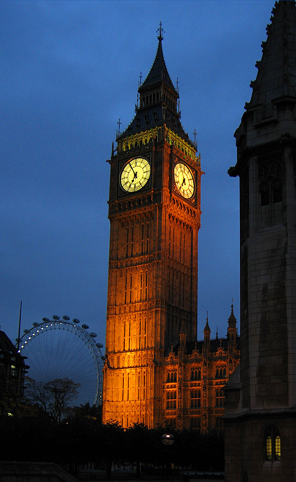
Though having a cohesive style of texture patterns would definitely help, I don't think it'd entirely solve it. Some of your level architecture is fundementally boring on the eyes. I mean, your clock towers look like cardboard boxes on posts. Considering the otherwise fantastic nature of your level, I feel it's deserving of majestic towers more on the tier of Big Ben and all.
BigBenAtDusk.jpg

Not all parts suffer from this though. A few notable examples of fantastic looking areas with excellent cinematics:
srb20013.png

Gotta love those gears, which give a great feeling of motion and progress to the level.

srb20015.png

This part is just amazing. The spiral of pillars really draws the player's eyes up and towards the huge clock, which is the backdrop. It feels like there's enough to look at, without it being too much.

Some of the rooms cannot boast this visual impressiveness though.
srb20010.png

This one is just plain dull. Same texture plastered all over, and no real visual variation. I think to really fix up the visuals of rooms like these (there's quite a few) you'd have to, first, get a proper floor texture. That alone would jazz it up a lot, and putting some extra woodwork like the stuff in Sphere's Clockwork Towers, would really hit the target dead on.

Visuals aside, there are two small things in particular that bugged me, gameplay wise. The first, is these platforms:
srb20016.png

The issue is that they're only used here in this one instance, and it's above a death pit. I didn't expect them to disappear at all, because every other platform in the level stays put, and I died to them instantly. The next time I played, I forgot they existed, and made the jump again, only to have them disappear out from under me. If you're gonna introduce a gimmick like this, it's best to do it in non death situations first, so I can know what I'm up against.

Lastly, this monitor is rather unpredictable, and is instant death if you get it wrong.
srb20017.png

I didn't expect the collisions of the spikes to rise above the top of the box itself, so I figured I'd be safe to grab it as long as I didn't stand around down there. I was not though, as the spikes apparently reach above the box, and it sent me plummeting to my doom.

I don't expect you to fix any of this, though. I wouldn't if I were you. This is already a fantastic level, and it's best to take the lessons learned onto future projects, rather than refining the same thing over and over again.

...That's all I have to say. Released. 10/10
 
Last edited:
The sky is the wrong dimensions too, and it stretches horizontally, making your stars oval shaped.

Do I even need to mention the cut in half clocks? I'm honestly not sure how you did that and didn't notice it. :p
Those are OpenGL issues. Both of those look right in Software. (The latter, at least the one instance of it I know of, was an accident in texture alignment that I liked enough to keep.)

I appreciate the rest of the criticism, though! I would eventually like to update it a bit, possibly if I put it into a level pack, to fix some of the issues and maybe add a bit more to the gameplay that I didn't have time to for the contest. Visual design is definitely my weak point, I will admit, and some areas of the level could really benefit from some custom texturework and general work on the geometry. The appearing/disappearing platforms were an effort to work around popup spikes not working properly on FOFs, and now that those work properly I could quite easily go through and add them where they'd benefit the gameplay.
 
Those are OpenGL issues. Both of those look right in Software. (The latter, at least the one instance of it I know of, was an accident in texture alignment that I liked enough to keep.)

Oh. My mad rig can't handle SRB2's ancient software, so I have no choice but to play in opengl. That being said, I've never seen it cause issues with midtextures before... and I'm making a level pretty much all midtextures used in weird ways. Never seen it stretch the sky either, but I'm sure that just has to do with the different way opengl handles sky images of different resolutions.
 
The particular clock midtexture that gets cut off is set above the ceiling of its containing sector. That's likely why it clips in OGL, as it's pretty much abuse of a quirk with the software renderer.
 
Um, I think he meant the "Spinach Ripened Butts 2" at the title screen, not the zone name.

Oh, maybe.
But, since that NeonSonik does not specified what was talking about, I take as reference the thread name, which is the zone name too.

But second thought, your idea makes more sense if we consider "title" and "zone name".
 
Oh, maybe.
But, since that NeonSonik does not specified what was talking about, I take as reference the thread name, which is the zone name too.

But second thought, your idea makes more sense if we consider "title" and "zone name".

Right. I can get the more obvious things when someone's talking about something that can actually be a problem; the zone name isn't and shouldn't be the issue here, since it's just the level's name. He probably thought that the title screen wasn't fitting to him because it wasn't funny, lol
 
The title screen was an IRC in-joke. I replaced a couple other things with jokes too, actually; the boot screen and the quit screen.
 
Status
Not open for further replies.

Who is viewing this thread (Total: 0, Members: 0, Guests: 0)

Back
Top