YOUR Artwork can be shown HERE!! (NO Sprite Rips, please)

Status
Not open for further replies.
They're archived sprites. I'm not going to be using them because I don't think they're as good as I wanted them to be. I just know SSNTails' sprites will be much better than these.
 
Come on... There's more problems than that, Chaos Knux!

The red that Nitro's Knux uses as the normal colour is not so good as the official Knux's red:
The hands are too small in the walking animations, and have obviously been edited from Sonic's hands, or the official Knux's completed frames;
The walking animation bobs up and down for the front/back, and Knuckles' head doesn't move for the other angles;
The running doesn't look all that good, and reminds me of how bad some people's attempt to make Sonic's SA running for SRB2 are;
Knuckles' dreadlocks don't seem to move in the gliding animations;
... and lots more that I would take a long time to list here...

I just don't like Nitro's Knux, OK? That's not the Knux I would want in SRB2 1.1.
 
Re: YOUR Artwork can be shown HERE!!

Chaos Knux said:
The pix are so large that the left/right scrollbar appeared.
Monster Iestyn said:
What did I say in the first post?

Monster Iestyn said:
Anyway, this is simply a topic to post your artwork - Scanned or made with programs like Paint for example. You don't have to show all of it, and obviously you don't have to show it at all. I'm just interested in seeing everyone else's artwork, SRB2-related or not. If you have enormous pics that stretch the tables, please remember to post a direct link to it rather than having it in the actual post. And please don't steal other people's artwork and say it's your's. That would make you look stupid if you are found to have done that.

The text in bold is what I said.
Hey, back off! 1. They don't appear like that on my computer, and 2. I can't see yours, so back off!
(Edit; Alright, now I cooled off, so now, I'm good.)
 
Sonicboy, simply because YOUR computer screen loads something a certain way, it's not like anyone else has it different. My monitor is somewhat small, so it can stretch things.
 
Use url tags where image tags might not be appropriate for smaller screen resolutions. That's simply a matter of online etiquette. There's no need to be an asshole about it.
 
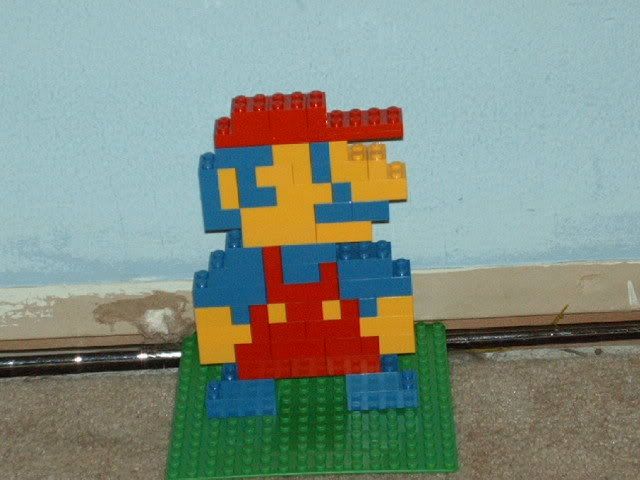
Ok, here's Lego Mario
cj001.jpg

Caution, Might be a bit big... If so click linky http://i293.photobucket.com/albums/mm62/SonicboyTH/cj001.jpg

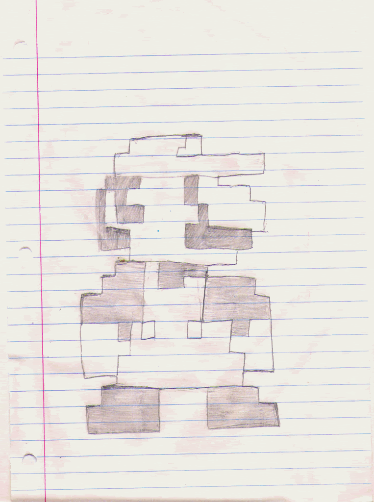
And Mario Drawing Also might be a bit big...
mariodrawing.gif

If so, linky... http://i293.photobucket.com/albums/mm62/SonicboyTH/mariodrawing.gif
 
This is concept art for the main character of a game I'm working on.
It's a quickie, and I'm not very good at drawing female characters.

dorimu.png
 
Status
Not open for further replies.

Who is viewing this thread (Total: 0, Members: 0, Guests: 0)

Back
Top