The individual rocks are far too uniform to work. Rather than jutting each one out equally, try making some appear to extend further, cut a few in half, see how that looks.
You are using an out of date browser. It may not display this or other websites correctly.
You should upgrade or use an alternative browser.
You should upgrade or use an alternative browser.
SRB2 CONTEST: Calling all texture artists!
- Thread starter SSNTails
- Start date
- Status
- Not open for further replies.
Draykon said:The individual rocks are far too uniform to work. Rather than jutting each one out equally, try making some appear to extend further, cut a few in half, see how that looks.
I feel OK about not making them jut out equally, but not about splitting some in half.
But how does this look now?
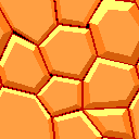
And when tiled to 512x512:
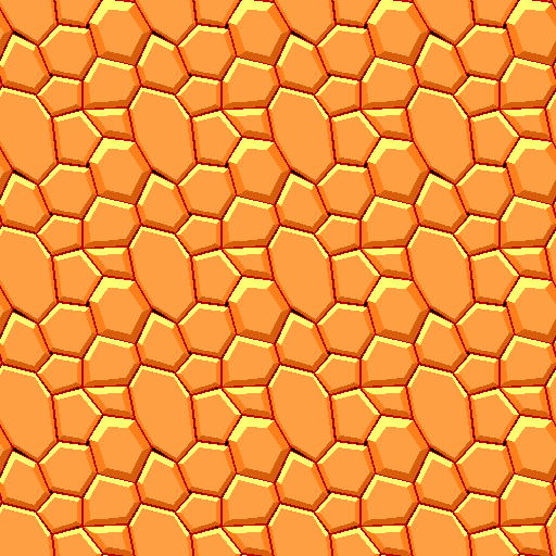
*Gasp*
Most of my posts today seem to be about improving this same texture!
xxBeanGirl420xx
Member
It still needs a bit more shading, in my opinion. Yes, we can see how perfectly the light reflects off of the rock, but it's not very smooth, and very, very jagged (whereas in real life, the light would gradient somewhat).
Blitzzo
It's Mr. Computer!
The shading isn't necessarily bad (after all, Lava Reef Zone used this style). The problem here is that the centers of each rock are far too flat. You should increase the width of the slanted edges. There's also a very large rock in there that makes the tiling very obvious due to how it repeats. More size variation wouldn't hurt, either... I'd say that when I first saw this, I was more reminded of some kind of futuristic cobblestone flooring, or a wonky beehive.
So would this be any better?
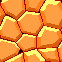
And when tiled to 512x512:
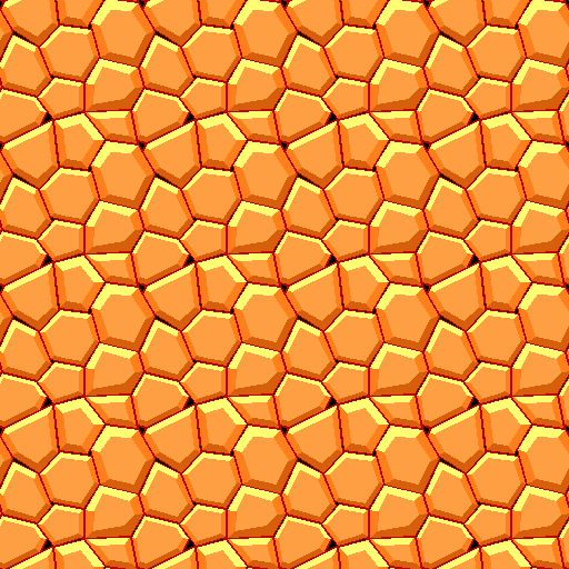
It seems to me like I'm the only person participating in this contest left.

And when tiled to 512x512:

It seems to me like I'm the only person participating in this contest left.
xxBeanGirl420xx
Member
Well, not everyone showcases them. Other people have sent textures simply by PM or email.
Mikesword221
The man with no plan.
No holes and you might just see that in srb2 1.1.
GemEarthBrandon
Member
Aaaaaaaaaah, Lemme test a few of mines.
Even if you extend the shading to be a little more like Lava Reef, it will pretty much look just like the MMZ textures, only a different color and slight variation on arrangement. I personally dislike the MMZ textures anyways and think they are unsuitable for use over large areas.
I'd recommend trying something else.
I'd recommend trying something else.
GemEarthBrandon
Member
I give up on this contest. Mines suck. Those were the only 3 three I could come up with.
mikesword221 said:No holes and you might just see that in srb2 1.1.
Are you really sure about that?
Anyway, I've changed the colour of most of the holes, and filled in one of them with a small rock. Here is how it looks:
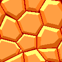
And tiled to 512x512:
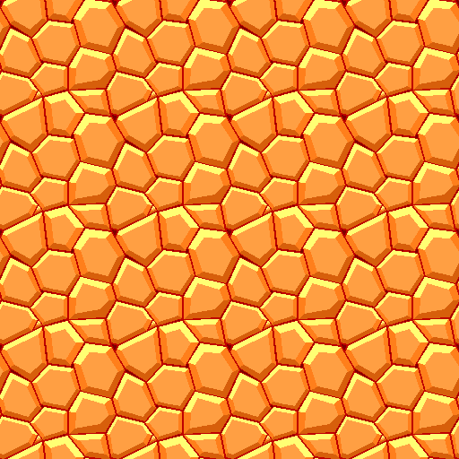
Is that any better?
nitro_the_hedghog said:There's one area that makes a curve at the bottom, fix that. It makes it look like the rocks were carefully placed..
I fixed that 'curve' you mentioned. But for some reason it looks like it's causing another to appear. Correct me if I'm wrong there.
Here it is now:
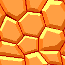
And when tiled to 512x512:
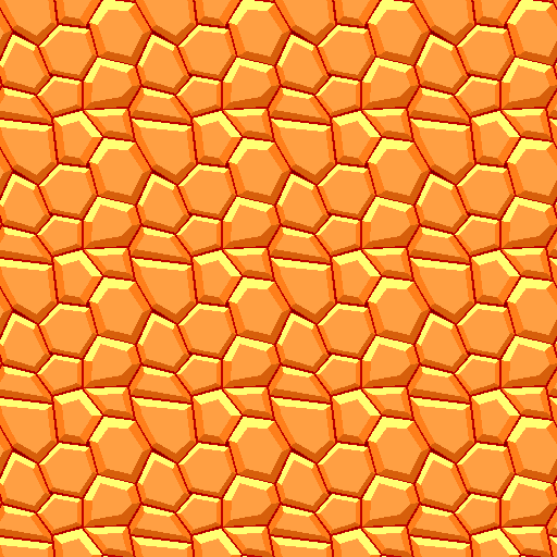
Better?
I can't wait to be finished with this texture, so then I can have a break from it for once...
*sigh*
But that depends on when everyone else is satisfied with how it looks...
Mikesword221
The man with no plan.
If this is for floor it might look different at a angle. Try it in the game and see if it looks better.
mikesword221 said:If this is for floor it might look different at a angle. Try it in the game and see if it looks better.
It's supposed to be for the walls, but I could try it ingame. I'll post a screen of it in a moment...
Here is the screen I said I would post, which is of this new test level featuring my rock texture for ACZ:
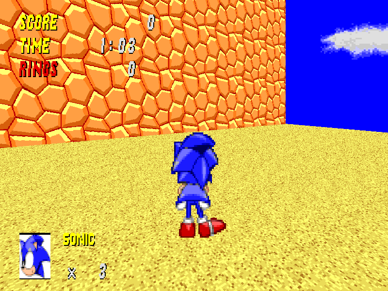
Is it good? I sort of think it is...

Is it good? I sort of think it is...
Chaos said:The trapezoid and the on below it seem like they are in that shape on purpose. Make them more natural shaped.
*Gasp* It's getting harder and harder to finish this texture. Besides, we don't need it too natural, yet I'll see what I can do about it...
I honestly see nothing promising in that texture, while some of the other ones you worked on were. When I look at the wall, I want to see a sandbaked texture (generally used for floors)... But its flat looking rocks which *look* tiled.
My recommendation is to try something entirely different, maybe see if a sandbaked wall actually looks good? Look at Greenflower, Techno Hill, and Castle Eggman textures. The main textures in there weren't really practical, but they set up the core theme of the level and looked good. (CEZ's textures are less of an example because they are modified GFZ walls)
My recommendation is to try something entirely different, maybe see if a sandbaked wall actually looks good? Look at Greenflower, Techno Hill, and Castle Eggman textures. The main textures in there weren't really practical, but they set up the core theme of the level and looked good. (CEZ's textures are less of an example because they are modified GFZ walls)
- Status
- Not open for further replies.
Who is viewing this thread (Total: 1, Members: 0, Guests: 1)
Share:
