SRB2 CONTEST: Calling all texture artists!

Status
Not open for further replies.
Is that so, Cue?

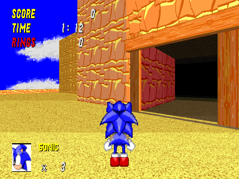
Then what about this? (Yes, I know that you can now see the thok barrier)

srb20044.png


Note that both of my rock textures are in here, the orangey one for the walls outside, and the red one for inside walls.
 
Thanks, but I don't really know what I could do next...

I said:
Hey SSNTails, could you suggest any other sorts of textures for Arid Canyon that we haven't tried yet? I'm getting bored with nothing going on here.
 
I worked harder on my rock-texture. I think it slowly develops into the right direction.
;)


Texture: (128 x 128)
O_Rock.png


Demo Wall:
Dem_O_Rock.png
 
@Morph: The rocks need to be bigger, at this size they just sort of blend. The background also needs to be a lot darker to provide a good amount of contrast. The patchwork thing could be cool, but I can barely see the rocks in front of it at a glance.

If you are going for a more grainy pebble look, then perhaps they should be closer together and there should be far less room around them.

@Monster: The texture is an interesting shape but it doesn't really look good when tiled, it looks flat at best and actually looks like you only used three colors in it. When tiled the shapes don't even appear to match up, try to make it either bigger or more uniform to make it seamless. Also keep in mind when designing the shape that it may be tiled a lot. Especially if its a flat, use a program to tile it to 1024x1024, and see how it looks.

The wood also looks a little boring, try to give it a little more texture. At the moment it just looks like a few lines on an orange block, nothing like wood... Don't be afraid to scribble a bit, if used correctly it can make something a little less flat.
 
I do appreciate what you thought of those textures of mine, JEV3, but I used Paint to create all of them, so I wouldn't be able to 'scribble' at all. I can't really think of ideas for better designs for rock textures for Arid Canyon for SRB2. These were, so far, the best I could do.

I might as well stop here...

SSNTails hasn't even answered my question (Which I have asked 4 times already, due to my dislike to ignorance)...

I said:
Hey SSNTails, could you suggest any other sorts of textures for Arid Canyon that we haven't tried yet? I'm getting bored with nothing going on here.

I'm losing hope now... *sighs*
 
Monster, I had a question very similar to that and asked it and I couldn't get an answer, just "use your imagination". If it was a level I was making I could think of everything, here you just think about it, decide whether or not it could work, and then act on it.

Gimp is free to download and you can use its palette feature and design it in layers. It takes a little work to figure out and you have to save often because it often freezes and throws whatever you were working on out the window, but it is definitely worth it if your only alternative is paint. Even then, it still all comes down to scribbling, Gimp just gives you a few filters and layers to make it more flexible for some larger images.

I'd also like to point out the keywords to your statement...

These were, so far, the best I could do.

I've been working on textures quite a bit before now, but I designed a sky for this... a 1024x1024 image from scratch. SSN's was better, but its better than what used to be "the best I could do". The textures I made were larger and overall better looking than ever before, I've done many things for this contest that I didn't match before. Last year I was completely unable to make anything decent, and the things I made looked horrible. Apart from recoloring Silver Shadow's bee hive textures for personal use, there was nothing else I could make of any merit.

And this is where I stand now:


And is there room for improvement? Absolutely!
(actually I think I have improved it since then to integrate the landforms into the ground better)
 
Because for something like this, GIMP is way too advanced. All the special effects won't fit into the pallete. If we were designing a banner for the website, I would reccomend a mixture of the two; Graphics Gale to make the image without shiny FX, and GIMP to apply the shiny FX.
 
It's also not the original size, because that's exactly what I didn't want happening.
 
Status
Not open for further replies.

Who is viewing this thread (Total: 0, Members: 0, Guests: 0)

Back
Top