Blaze the Cat RE WAD

Status
Not open for further replies.
Dr.Pepper said:
You mean the life icon? There's not much I can do about it because of her hair. If I do shrink Blaze's height even slightly, she'll be even shorter than Sonic than she ought to, and that would look strange. XD

Also, did some more minor edits to the select picture. That's about the best I can do with it right now. :P
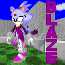
srb20039-1-1.png
Love the Select Picture and about the life icon? knowing you you'll find a way to fix it (oh and try moving Blaze a slight bit to the left on the backround you set for the select picture she looks a bit too close to the edge)
 
Keep up the good work.
This wad is excellent, it's one of the only character wads I ever load
into srb2. Nice job.
 
Well, if everyone's fine with what we have, I'll update the download link with the final version. :P

Also, I might just use this as an avatar:
139431460148a3d72ee38d7.png
 
Dr.Pepper said:

Yeah, ruins do go better, on second thought, seeing it in action.

Also yeah, light blue and grey (EDIT: Sol Emeralds) could do with updating. Unless they were put together I wouldn't tell much of a difference. But then again, why do you need to know the colour? Just how many you have.
 
Your monitor's brightness might be a bit too high, I can tell the color difference pretty okay on mine. It's no big deal though, they're the same colors as SRB2's normal emeralds, so who cares anyway? :P

Also, I've been experimenting with the front walking sprites, to see if I could improve the animation. I made the sprites bump up and down, using CZ64's Silver sprites as a reference. I'm not sure if it's actually better, though.
1-21.gif
 
Dr.Pepper said:
Your monitor's brightness might be a bit too high, I can tell the color difference pretty okay on mine. It's no big deal though, they're the same colors as SRB2's normal emeralds, so who cares anyway? :P

Also, I've been experimenting with the front walking sprites, to see if I could improve the animation. I made the sprites bump up and down, using CZ64's Silver sprites as a reference. I'm not sure if it's actually better, though.
1-21.gif
Ooh, looking good! Seems really smooth. Keep it up, Doc!
 
I just did that to the rest of the angles and tried it in-game. Wow...Blaze doesn't look like she's sliding across the ground anymore! What do you guys think?
2-12.gif
3-11.gif
4-12.gif
5-17.gif

I've went ahead and updated the WAD with these changes so you guys can see it in action for yourselves. (The updated Sol Emerald WAD is included too.) Get it here:
http://www.mediafire.com/download.php?nt0zx2jndmy
 
Dr.Pepper said:
Well, if everyone's fine with what we have, I'll update the download link with the final version. :P

Also, I might just use this as an avatar:
139431460148a3d72ee38d7.png
0.o Didn't skyninja have an avatar like that once?
 
darkness claw said:
Dr.Pepper said:
Well, if everyone's fine with what we have, I'll update the download link with the final version. :P

Also, I might just use this as an avatar:
139431460148a3d72ee38d7.png
0.o Didn't skyninja have an avatar like that once?

that and it looked like HMS(with those numbers and stuff >>)
 
Dr.Pepper said:
Well, if everyone's fine with what we have, I'll update the download link with the final version. :P

Also, I might just use this as an avatar:
139431460148a3d72ee38d7.png
Make the mouth open wider, like my character select pic.
 
It does look too much like SkyNinja's old avatar, fixed:
139431460148a3d72ee38d7-1.png

XD *stabbed*

Anyway, the updated WAD above will more than likely be BlazeRE's final update, unless anyone else has further critique for the sprites. So yeah, both versions are finished, overall. :P
 
Dr.Pepper said:
It does look too much like SkyNinja's old avatar, fixed:
139431460148a3d72ee38d7-1.png

XD *stabbed*

I loled, seriously. xD

Dr.Pepper said:
Anyway, the updated WAD above will more than likely be BlazeRE's final update, unless anyone else has further critique for the sprites. So yeah, both versions are finished, overall. :P

I don't think there can be much critique regarding the anim. It seems so fluid.
 
This new Blaze is great! I really like how the graphics seemed to look softer (I don't know the exact word to describe this). This is the coolest WAD you have made, yet!

Anyways, I want to know what WAD or level is in the 7th picture. Looks interesting from those slime waterfalls.
 
Firstly they aren't slime falls. Secondly, it's from Flame Core in the STH06 mod and thirdly, nice to meet you Shadwonic. You seem, not n00by.
 
Status
Not open for further replies.

Who is viewing this thread (Total: 2, Members: 0, Guests: 2)

Back
Top