• Do not use Works in Progress as a way of avoiding the releases system! Works in Progress can be used for sharing early betas and for getting suggestions for improvement. Releases of finished content are not allowed in this forum! If you would like to submit a finished addon, click here for instructions on how to do so.

Sonic next-gen style(Unfinished)

Status
Not open for further replies.
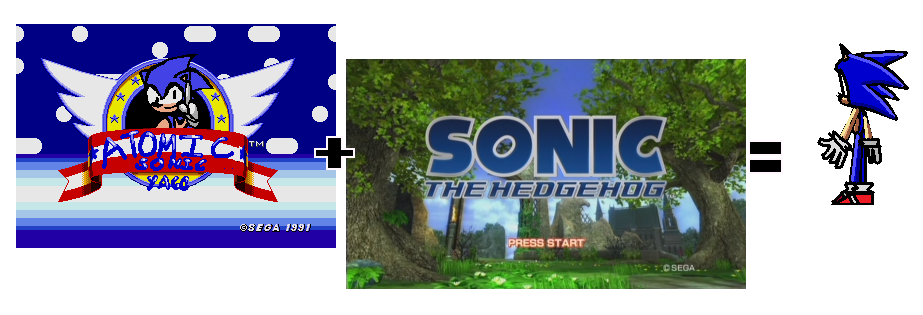
Kinda reminds me of that Atomic sonic hack for Sonic 1.
It doesn't really fit SRB2's style but it's a good start!
 
Err, it is ok,I think.. The left shoe of Sonic id off by a few pixels. And is that all the frames you have so far? Remember making a character wad takes over 350 drawings. (Around there I think)
 
Ugh, the pictures don't match at all! Sonic's left standing animations is smaller than his running. Second, The running animation's spike's looks like they are coming out of Triangular-ish head!
 
Hm....
I can't say I like the newer frames.
They look like they've just been made with the Polygon tool in paint.
It looks like you went from Sonic 2006 to Sonic R.
Try to make them match the back frame.
 
Last edited:
AtomicSonic06.png


Pretty much.

It looks disgusting. The lines are too thick and jagged, the shading looks like crap as well, the sizing between sprites is inconsistent by the looks of it, and in THIS frame (http://img21.imageshack.us/img21/2985/mysonic2.png), it looks like he's missing his leg. The only thing that's next-gen about it (which isn't even next gen anymore: It's the CURRENT GEN people) is that it uses lanky limbed Sonic instead of ol' preggers. It just doesn't look good.
 
Pretty much.
<Insert image here>

It looks disgusting. The lines are too thick and jagged, the shading looks like crap as well, the sizing between sprites is inconsistent by the looks of it, and in THIS frame (http://img21.imageshack.us/img21/2985/mysonic2.png), it looks like he's missing his leg. The only thing that's next-gen about it (which isn't even next gen anymore: It's the CURRENT GEN people) is that it uses lanky limbed Sonic instead of ol' preggers. It just doesn't look good.
Like D00D64 said, it needs A LOT of work. The shading is not good (It's like 5 colors?), the images are all pointy, thick, jagged. It looked like you just use a size 2-3 line tool in mspaint for the whole thing. I would like it if you posted your progress in small images like the 2nd sprite you made instead of screen shots. It's also missing ears in the back sprite. :<
Overall, I don't see how this will pass the submissions without changing it to something else. Please use a little more color and don't use the line tool so much.
 
I got yelled at by 3 people for posting your Sonic in IRC. I have a good feeling about this project.
 
Ok a nice guy would be nice and say: "All you need is practice and then someday you will be pro!" But what I'm thinking is: "Oh my god! This is one of the worst sprites for SRB2 I've ever seen! Talk about weird legs and bad pixel art even though it's made in paint. Maybe he should download Paint.NET, GIMP, Photofiltre or some other good program instead of making these really bad pictures in paint." Now I really feel guilty but it's the truth. (This is just what's in my mind. SORRY!)
 
Last edited:
Oh wa? No one said anything like that :/

And also, if you gonna make Sonic hi-res, I suggest you make bigger sprites then, but make a full hi-res wad takes alot of time, so you may want to make it normal-res

And also, this sprite kinda looks squary in the head in my opinion, you could use some Sonic next gen pics for reference to try make it better
 
Status
Not open for further replies.

Who is viewing this thread (Total: 1, Members: 0, Guests: 1)

Back
Top