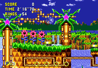
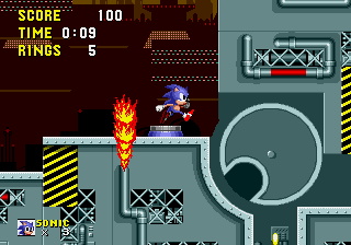
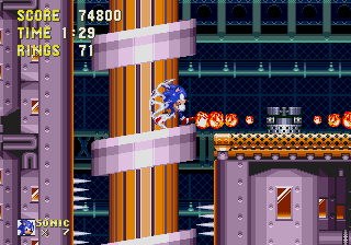
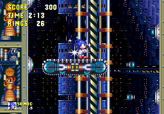
The majority of levels in SRB2 are dark or grey

The only problem with massively improving the game in every aspect, including visual design, is that now the visual design is good enough that it's worth critiquing! :P (Don't even get me started on how ugly DSZ was in previous versions.)

Anyway, this is best explained with pictures.

b4ZnbNa.png


It's grey.

o30Jyic.png


It's dark.

4p7jf6i.png


It's dark.

iEKH07G.png


It's dark and grey.

hRH1rhD.png


It's grey.

In theory, SRB2 will get two more zones in future versions too.

Dark City Zone: It'll be dark.

Grand Eggship Zone: It's a ship, and it'll likely be grey.

There's obviously no easy fix for this, but it's at least something you guys should consider when designing levels. I'll make an attempt at giving my own suggestions, but I know very well that one-sentence ideas like this aren't all that helpful when it comes to actually implementing changes.

Greenflower: Great!

Techno Hill: While I don't at all mean that you should copy Chemical Plant, it's a good stage to look at for inspiration on how to design a factory level that's still bright and colorful. I'd recommend using colors like pink and toxic green as those aren't colors often used elsewhere in the game.

6FoASI7.jpg


Deep Sea: The skybox areas are much better looking than the temple areas, and yet there's so much more of the latter than the former. I'd also recommend more decoration like bright red coral reefs. In Subnautica, a game that takes place entirely underwater, the areas close to you have far less of a "colorbox" effect than the areas further away. While SRB2 shouldn't go as far as Subnautica does, I think the colorbox should be less intense than it currently is.

Q6SerRv.jpg


Castle Eggman 1: I think this stage should actually start in the evening and then transition to nighttime during the "no music" section. In an ideal world, I think this level should look more like the Lost Kingdom from Super Mario Odyssey than the depressing forest it currently is.

cscqsFw.png


Castle Eggman 2: Honestly, it's fine. Being dark and grey works in this case; if the rest of the game weren't so similar it wouldn't be a problem at all.

Arid Canyon: Great!

Red Volcano: Great! This is actually a perfect example of what I like. It manages to be colorful and varied despite largely taking place in rocky underground areas.

Dark City: Uh... remember that purple can make things look "dark" while still being visually interesting?

Grand Eggship: Why am I writing this for stages that don't exist?

Egg Rock: I don't know what the remake looks like so this is as pointless as making suggestions for DCZ and GEZ.

Anyway, that's all.

---------- Post added at 07:26 PM ---------- Previous post was at 06:35 PM ----------

In retrospect, I totally missed an opportunity to post a GIF of the first few seconds of ERZ2, rather than the screenshot I went with.

"It's dark, and then it's grey."
 
In the back of my head, I knew there was something more a good part of the SRB2 levels could use in terms of visuals, and after giving this a read, I realize that this is definitely it.

I say this is something definitely worth experimenting upon some time in the future. The levels are already in a good direction with the way they are structured in 2.2, so experimenting with their color presentation would make it all the more authentic and lively, so it would definitely pay off.
 
Your refrigerator's running? Can you help me out, my fridge's legs don't work!

Huh, I didn't even parse it until you pointed this out, but the game really is overwhelmingly grey. I wonder how much of this is a leftover from the days before the newer palette(s), considering how desaturated half of Doom's original colors were. THZ grabbing a bit of pink and acid green sounds like a pleasant dream to me- bit funky, but that's just in true sonic fashion, y'know? I wouldn't be too opposed to full on sunrise CEZ1, because sunrises are cool, but the dusk is also neat in its own way... CEZ is officially Real Life Zone which is funny considering the absolutely excessive scale of that castle.


Also yeah, flaunt that DSZ1 skybox more, there's no way anyone would be opposed to that~


On the subject of what new ERZ looks like, since you mentioned it: There's this small bit from the 20th Anniversary Trailer, as well as this screencap in the spoiler. Both of these are technically spoilers, but in reality I just didn't want them to take up space---

SPOILER_SPOILER_srb20007.png
 
Welp, you have point about majority of zone being Dark/Gray.

Even though I am not really against it. Well, I think majority zones in this game should be colorful at very least, which most of them are. Some of them could be easily changed, but some of them would require entire texture set to be well re-done. Like in case of THZ2 (well THZ1 contains parts of THZ2's texture set yes, but THZ1 is way less gray than its continuation).

I mentioned that it would be quite easy to change in some cases darkness or amount of gray. Like CEZ2 doesn't used at all color map, which could make at very least darker sectors purpler. Or they could just changed brightness value on some of the sectors in DSZ.

Either way don't expect from ERZ's remake much, yes there will be better texture use, but it will be pretty much gray in exteriors, due to it being in space. (I wish they would make some kind of large earth skybox though)

Also situation about DCZ and GEZ isn't really known, not only because both of those zones are in planning stage, but also we are waiting on UDMF mapping format to be done before anything starts from mapping stand point.
I hope they take inspiration out of GuyWithThePie's DCZ Concept art though.
And GEZ doesn't have to be gray mind you !

There are some of the old textures, which are light purple/blue with ton of gray, but that doesn't mean they will be used in actual GEZ. And in official sonic games like Sonic 2 or Sonic 3, those large ships were brown/orange (or in case of flying battery interiors were purple/greenish). So definitely ships don’t have to be gray.
 
Last edited:
THZ2 being predominantly grey helps to make the action points of the map, like the goop at the start, stick out more, which helps guide a new player's attention. I agree it could use some more color variation, but I think it should stick to more muted colors for decoration, so the action points still stand out by being vivid. Maybe some steel blues, puce greens, a bit more orange to highlight notable areas?


The skybox is pretty colorful, even if dark. Maybe having more windows around would help the aesthetic too.
 
I don't really mind the grey, I kinda like the ones you point out because they show SRB2's bigger emphasis on atmosphere (besides ERZ). Sonic 3 wasn't as flashy/colorful as the other games, save for a few exceptions, but they made for it it with depth in lots of the finer details. I could see the benefit in more color but it also just doesn't really bother me. In fact I think more color in CEZ would be detrimental to the dark vibes it gives me.

Somewhat related, somewhat unrelated, but more than ever SRB2's reminded me a lot of Donkey Kong Country than Sonic (which is not a bad thing), in a lot of ways -- not momentum-driven what-so-ever but still has kinetic fast gameplay like Sonic, but has the precision of Mario, is way less forgiving than either of those, and its art direction features a lot of incredible atmosphere.
 
Overall I love the look of the new SRB2. I think that the redesign of most of the levels really pushes the visuals to the point where it's stylistically almost a different game with many more cues, architectural decorations, and a pseudo-realistic feel.

Either way don't expect from ERZ's remake much, yes there will be better texture use, but it will be pretty much gray in exteriors, due to it being in space. (I wish they would make some kind of large earth skybox though)

ERZ was designed with three texture palettes, red, blue, and gray. Each was originally designed with a certain sub-motif in mind but regardless how the redesign is approached the net result is that the existing textures still offer some variety in color design... and I've noticed a few of the textures have already been improved on anyway. The main goal was to keep ERZ feeling visually distinct from THZ. The screenshot from earlier in the thread certainly looks promising in terms of both being colorful and varied.

fickleheart said:
THZ2 being predominantly grey helps to make the action points of the map, like the goop at the start, stick out more, which helps guide a new player's attention. I agree it could use some more color variation, but I think it should stick to more muted colors for decoration, so the action points still stand out by being vivid. Maybe some steel blues, puce greens, a bit more orange to highlight notable areas?[

I think a few of the areas in SRB2's redesigned levels could use some "accents" of some sort. THZ in particular could benefit from it. I honestly don't have any other ideas for how to bring more color into it. My first thought is to substitute some light green tinted textures for it, but that would be too similar to the vines in DSZ and GFZ is already pretty green. Maybe have some slight red tinged colors? I do agree the color being muted works pretty well to point out gimmicks.

As for CEZ, it's very atmospheric and unique. I really love the thorns and the forest textures. CEZ2 has a very diverse range of environments even if the castle bricks may be ubiquitous. There was one area where there was a side courtyard that just kinda felt empty. However the areas are so huge I wonder if any more decorating would cause performance issues, the polyobjects are buggy enough as it is.

RVZ is hugely improved thanks to the prehistoric theme, but I've never been a fan of those original rock textures... I even tried to replace them once but my replacements were actually worse than the originals and stylistically don't fit in SRB2's more detailed design. But that's a matter of personal taste and I don't know that anything really needs to be done about it. In some places it looks really good and in others it still just feels you're in a big circular room hopping on fairly repetitive rocks over lava.
 
In my opinion, the color scheme of Techno Hill act 1 makes it look like a bad future, and I'm not sure if that's a good or bad thing. I remember back in 2.0, Techno Hill act 1 was more of a good future, but it was admittedly too close in ascetics to Green Flower. What I, personally, would do is restore the 2.0 look and give the level more pipes as scenery to bring it closer to Palmtree Panic Good Future.
scd-pp-appearanceimg5.png
 
Personally, in regards to Techno Hill, I feel like Act 1 is okay-ish but Act 2 could really use a visual overhaul. There's just too much grey. To the point that now, it almost reminds me of Old DSZ, especially given the fact that the more detailed pipes were replaced with plain flat ones. (For good reason, but still.)
 
Looking back at this topic, I just noticed that I never clarified what I meant when I said "the majority of levels" in the topic title. By that, I meant the literal definition of "over 50%". Let me explain properly:

Bright levels:
  1. Greenflower 1
  2. Greenflower 2
  3. Greenflower 3
  4. Techno Hill 1
  5. Deep Sea 3
  6. Arid Canyon 1
  7. Arid Canyon 2
  8. Arid Canyon 3
  9. Red Volcano 1

Dark or grey levels:
  1. Techno Hill 2
  2. Techno Hill 3
  3. Deep Sea 1
  4. Deep Sea 2
  5. Castle Eggman 1
  6. Castle Eggman 2
  7. Castle Eggman 3
  8. Egg Rock 1
  9. Egg Rock 2
  10. Black Core 1
  11. Black Core 2
  12. Black Core 3

This also applies when you include the extra levels.


Bright bonus levels:
  1. Frozen Hillside
  2. Pipe Towers
  3. Aerial Garden

Dark or grey bonus levels:
  1. Forest Fortress
  2. Haunted Heights
  3. Azure Temple
  4. Techno Legacy
 
You know, when you put it that way it looks like part of the reason for that is way-way back when the ideas for all the levels were outlined a lot of them were levels that it just makes sense to be dark and/or gray. Castles and factories are gray, space and underwater ruins are dark... and that's not taking into account Dark City which was originally inspired by the Sonic OVA and would be a post-apocalyptic city ruin.

I still think Egg Rock has the potential to not quite be gray enough to make your list, and the indoor areas can be made to be pretty bright, even the current version isn't gray and dark through the whole level.

At least Red Volcano is on the bright list. It was always so dark in previous versions.
 
My friend (an amateur game designer) mentioned this while he was in Deep Sea Zone 2. He said that the cave walls should be a blue-ish tint, and that there should be more bright blue sprinkled around the level in general.
 
You know, when you put it that way it looks like part of the reason for that is way-way back when the ideas for all the levels were outlined a lot of them were levels that it just makes sense to be dark and/or gray. Castles and factories are gray, space and underwater ruins are dark... and that's not taking into account Dark City which was originally inspired by the Sonic OVA and would be a post-apocalyptic city ruin.

I still think Egg Rock has the potential to not quite be gray enough to make your list, and the indoor areas can be made to be pretty bright, even the current version isn't gray and dark through the whole level.

At least Red Volcano is on the bright list. It was always so dark in previous versions.

Yeah, there are lots of times where things seem like a good idea in isolation, but then you take a step back and go "Wait a minute..."

As another (much more trivial) example, 1/3rd of the planned main zones in this game have the word "Egg" in them (Castle Eggman, Grand Eggship, Egg Rock).
 
Honestly, two suggestions I thought of for this:

Haunted Heights: This may just be a graveyard theory and may not look the best, but I would maybe take inspiration from Pumpkin Hill and add a little brown to some of the rock textures. Likewise, I would also maybe add some character to them with spooky designs on the rocks, like Jack'o'lantern faces and whatnot, in a similar vein to the designs added to Greenflower's walls to differentiate them from typical Green Hill walls. For the former I would experiment with it, as like I said it may not look the best, but I think the latter could work well. Hell, if the black/grey rock textures are kept maybe have the designs be purple (and a darker one than the goop btw) to fit the Halloween theme and still stick out on the wall, but not a garishly as an orange on black.

CEZ3: Maybe a bit out there, but you know the Egg Robos with the foam fingers? Go all in on the joke. Brighten up the coliseum, then justify it in game with giant football stadium lights. Maybe even take it further and add giant screens to the walls of the coliseum behind the Egg Robos on the highest seats. IDK I just think it would be fun to see that little design choice taken further.

One I wouldn't want changed is Techno Legacy since, well, it's supposed to look straight out of version 2.0 or prior. I know the acid was changed to green, but I feel that was only done to communicate to players new to 2.2 that it's not the same as the goop in the new THZ.
 
Last edited:
Apologies for bumping, but I wanted to share my two cents on the matter-


I think it's a good point that SRB2 should be less grey and one thing I've noticed at least since the 2.1 era, is the fact that not only does SRB2 use a lot of grey level textures, but those level textures are almost always pure grey, i.e. no hue or saturation to speak of. Some of the greyer levels like Techno Hill, Techno Legacy and Egg Rock will occasionally have entirely grey areas where the player character and the HUD are pretty much the only things rendered in colour, which gives off a similar energy to artwork like this:


ba3d59161e2fb350b13a566cb3b983f2.jpg


If you go back to the 16-bit Sonic games, you'll notice that even the duller levels tend to avoid pure grey, instead going for a similar colour that gives off a cold metallic look. In Scrap Brain acts 1 and 2, for example, the "grey" areas are actually a turquoise/teal colour:


Sonic1_ScrapBrainAct1.png


In Flying Battery, the "grey" areas are lilac.


Flyingbattery.png


And in Death Egg there's a mixture or blues, olives and copper colours to communicate a dark, mechanical feel, whilst still avoiding a massive amount of grey.


Danger_Zone.png


The only classic Sonic levels I can think of that use a considerable amount of grey in their level tiles are Chemical Plant and Scrap Brain act 3. Chemical Plant is set pretty much entirely outdoors (in contrast to THZ2 being mostly indoors) allowing the colourful background to be prominent throughout the entire zone, whereas Scrap Brain Act 3... actually just looks ugly.
 
Dark coty and grand eggship textures are in the game. I guess you can use these as examples?
 
I disagree about it being Dark/Grey.

Also keep in mind that Castle Eggman is supposed to be stone grey and gloomy (because it's the theme of the level).

I would agree that Sonic CD is more colorful than Robo Blast 2 but even Sonic 1 and 3&K were pretty Dark color-wise (Sonic 2 felt brighter/more colorful).

I'd even say that about modern Sonic games, Adventure 1 was pretty realistic (while being still colorful like most 90's 3D platformers of its era) while SA2 was getting darker and even more realistic. Heroes on the other hand has done a 180° turn and was one of the most colorful game of the Adventure era (until Shadow the Hedgehog and 2006 has gone completely dark and realistic).

At least Unleashed came back to Adventure 1's realism but still colorful style while Colors is very colorful (maybe even more than Heroes).
 
well I understand the sonic franchise tends to be very colorful in most of its games but I like the gray atmosphere in castle eggman and egg rock
 
Dark coty and grand eggship textures are in the game. I guess you can use these as examples?
Probably not actually, all of those textures are pretty old now (Dark City's have been in since Final Demo, with the exception of some rocks and a sky texture (which were added in 2.1 or 2.2?), and Doomship's were added for 2.0), and it's no secret even the devs think Dark City's old textures are ugly at this point. When those levels are finally made, they'll be given much better texture sets.

That said, it's probably quite hard to uncouple the concept of darkness from Dark City given that it's in the stage name. XD
 

Who is viewing this thread (Total: 1, Members: 0, Guests: 1)

Back
Top