Unknownlight
Member
The only problem with massively improving the game in every aspect, including visual design, is that now the visual design is good enough that it's worth critiquing! :P (Don't even get me started on how ugly DSZ was in previous versions.)
Anyway, this is best explained with pictures.

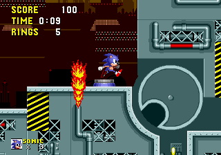
It's grey.

It's dark.

It's dark.

It's dark and grey.

It's grey.
In theory, SRB2 will get two more zones in future versions too.
Dark City Zone: It'll be dark.
Grand Eggship Zone: It's a ship, and it'll likely be grey.
There's obviously no easy fix for this, but it's at least something you guys should consider when designing levels. I'll make an attempt at giving my own suggestions, but I know very well that one-sentence ideas like this aren't all that helpful when it comes to actually implementing changes.
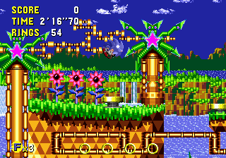
Greenflower: Great!
Techno Hill: While I don't at all mean that you should copy Chemical Plant, it's a good stage to look at for inspiration on how to design a factory level that's still bright and colorful. I'd recommend using colors like pink and toxic green as those aren't colors often used elsewhere in the game.

Deep Sea: The skybox areas are much better looking than the temple areas, and yet there's so much more of the latter than the former. I'd also recommend more decoration like bright red coral reefs. In Subnautica, a game that takes place entirely underwater, the areas close to you have far less of a "colorbox" effect than the areas further away. While SRB2 shouldn't go as far as Subnautica does, I think the colorbox should be less intense than it currently is.

Castle Eggman 1: I think this stage should actually start in the evening and then transition to nighttime during the "no music" section. In an ideal world, I think this level should look more like the Lost Kingdom from Super Mario Odyssey than the depressing forest it currently is.

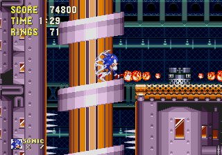
Castle Eggman 2: Honestly, it's fine. Being dark and grey works in this case; if the rest of the game weren't so similar it wouldn't be a problem at all.
Arid Canyon: Great!
Red Volcano: Great! This is actually a perfect example of what I like. It manages to be colorful and varied despite largely taking place in rocky underground areas.
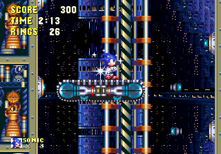
Dark City: Uh... remember that purple can make things look "dark" while still being visually interesting?
Grand Eggship: Why am I writing this for stages that don't exist?
Egg Rock: I don't know what the remake looks like so this is as pointless as making suggestions for DCZ and GEZ.
Anyway, that's all.
---------- Post added at 07:26 PM ---------- Previous post was at 06:35 PM ----------
In retrospect, I totally missed an opportunity to post a GIF of the first few seconds of ERZ2, rather than the screenshot I went with.
"It's dark, and then it's grey."
Anyway, this is best explained with pictures.
It's grey.
It's dark.
It's dark.
It's dark and grey.
It's grey.
In theory, SRB2 will get two more zones in future versions too.
Dark City Zone: It'll be dark.
Grand Eggship Zone: It's a ship, and it'll likely be grey.
There's obviously no easy fix for this, but it's at least something you guys should consider when designing levels. I'll make an attempt at giving my own suggestions, but I know very well that one-sentence ideas like this aren't all that helpful when it comes to actually implementing changes.
Greenflower: Great!
Techno Hill: While I don't at all mean that you should copy Chemical Plant, it's a good stage to look at for inspiration on how to design a factory level that's still bright and colorful. I'd recommend using colors like pink and toxic green as those aren't colors often used elsewhere in the game.
Deep Sea: The skybox areas are much better looking than the temple areas, and yet there's so much more of the latter than the former. I'd also recommend more decoration like bright red coral reefs. In Subnautica, a game that takes place entirely underwater, the areas close to you have far less of a "colorbox" effect than the areas further away. While SRB2 shouldn't go as far as Subnautica does, I think the colorbox should be less intense than it currently is.
Castle Eggman 1: I think this stage should actually start in the evening and then transition to nighttime during the "no music" section. In an ideal world, I think this level should look more like the Lost Kingdom from Super Mario Odyssey than the depressing forest it currently is.
Castle Eggman 2: Honestly, it's fine. Being dark and grey works in this case; if the rest of the game weren't so similar it wouldn't be a problem at all.
Arid Canyon: Great!
Red Volcano: Great! This is actually a perfect example of what I like. It manages to be colorful and varied despite largely taking place in rocky underground areas.
Dark City: Uh... remember that purple can make things look "dark" while still being visually interesting?
Grand Eggship: Why am I writing this for stages that don't exist?
Egg Rock: I don't know what the remake looks like so this is as pointless as making suggestions for DCZ and GEZ.
Anyway, that's all.
---------- Post added at 07:26 PM ---------- Previous post was at 06:35 PM ----------
In retrospect, I totally missed an opportunity to post a GIF of the first few seconds of ERZ2, rather than the screenshot I went with.
"It's dark, and then it's grey."