• Do not use Works in Progress as a way of avoiding the releases system! Works in Progress can be used for sharing early betas and for getting suggestions for improvement. Releases of finished content are not allowed in this forum! If you would like to submit a finished addon, click here for instructions on how to do so.

You got Yahtzee in my SRB2...

Status
Not open for further replies.

Blacklightning

Insane Idealist
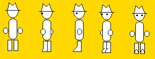
I was considering taking up some SOCing/WADing in my spare time, so I thought I'd start with something relatively simple to get my bearings first. And it doesn't get much simpler than Yahtzee of "Zero Punctuation" fame.

YahtzeeV1-1.png

EDIT: Now V1.1 upgrade

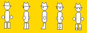
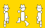
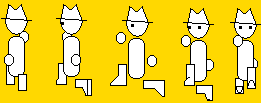
Lack of shading, background colour choice and the non-moving hat are deliberate, if only to stay faithful with Yahtzee's own lazy drawing style. I am simply hopeless at drawing perspective however, so I'd really appreciate tips towards getting the rotations right. ESPECIALLY on the feet. Good lord.
 
The hat is leaning to one side in every angle.

Make the lines more anti-aliased (not in to the background color of course).

Separate the hands on the diagonal angles a little bit, to widen him up. Change the side-view's boots so they're symmetrical (cannot see the foot in the back).
 
Furyhunter said:
The hat is leaning to one side in every angle.
As noted above, that's deliberate. The hat never changed positions in the reviews, either.

Make the lines more anti-aliased (not in to the background color of course).
You'll have to forgive me for not being familiar with that term. What's anti-aliasing exactly, again? EDIT: Disregard this, I just figured that out.

Separate the hands on the diagonal angles a little bit, to widen him up. Change the side-view's boots so they're symmetrical (cannot see the foot in the back).
Will do.
 
Thicker lines would be good. Also, the lines of the hat weren't askew. The entire hat was tilted to one side.

That said, are you making this to improve your spriting skills, or to acquire skill with you lump editor?
 
BlueZero4 said:
Also, the lines of the hat weren't askew. The entire hat was tilted to one side.
...looking back at my references, it seems you're actually right on that count. Rats, I was hoping I wouldn't have to redo the hat. Though I guess I could cheat and tilt only the bottom line and still make it appear that way.

You aren't the first person to suggest thicker lines, and I wasn't sure I should add them just yet. I'll experiment with it and see if I can get something without messing up the scale.

That said, are you making this to improve your spriting skills, or to acquire skill with you lump editor?
A little of both, but priority's on the editing part as soon as I get the most basic poses working (standing, running, jumping). The stats part of things doesn't look particularly complicated and I've picked up a bit of basic SOCing (thanks to a bloody nice tutorial on the boards that Morph made) but I don't have a clue of how to make it all into a WAD yet. I have SLumpEd, if that helps. Wasn't particularly sure which editor I should get.
 
YahtzeeV1-2.png

Made minor improvements to the standing sprites - tilting the angle of the hat slightly and widening the hands a bit on the diagonals, to my recollection. I've decided to save antialiasing and line thickening and whatnot for later, because these will almost certaintly not be the finalized poses - it'll change later when I think of how to throw an umbrella in, among things.

Also did the first part of the jumping pose, minus the diagonals:
YahtzeeJumpV1.png

In the front-facing pose, you might notice the back leg looks exactly like the rear pose. This is because I honestly have no clue of how to draw it facing forwards, so I'd appreciate some advice there.
 
Unless you want the character to have a yellow square around him all the time, then you should change it to pure cyan (the 247th color on the picture below).
Palette.png


Maybe a better idea is to change the textures in the game, so that they are yellow.
 
bioshock-zero-punctuation.jpg


Copypasta to the front-side angle standing frame, and tilt the hat a little more on your frames.
Also, possible boredom frame?
zeropuncths-1-r3eviewcopy.jpg
 
Unless you want the character to have a yellow square around him all the time, then you should change it to pure cyan.

Maybe a better idea is to change the textures in the game, so that they are yellow.
The yellow in these pictures is deliberate. I'm aware of the transparency requirements and I won't be importing them as they are here.

I just thought it'd look a bit more authentic for now if he were displayed against his traditional yellow background for the time being.

bioshock-zero-punctuation.jpg


Copypasta to the front-side angle standing frame, and tilt the hat a little more on your frames.
Also, possible boredom frame?
zeropuncths-1-r3eviewcopy.jpg
I dunno, the hat looks fine to me at the moment. Any more than it is now and I'll be risking clipping through one of the eyes on some frames.

Idle pose isn't a bad idea though. I'll have to consider that one.
 
Lines need to be at least 2-3 pixels thick if you want to emulate the style of the ZP videos, the eyes need to be round instead of squares, and the head needs to be a circle.
 
The sprites are actually scaled down perfectly from elements of the original drawings. The line thickness I can agree with (and I'll be doing later, once I finalize the poses), but I can't possible change the eyes any further than this without ruining the scale and making something that looks downright wierd. Interestingly enough I experimented with the eyes a bit as they are and all the traditional expressions are still possible on a pair of 3x3 squares, so I'm pretty happy with keeping them the way they are now.

Also, going back to editing today I noticed that the torso on some sprites is a pixel thicker than it should be. I'll be rooting those out after I get the next pose done.
 
So I got around the previous back-foot problem simply by changing the angle of the foot from diagonal to directly horizontal. Didn't think it would be as simple as that. XD

YahtzeeJumpV1-2.png


I made an embarrasing screwup on the last two frames, but other than that, I'm pretty happy with how I've progressed so far. I might fix this up further when I'm in a better mood, but christ do I need to wind down for a while after this.

I've started some work on the falling frames, but I won't post it just yet. So far it looks more like a Trinity kick than falling from a height. =\

EDIT: Also, depth perception with mono-shaded sprites is absurdly difficult. =(
 
WAY too jagged, it needs to be a lot smoother than that, really... :/

Thicker, too.
 
Anti-aliasing might look strange since the backgrounds in SRB2 always change and there isn't partial transparency due to the 256-palette. I suppose you can use the same method as SSNTails used in that "SRB2: Coloring Sprites Part 2" video.

Having the lines 1 pixel thicker might also look strange since the sprites are limited to a 70 x 70 square.
 
Maybe instead of making the line thicker, coloring the parts on the inside edge of the line a darker shade of the main color? Then it would look thicker without looking weird.
 
I suppose you can use the same method as SSNTails used in that "SRB2: Coloring Sprites Part 2" video.
Source please? That could come in handy.

Maybe instead of making the line thicker, coloring the parts on the inside edge of the line a darker shade of the main color? Then it would look thicker without looking weird.
Definently considering this. I plan to test what sprites I have ingame soon, so I'll try a minor effect or two (anti-aliasing included) and see what works.
 
Yes, I still plan on finishing this. I had to put it aside for a while seeing as my classes take priority when there's a major project to finish. Anyway, seeing as I might actually be implementing some (gasp) basic shading sometime, I figure it might save me time later if I decide on a colourmap now so I don't have to waste time recolouring after the poses are done. Problem is, though, I can't decide on exactly what parts of Yahtzee should be coloured, and I don't really want to make him a Greeman lookalike more than it has to (no offense).

TRIBA10.png
TRIBA11.png
TRIBA12.png


The basic idea I had in mind is that the hat WILL be coloured in any scenario (if only because I plan to use it as a life/face icon too), whilst the face won't, so without screwing around with symmetry these are pretty much the best ideas I can come up with. I'll probably make up my own mind eventually come the next planned pose, but I figured it'd be wrong to leave the people that might actually be waiting for this out of the equation. =)
 
Status
Not open for further replies.

Who is viewing this thread (Total: 1, Members: 0, Guests: 1)

Back
Top