SRB2 CONTEST: Calling all texture artists!

Status
Not open for further replies.
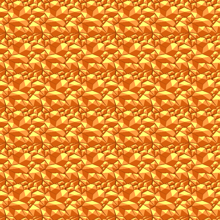
Here is a new rock texture; surely it must be better, even when tiled!
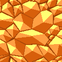
ACZWAL05.png


And when tiled to 768x768:
ACZWAL052.png
 
Monster Iestyn said:
Here is a new rock texture; surely it must be better, even when tiled!
ACZWAL05.png


And when tiled to 768x768:
ACZWAL052.png
You're definitely gonna be a winner. That's really good!
 
PRetty good, but it seems like the rocks seem to become smaller as they get closer to the edge of the image. Try to keep it looking even throughout.
 
NO NO NO NO NO NO!!! I like the textures but the textures should be really matching the sky SSNTails showed.

The textures im seeing makes the level seem/looks more unreal.
 
You quoted that Arid Canyon will be a mix of Mine Maze and Rocky Mountain and will have mine carts?

Why cant you just use the MM1... and MRMZ... textures?

Do you want me to create a sample of the level for you?
 
First of all, please don't post 4 times. Use the edit button.

Next, If you think our textures are no good, why don't you make one yourself?

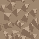
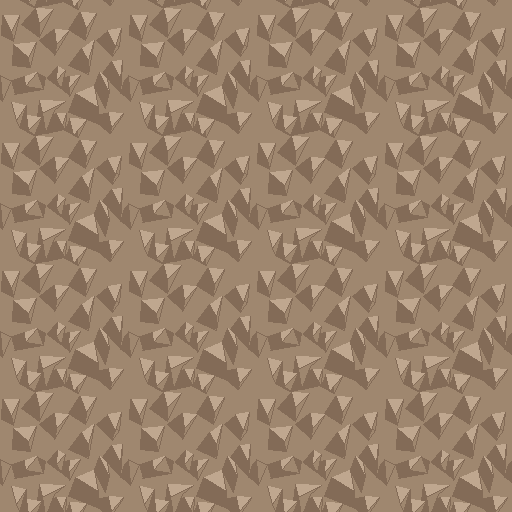
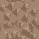
Anyway, I also have a texture that I made just now that is meant to be like the rocky structures in the sky. But I now am not sure it is that good, but here it is anyway:
ACZWAL063.png


And when tiled to 512x512...
ACZWAL064.png


Any good?
 
Monster, the rocks/crystal things in the second texture look just randomly scattered there, and I doubt that's the intended result.

As for the first one, it looks cool, I noticed a strong influence of Lava Reef in that. If you want to avoid it looking tiled, you can try making it as big as 256x256 and rather than resize it, add some depth. However it looks no less tiled than the LRZ textures already present.

My main criticism would be the coloring, which looks very flat. While blocky shading *is* something that works well for SRB2, its still good to have some light dark variation. Try using lighter or darker colors from the color range you used and see if you can make it look good with a little variation. A little added depth definitely wouldn't hurt.

My last gripe is that it doesn't *quite* look like something you'd see in a Desert, its more of a Hidden Palace texture. Right off the bat those look more like crystals than rock.

And GemEB, the current textures have been exhausted to the point where its hard to come up with an original stage design without making new ones, which nobody ever does here. (haven't seen ANY recently other than Palmtree Panic excluding secrets) Furthermore having its own texture set will make ACZ its own theme, rather than becoming a mixture of other suitable themes. I'm hoping that every official SRB2 level will have its own exclusive texture set, and that RVZ is going to lose the repetitive MMZ textures it has in the demo.
 
GemEarthBrandon said:
Here is what your Arid Canyon Zone sky image looks like.
Frame stretchin' good.
Any comments SSNtails or anyone else?

Don't suppose you've been listening, SSN scaled down the image, so attempting to use it would result in the pixelation you see there. In addition, it's made for the 1.1 pallete, where I imagine the colors look less horrible. So yeah, don't go trying to use that sky in a level, it won't work.
 
Status
Not open for further replies.

Who is viewing this thread (Total: 0, Members: 0, Guests: 0)

Back
Top