-
Do not use Works in Progress as a way of avoiding the releases system! Works in Progress can be used for sharing early betas and for getting suggestions for improvement. Releases of finished content are not allowed in this forum! If you would like to submit a finished addon, click here for instructions on how to do so.
You are using an out of date browser. It may not display this or other websites correctly.
You should upgrade or use an alternative browser.
You should upgrade or use an alternative browser.
Midnight Park Zone
- Thread starter Chaos
- Start date
- Status
- Not open for further replies.
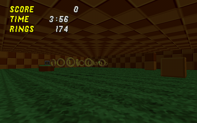
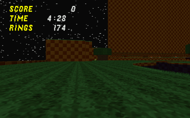
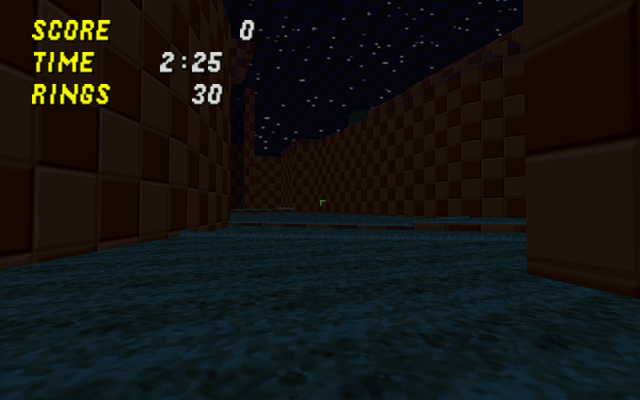
Seems too dark to me.
super silvex
Member
Don't bring smilies back *Don't say anything bad, must not say anything bad*
Ice
Pretty chill guy
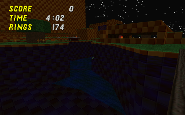
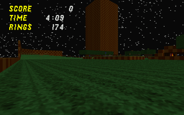
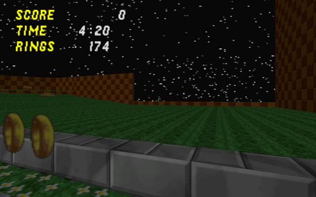
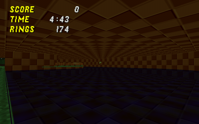
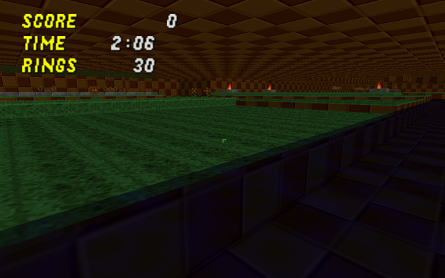
Okay, first thing I thought about upon entering the level: Woah, this place is way too dark. It even gave me the creeps when I exploring inside the water (not really, erm kinda...). Some parts, like under the trees, you could hardly see a thing. Especially in software mode. Secondly, there are some areas where it's open, and a bit flat, while other areas are pretty cramped. It's like a flat field with bits of higher ground here and there. Though I did like your use of RedXVI's place, along with cool looking benches. I also liked how you could go through the waterfall to get back to the starting area.
First thing I would do is to brighten up the level, it's a little on the opaque side...
First thing I would do is to brighten up the level, it's a little on the opaque side...
Chaos said:[
And guys, don't criticize a level for looking dark in pictures.
Then why did you criticize my level for being flat in a screenshot? >.>
Chaos
Member
http://www.sendspace.com/file/ud5u5x
Major change in the cave. Still working on the design, so the object placement might not be permanent. Nothing on the other cave or parts of the level, unless I forgot them.
Major change in the cave. Still working on the design, so the object placement might not be permanent. Nothing on the other cave or parts of the level, unless I forgot them.
Chaos
Member
http://www.sendspace.com/file/t2qclu
Yay right one this time.
Yay right one this time.
Ice
Pretty chill guy
Well, it seems you've fixed the lighting. Pretty good, though I would make that small cave part in the center of the level a little bigger. I would have to play it in a netgame to critisize it beyond that. You should host sometime.... Also, you better edit your fist post so people will download this wad instead of the first one (unless you already have.)
Chaos
Member
I think the cave at the middle should just be removed altogether, or replaced with something like a giant, hollow, tree. Apparently, I can't netgame, so I can't play with people much. I only got to once. :V
Planned stuff:
-Fixed fort thing
-Bridge part in the cave bigger
-Fixed left part
-Better placement
-Some more detail
Planned stuff:
-Fixed fort thing
-Bridge part in the cave bigger
-Fixed left part
-Better placement
-Some more detail
SWP (SRB2)
Member
The Review(*****)
-Why it got 5/5 stars-
1. As far a match levels go, this one is pretty big.
2. Lots of scenery, makes for a unique feeling to the level.
3. I can see people fighting here, in multiplayer matches.
4. High caliber work, lot's o detail.
5. Dude, a river, with a current!!
-What you can do to improve-
Nothing, in fact the light adjustment wasn't even all that nescessary. Keep up the good work, i want to see some single player levels from you.
Chaos
Member
This is the first match level I ever made, aside from the one where I just checked out how the features were. As of the newest release, the currents are broken. I'll fix the lindef tags some day.
Also, can someone take really good snapshots of places for me to add to my first post? It's a bit late, and I can't take pictures at the moment. (yes, I'll credit you adfsdsdfs)
Also, can someone take really good snapshots of places for me to add to my first post? It's a bit late, and I can't take pictures at the moment. (yes, I'll credit you adfsdsdfs)
Ice
Pretty chill guy
Chaos said:This is the first match level I ever made, aside from the one where I just checked out how the features were. As of the newest release, the currents are broken. I'll fix the lindef tags some day.
Also, can someone take really good snapshots of places for me to add to my first post? It's a bit late, and I can't take pictures at the moment. (yes, I'll credit you adfsdsdfs)
Eh, I'll take some screenshots. You can see if you like them or not. I'll pm them to you.
xxBeanGirl420xx
Member
This map is SEVERELY OVERRATED! Perfect scores? Are you serious? I know why it's being overrated and I'll explain in a second, but first, here's my rating:
4/10
This is a C-/D+. C-/D+, in the American grading system, is essentially the line that borders average and below average. It is not exceptional, nor is it horrible; it is a bit below average. Not bad for a first match map, I must say, but not a particularly good map either.
1.) Overused Pegging~
-This is the FIRST thing I noticed. Seriously, when you use GFZGRASS for almost EVERY exposed line, it looks annoying.
2.) Misuse of Space~
-You made the map fairly big, and you have a ton of space. Most of the map is ONLY EMPTY SPACE. How do you expect to get anywhere with empty space? If you're thinking "what do you mean? lol i put features in it", guess what:
~You may use these images for the first page of this topic; I don't think it's possible to make it any more "awesome" than it already is. =|~
Wastes of space. Adding stuff to make use of the space will only make the map worse, at this point, as the design doesn't allow for that kind of versatility. Right now, it appears it'll either be a gratuitous waste of space, or a very, very cramped map.
3.) Homing-Rail Achievable~
-You don't get points off for this, but it has to be noted: Homing-Rail is arguably the most powerful weapon combo in the game. This map's design makes Homing-Rail overpowered to the extreme. Before anyone comes and says "OMG AUTOMATIC 0/10 HOMING-RAIL IS NOT ALLOWED!", I do believe a positive Homing-Rail combo is able to be made to work with a map's structure. This one, does not. Let's face it: We all LOVE the Homing-Rail combo, but it's difficult to make it work.
4.) Corrupt Risk vs. Reward~
-You have the Homing-Rail at a viable range for anyone to use. Okay, that's nice. Any risks to getting either of them? Nope. The reward? A few hundred points. So wait, Risk < Reward? That makes no sense! There are virtually no risks in this map to take. Nothing can kill you except for torches, drowning, or another player -- all of which are easily escapable. Also, you have a lot more deafed monitors than you really should. I see maybe 4 or 5 that are deafed, plus random monitors. These should be avoided unless risk is provided. If there is no risk, one could simply take a run through the map and get significant bonuses in less than a minute of playtime.
5.) Ring Combination Doesn't Support Map Design~
-You don't have to place a two-special-ring combination in every map for it to be interesting. Since your map has close quarters, rail is a poor choice. Your map is very big, so homing is a poor choice because of its speed. Put them together, and it's overpowered! How does this make sense? Well, in some areas you have tons of obstacles, whereas in other areas, you have none. This makes for unbalance, as neither work for this map. You would've done better placing just automatics in this map. Sapphire Falls did it, so why can't yours? It works perfectly fine. Hell, even Homing-Auto would've worked out better than your current one.
6.) Another Generic Greens Level~
-I don't understand why everyone thinks the generic "GFZ-Themed" map is the nicest and most beautiful theme to use in SRB2. It's overused to a point where the amount of maps that go by this theme are staggering. "I don't have to think of a new type of design when I have my trusty FLOOR0_3, FLOOR0_6, and GFZROCK!" It's boring. That's just it. The majority seem to think it looks fantastic when overused, but in reality, it's just the most common, so that's the only theme they ever get to see used at all, whether it be used correctly or incorrectly.
7.) Poor Item Placement~
-There aren't a lot of rings in this map. You can get the lot of them from monitors, yes, but do I have to? What about the other players? Be generous. Match eats up your rings, so provide some. Don't be shy, just throw them on the map in some sort of order. Too little rings makes a gap in gameplay.
8.) Obstacle Disruption~
-You have areas with a large clump of obstacles, and areas with no obstacles. Both are annoying and suck equally, and it does not balance your level between "flat" and "interesting", it makes it fall on either "annoying" or "annoying".
I think a nice long look at Level Design 101 will really help you improve:
http://www.srb2wiki.sepwich.com/wiki/Level_Design
Also, I found a bug:
The water is 8 units above the ground. That's not a good thing.
Other than that, this is what I feel you deserved. Perfect scores? You didn't achieve perfection, so how is this map worthy of perfect scores? Don't let the SRB2MB's foolish ratings sway you in the wrong direction; it's not perfect; in fact, it's far from it. Anyway, okay for your first Match map. In terms of an actual stage: Not awful, but not very good either.
As for the rest of you, please try to actually play maps in netgames rather than testing it by just roaming around, or using bots. The only real way to tell the gameplay of the map is by netgaming with it, because that's the primary use of custom maps. If it works in JTE, by yourself, but not in netgames, something is wrong. It's that simple.
4/10 - C-/D+
csmgiw
Member
Re: The Review(*****)
I Lqtm'd there
SWP (SRB2) said:5. Dude, a river, with a current!!
I Lqtm'd there
- Status
- Not open for further replies.
Who is viewing this thread (Total: 1, Members: 0, Guests: 1)
Share: