• Do not use Works in Progress as a way of avoiding the releases system! Works in Progress can be used for sharing early betas and for getting suggestions for improvement. Releases of finished content are not allowed in this forum! If you would like to submit a finished addon, click here for instructions on how to do so.

PTH's potato sack of things

Status
Not open for further replies.
kv9hHc4.png

I have risen from the ashes, along with Blake.
If he sees a release it's gonna be a 2.2 one.
sCad874.png

(Tries silently to produce hype)
 
Last edited:
I have no idea what any of those are supposed to be, but at least they look quite nicely done.
 
Really? Because it looks pretty unfinished. The red shading could look a lot darker for the sake of actually putting some contrast and depth within the sprite, and same goes to his teeth's shading.
 
Really? Because it looks pretty unfinished. The red shading could look a lot darker for the sake of actually putting some contrast and depth within the sprite, and same goes to his teeth's shading.

I hate that you're right, because that means I actually have to do something ;-;
Edit: I'm just kidding here.
 
Last edited:
bCUaNP2.png

A character select pic thing
Oh oh wait I forgot to finish up the AA.
And I mismached the style of those hands, whoops
 
Last edited:
The muzzle still looks larger on the far right of her face (our left).

Ohhhhhh I see it now.
I just thinned it out, didn't realize it was just too long anyways.
HgiSPvs.png

Hopefully that was the last edit.
I altered the first post, the most most recent version of that^ is there.
 
Last edited:
Random stick legs Sonic recolor. You should try designing something that is not a hedgehog, really.

And give your sprites some outlines, because without those, your character often look like cottons.
 
Those springs look... ugly, really ugly. They don't even look like springs. The bottom part of it doesn't seems to have much depth at all, and just looks like a cylinder with a few lines in it, and the top looks... inconveniently tiny, not to mention it looks like rubber, instead of anything metallic. The worst of the three springs is certainly the yellow one, given you used the brightest colors possible for it.
 
Those springs look... ugly, really ugly. They don't even look like springs. The bottom part of it doesn't seems to have much depth at all, and just looks like a cylinder with a few lines in it, and the top looks... inconveniently tiny, not to mention it looks like rubber, instead of anything metallic. The worst of the three springs is certainly the yellow one, given you used the brightest colors possible for it.

Okay, just needed to see what people had to say. But urm...
I thought the tops of the springs were supposed to be rubber :P
EDIT: I must argue that they do actually look like springs though.
 
Last edited:
Spring_Sonic_2.png
Spring-Sonic-Chaos.png
Spring_Knuckles%27_Chaotix.png


Spring_Sonic_3.png


Skysanctuary.png


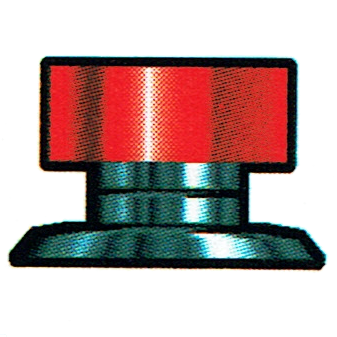
Rubber can't have metallic brightening.

Well, true. But you can't say 'they don't even look like springs', because as long as the basic structure is there, you can tell what it's intended to look like and thus cannot say they don't look like springs.
Loopy reasoning here.
 
Status
Not open for further replies.

Who is viewing this thread (Total: 1, Members: 0, Guests: 1)

Back
Top