-
Do not use Works in Progress as a way of avoiding the releases system! Works in Progress can be used for sharing early betas and for getting suggestions for improvement. Releases of finished content are not allowed in this forum! If you would like to submit a finished addon, click here for instructions on how to do so.
You are using an out of date browser. It may not display this or other websites correctly.
You should upgrade or use an alternative browser.
You should upgrade or use an alternative browser.
Ray for 2.0 (100% scratch)
- Thread starter H Y P E R
- Start date
- Status
- Not open for further replies.
Blacklightning
Insane Idealist
Oh for the love of...

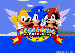

One of those pictures was even posted in this very thread, just last page. For the life of me I can't comprehend what you people could possibly be talking about. Tan, maybe, but FAR from black. More evidence of this should not be necessary.
One of those pictures was even posted in this very thread, just last page. For the life of me I can't comprehend what you people could possibly be talking about. Tan, maybe, but FAR from black. More evidence of this should not be necessary.
No one wanted him white, they wanted him like this, I guess:

Also I did one fix that you forgot about, Ray's head is round
EDIT: I actually noticed that without the shiny thing in his mouth makes him look a little better:

Also I did one fix that you forgot about, Ray's head is round
EDIT: I actually noticed that without the shiny thing in his mouth makes him look a little better:
Last edited:
Blacklightning
Insane Idealist
My bad, I didn't take pallete limitations into account. I keep forgetting we're trying to make this run on a Doom engine here. XDAnyway, the main color I used when I paled Ray's skin was
the closest in the srb2 pallete to the skin on the SegaSonic reference.
On the contrary, I was perfectly fine with his previous palette revision - it's just that calling Ray "black" seems like a pretty silly statement to make. Don't make changes based off my word dear, I'm just being a ranty bastard as usual. XPNo one wanted him white, they wanted him like this, I guess:
Okay then, I'll use the colors I am using.
Also, the back frame is done. :)

Could someone please put these in a gif animation for me,
as I do not have a good gif animating program on hand?
http://img25.imageshack.us/img25/8504/22575742.png
---------- Post added at 06:00 PM ---------- Previous post was at 04:38 PM ----------
Wait, nevermind, I animated it my self:

I think it looks ok, the feet are a bit shaky though.
Also, the back frame is done. :)
Could someone please put these in a gif animation for me,
as I do not have a good gif animating program on hand?
http://img25.imageshack.us/img25/8504/22575742.png
---------- Post added at 06:00 PM ---------- Previous post was at 04:38 PM ----------
Wait, nevermind, I animated it my self:
I think it looks ok, the feet are a bit shaky though.
the feet is weird, and the head must be round like the one i made, and colors are still darkened to me, can't you use the colors I used? It actually makes Ray look more... alive or something
TDSunshine
Is a Cyan Sonic in SRB2
Look great!
I just think the yellow should be lighter.
[offtopic]Ground the Fox, are you on the Mystical Forest Zone forums?[/offtopic]
I just think the yellow should be lighter.
[offtopic]Ground the Fox, are you on the Mystical Forest Zone forums?[/offtopic]
Ground, thanks for the suggestion, but no offense, the colors on yours
are a bit 'off'. Sorry. I gave him tufts of fur on the sides of his head
because I thought it made him a bit cuter.
TDS, the yellow is already lighter than it was in SegaSonic arcade,
I don't see a need to make it any lighter, but thanks for the suggestion.
Also, are these bored frames okay?

are a bit 'off'. Sorry. I gave him tufts of fur on the sides of his head
because I thought it made him a bit cuter.
TDS, the yellow is already lighter than it was in SegaSonic arcade,
I don't see a need to make it any lighter, but thanks for the suggestion.
Also, are these bored frames okay?
Blacklightning
Insane Idealist
Well, it ain't bad per se, but I feel it could be a little more obvious, for lack of better description. I mean, it's the same arm moving up and down by a single pixel's height. It doesn't look like there's enough going on.
Is he meant to be rubbing the side of his head there? If so, you should probably move that same arm over a little further to the right, it looks like he's poking himself in the eye. Beyond that, make the motion a little more noticable (more distance between frames I guess) and I can't really complain.
Is he meant to be rubbing the side of his head there? If so, you should probably move that same arm over a little further to the right, it looks like he's poking himself in the eye. Beyond that, make the motion a little more noticable (more distance between frames I guess) and I can't really complain.
I see your point... Okay, how's this?

Now he actually looks like he's scratching his head! :D
http://img90.imageshack.us/img90/7042/boredd.gif
Now he actually looks like he's scratching his head! :D
http://img90.imageshack.us/img90/7042/boredd.gif
Violo
Resisting Pony Avatar
TDS, the yellow is already lighter than it was in SegaSonic arcade,
I don't see a need to make it any lighter, but thanks for the suggestion.
I compared. No, this Ray is darker. More saturation in this one than the SegaSonic one, that's what makes it look darker. You need to use a lighter colour because it doesn't use saturation.
THe colours I don't like, and the spines. They look a bit unnatural. But I like every other aspect.
I gave him tufts of fur on the sides of his head
because I thought it made him a bit cuter
Well, it doesn't make him cuter for me, actually it makes him looks like a girl
the colors on yours are a bit 'off'.
Whaddya mean?... Well, maybe the skin, but it would look better if you use the white and the red I used
Blacklightning
Insane Idealist
Perfect. Can't wait to see the rest in motion now.I see your point... Okay, how's this?
Now he actually looks like he's scratching his head! :D
That is not official art, and as such irrelevant to the point. The last thing you should do when drawing a character is to use fanmade material as a reference. :VEdit: Image time: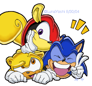
For that matter, I should probably point out that the critics here (yes, I'm aware of the hyporcrisy) are sending very mixed messages when it comes to the colours so far, and frankly, it ain't helping. I'd much rather see the character finished, period, than waste three pages arguing over shade of yellow and tan Ray should be. Worry about it later if you really must.
For that matter, I should probably point out that the critics here (yes, I'm aware of the hyporcrisy) are sending very mixed messages when it comes to the colours so far, and frankly, it ain't helping. I'd much rather see the character finished, period, than waste three pages arguing over shade of yellow and tan Ray should be. Worry about it later if you really must.
But the color is dark, no kidding, Ray is more.... I don't know how to explain, but you know what I mean :l, and I'm not just giving critiques about the color, but also the tuffles, does he really needs that? In my opinion, it makes him looks like a girl, but it's H Y P E R's choice, so I'll not care about it
Mike_The_Hedgehog
Member
I thought I'd have a go on making the colors more actuate. anyway, this took a few minutes as It's not at all custom.
Here it is,

And here is where I got the colors,

I hope this was useful. Oh, and I tired to fix some of the shading too.
Here it is,
And here is where I got the colors,
I hope this was useful. Oh, and I tired to fix some of the shading too.
Chao Freak 1
Member
That's so.... ORANGE! O_O
Truthfully I like Ray having darker skin. It looks cool against the light yellow.
Truthfully I like Ray having darker skin. It looks cool against the light yellow.
Monochrome
Member
Good to see ya back, Hyper, but I have a thing that you probably forgot about back in the 1.09.4 days...which I'll send via PM.
- Status
- Not open for further replies.
Who is viewing this thread (Total: 1, Members: 0, Guests: 1)
Share: