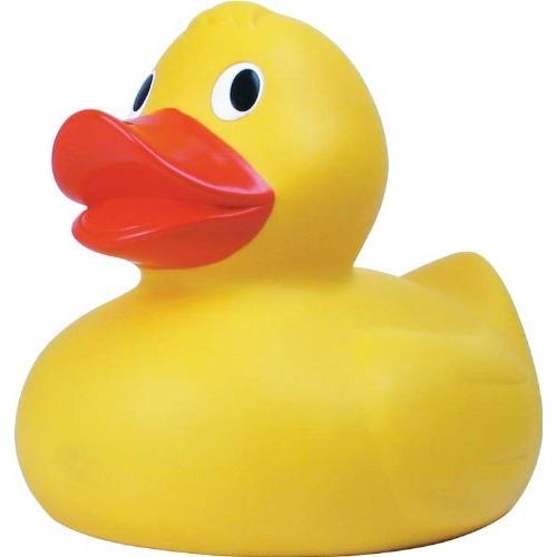
By your logic, you could say that a rubber duck looks like a realistic duck. Or that a cardboard cutout looks like a real human being.
Well, true. But you can't say 'they don't even look like springs', because as long as the basic structure is there, you can tell what it's intended to look like and thus cannot say they don't look like springs.
Loopy reasoning here.
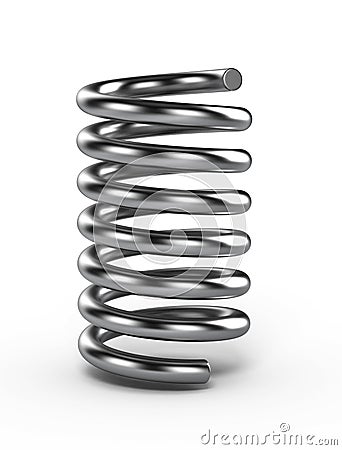
<TehRealSalt> did he think the springs were rubber duckies or something
<MotorRoach> He probably did
<MotorRoach> Did he even LOOK at the springs?
<MotorRoach> " EDIT: I must argue that they do actually look like springs though. "
<MotorRoach> Oh my god
<TehRealSalt> but they dont
<TehRealSalt> They resemble them
<MotorRoach> I'm not even going to comment on that
<TehRealSalt> But they look more like a bunch of cylinders stacked on each other
<TehRealSalt> Yeah, it's not worth it
<MotorRoach> I outright explained why it sucks and doesn't looks springy
<MotorRoach> And all he does is deny it
<MotorRoach> Its like telling me that a rubber duck looks like a real duck
<Steel_Titanium> that's like saying if i draw a circle, and color it yellow it's a ring.
...Also, rubber ducks do 'look' like real ducks. That's why their called 'rubber ducks' and not 'duck replicas'

Ducks and rubber ducks look different, and are identifiable as related to each other. Generally, graphics want to look closely like something, rather than being merely identical. Classic sonic springs are stacked cylinders that spread out, but that's due to a technical limitation. You haven't mentioned it in particular though, so, uh, I dunno?
Phil, how you respond to constructive criticism is important - including criticism you think is wrong. Insulting people over it won't clear up any misunderstandings or generate any viewpoints that you find valuable, it just makes you look like an out of touch jerk, and leads to more vitrol. You're going to have a harder time getting real critique after this, because that's what people will expect to happen if they say something you don't like.
Regardless, the time to move on is now. This is getting nowhere and is just generating trash.


The emerald itself looks decent, although really low on the contrast. You might want to apply some darker shading to it, so that way it has more depth.

I don't know if that's really a good idea, but could they glow?
