Not a lot of time left so i'm going to attempt to be brief. Note that I hardly got any chance to play most of these in a decent sized server (ie, more than 4 people), especially in CTF.
* Match *
Secluded Woodland Zone by Spherallic - 7/10
-Frikken gorgeous map.
-The layout is pretty good but it tends to be unclear where you're going in the narrow hallways; as a result, I almost never encounter anybody on the upper path and most of the fighting gets done around the water, which I imagine is because they keep looping around through the Scatter room.
-The random boxes seem to be a bit too out of the way
-<@Titanium> tunes 29 is proof that SSNTails is a pian killer
Random Valley Zone by nightmare cenz - 7/10
-Also very pretty use of the textures
-Yes it has too many redundant rooms and too many rings, though I didn't find it to be as disastrous as some of the votes would suggest. Let's file this under "excess of level design".
Cold Canyon Zone by RedEchidna - 3/10
-Unbalanced as all get-out, Rings are scarce in a large group
-Seriously? This feels like it was halfway crapped out of a drunken algorithm.
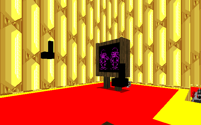
Sparkling City Zone by Neo - 8/10
-Awesome layout sabotaged by desperate lack of building texture/appearance variety
-Perhaps related to the above, can be a little tough to find people in small groups
-Just maybe too many rings
-1up theater screen kicks ass, just to reaffirm
-Just throwing this out here, but the unconstructed building seems like a slightly underutilized idea...
-If you update this without changing the BGM to Speed Highway At Dawn, you are a bad person and I will hurt you with a knife :( (seriously, i've got a perfect looping OGG of the song if you want it)
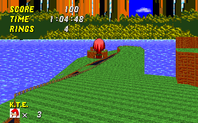
Midnight Park Zone by KO.T.E - 6/10
-I tend to lose track of people very easily on this map, be it due to the awful wall texture around most of the place or the colormap or whatever it is, but i'm not having much fun when i'm repeatedly getting beat up by shit that comes from seemingly nowhere :x
-Layout is otherwise alright I guess
-Bouncebouncebouncebouncebounce *ragequit* (auto is also a little cheap here)
Rocky Schlocky Mesa Zone by Brawl - 1/10
-Ha ha, no
-This is a 1094 map pulled out of cryogenic stasis in one's ass
-Independant floating waterfalls! Serious shit guys!
* CTF *
Slime Stronghold Zone by RedEchidna - 4/10
-My, what a confused level this is (read: what the fuck is with these textures)
-A couple interesting layout ideas (glass pipe base exit is one I guess) wrapped up in a heap of bad or poorly executed ones
-Flag rooms are quite curious. Extremely campable yet a nightmare to defend. No thanks.
-The map does seem salvageable, at least
Disrepaired Sanctuary The Hell Is In Our Water Supply? Zone by Mach - 3/10
-What everybody else has said: straight level, no base defense whatsoever, rail is OP if you're any good with it, takes eons to clear, ect... playable but weak.
-
Just a lil' stuck there Inu?
Spaceport Warfare Zone by KO.T.E/Spherallic - 6/10
-It seems quite solid/fun, in spite of how much work it needs yet (hence why it's not a 7), though i've still not been able to play this yet with more than 4 people.
-Most impressive visuals
-Elevators should not stop your movement once the door closes - what's the point?
-If you're Sonic, there is only one way out of the base
-The SRM room in the base is a sucky dead end that seems very easy to hide in, and needs to be made into something else
-Middle area is rather dull
-Although the rafters around the rockets should be made use of, the map has a lot of hiding places as it is and caution should be excerised in not making them abuseable
-Try to find a way to be able to launch the rockets and cause a giant explosion somewhere else in the level :P *shot*
Flood Forest Zone by Glaber - 3/10
-Collossal excess of ammunition everywhere
-Interesting layout I suppose, but every enclosed space in the map is begging to be bounce-spammed
-Dead ends are bad, mmkay
* Circuit *
Azure Night Zone by Kaysakado - 2/10
-Uh, whatever?
-Even after you find the shortcuts it's still not funny :(
Super Sonic Starway Zone by RedEchidna - I abstain
-Neat idea, fucking awful map. I can't even finish a lap of this evil thing
offline...which is your salvation, since I don't feel like scoring it otherwise. Try again with a less brutally obnoxious layout.
-This map is a really easy way to get a server stuck, if the host is AFK and does not move from a checkpoint sector or the finish line. If nobody around is capable of making 4 laps without running out of lives - a very common possibility - then people have to quit and rejoin to try their luck again. Even with the ability to get 50 rings back at checkpoints, it's a tedious pain up the ass once most of the rings get used up. Hence, the easy way out is just to give up and ragequit. And so the server sits. Barf.
-This thing isn't even functional in XSRB2, just for the record.
Cyan Caves Sunkist Slushi Zone by Blade - 7/10
-Not too shabby for a 2-hour rush job
-Horizontal flamethrowers are just a tad annoying to avoid as Knux
Aqua Palace Zone by Simsmagic - 4/10
-Thoooooook Feeeeessst (mostly due to that one underwater path, though)
-See above map for an example of what can be done in a hurry
Sky Cliffs Zone by darkbob1713 - 6/10
-A little plain, but fun. Needs more to do
-I know the blue springs at the start suck, but (speaking as a Knux user) there's a certain sadistic amusement from listening to the Sonics rage when they Game Over on it at lap 1 :p
---
Not voting on single player as usual, but next time some idiot crams a WAD full of 15-odd MB of garbage, a lot of which is from someone else's WAD and/or isn't even used, I might suggest disqualifying them out of spite. No, really.