-
Do not use Works in Progress as a way of avoiding the releases system! Works in Progress can be used for sharing early betas and for getting suggestions for improvement. Releases of finished content are not allowed in this forum! If you would like to submit a finished addon, click here for instructions on how to do so.
You are using an out of date browser. It may not display this or other websites correctly.
You should upgrade or use an alternative browser.
You should upgrade or use an alternative browser.
Prisima's Pixeled Productions
- Thread starter Prisima
- Start date
- Status
- Not open for further replies.
Puppyfaic
Member
If you are going to make it bounce, then make a bounce like animation. Like a bouncy ball, otherwise it looks strange. Like make it go flatter when it hits the floor.
This, or make it kind of stretch out when it moves vertically.
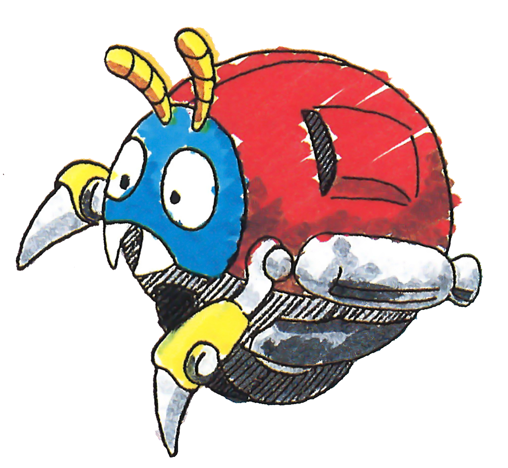
Here's a new sprite:That is a nice Motobug. I am just a little bothered that he seems far too small compared to Sonic.

About as tall as a crawla, and better shading!
That's certainly a better sprite. Although I swear his arms were not really that simple.

Here's a nice reference for you to work with.

Here's a nice reference for you to work with.
Like this?:That's certainly a better sprite. Although I swear his arms were not really that simple.

Here's a nice reference for you to work with.

Phantom-blade
Door
That looks a bit weird. But nice sprite!
frozenLake
Member
Hmm... The area around the eyes would not get nearly as dark, and the eyes themselves are overly angular, compared to the ovals of art.
Also, the black rectangles on the sides should be red... and kinda shaped inwards so its like an air intake on a car.
Also, the black rectangles on the sides should be red... and kinda shaped inwards so its like an air intake on a car.
I tried to combine my past Motobug sprite with the picture MotorRoach showed me, and that's why the intakes are black. As for the eyes...Hmm... The area around the eyes would not get nearly as dark, and the eyes themselves are overly angular, compared to the ovals of art.
Also, the black rectangles on the sides should be red... and kinda shaped inwards so its like an air intake on a car.

I found that Spring Shell's eyes fit him nicely ,though it makes him look less cartoony (like the Lost World Motobug he was originally modeled after) and more like the Sonic Colours Motobug).
Volkatrace
Mexican Flyer
Hmm... The area around the eyes would not get nearly as dark, and the eyes themselves are overly angular, compared to the ovals of art.
Also, the black rectangles on the sides should be red... and kinda shaped inwards so its like an air intake on a car.
He did not mention anything to follow the original design. He could do it, but it is also good that put his style.
However, I agree with your opinion about the eyes design.
Alright, I've altered the eyes some more, redesigned the wheels, and added an extra frame.He did not mention anything to follow the original design. He could do it, but it is also good that put his style.
However, I agree with your opinion about the eyes design.

Volkatrace
Mexican Flyer
Now this is working. The progress is coming.
I like the shading, the new eyes and the wheel detail.
Volkatrace
Mexican Flyer
Looks like Motobug got a new shell.

Good, but now the black metal patch need a shading rework according to the new shell shading.
- Status
- Not open for further replies.
Who is viewing this thread (Total: 0, Members: 0, Guests: 0)
Share:


