[Open Assets] SCR_SRB2Silver_V0.19.9

This content may be freely modified and/or maintained by anyone.
Status
Not open for further replies.

furythehog

The Emblem Guy!
This is my old 2.0 Level pack re-released for 2.1 with some new features, so i'll give a quick rundown of whats included-

Single Player Content-

Serene Falls Zone 1
Serene Falls Zone 2 (Custom custom scenery needs to be fixed)
Serene Falls Zone 3
Aqua Relic Zone 1 (same as SFZ2)
Aqua Relic Zone 3 (personal preference but I REALLY wanna see if i can make this boss work like it did in 2.0)
16 emblems to collect
1 unlockable (emblem hints)

MultiPlayer Content-

Green Court Zone (this isn't particularly special, just something I threw together as a test that functions fine so I figured why not pack it with the rest of my levels)

Why 0.19.9? Simple really, I have 0.20 finished, but one of the levels used in it is something I want to submit to the OLDC first, and since im not currently working on this extensively, I figured I'll upload this version now, and the full 0.20 after the OLDC.

Things to Come in 0.20:

25 Emblems to collect (including current ones)
2 additional levels
boss rush mode
Several fixes to levels no doubt

UPDATE: fixed the broken scenery in SFZ2 and ARZ1 and updated the soundtrack.
 

Attachments

  • SilvZ1A1.png
    SilvZ1A1.png
    29.9 KB · Views: 1,215
  • SilvZ1A3.png
    SilvZ1A3.png
    44.8 KB · Views: 1,079
  • SilvZ2A1.png
    SilvZ2A1.png
    57.5 KB · Views: 1,090
  • SilvZ2A3.png
    SilvZ2A3.png
    51.4 KB · Views: 971
  • scr_SRB2Silver_V0.19.9.rar
    10.3 MB · Views: 1,906
Last edited:
I don't know if this is intentional but there are a lot of missing sprites for some levels.
 
I don't know if this is intentional but there are a lot of missing sprites for some levels.

...damn it prime 2.0! they were a scenery object i'd yet to figure out how to port (I know it might seem easy to some but i've yet to grasp what changes to what) they didnt show up in my build because I left the redundant sprites and SOC in... so I didnt get errors, they just didn't work. well, time to go pick them all out, thanks for the heads-up on that.

The remaster tunes you're using are outdated. Get the ones from my wad here.

Simple Enough, i'll do that alongside the scenery-chop.
 
I remember playing Aqua Relic a few years back in the OLDC, and while it was pretty mediocre and had some issues with direction, a few rooms were quite interesting from an architectural standpoint. Serene Falls Zone is definitely an improvement in that regard. The direction issues are mostly gone, the rooms are much more solidly designed, and there were more sections that caught my interest than before.

The problem? Platforming is nice and everything (this is a platforming game after all), but a lot of those levels felt like platforming for platforming's sake, and it got repetitive fast. In particular, you seemed almost obsessed with this particular part of THZ1:

attachment.php


Structures like this one appear over and over again in your levels, even though it's hardly one of the most interesting parts of THZ1. It's okay to incorporate something like this into your levels every once in a while, but the way you use them, you seem to think that the player will actively enjoy climbing structures like this, when in fact... ehn. They're not interesting on their own. An interesting room has to offer a bit more than just a few platforms to climb.

There are sections in your levels where you're doing it absolutely right: I'm thinking in particular of the very first room of the first act, which has a lot of stuff on the sidelines for you to explore. In the overall progression of the level, it's not much more than a glorified corridor, but just by having some stuff for me to explore, it engaged me much more than pretty much anything else in the level. Another strong room was this one:

attachment.php


Not because it had a lot of action - it didn't. But unlike some many other parts of your level, here the gameplay is integrated into the architecture of the room. Just by putting that FOF there, you're dividing the room into vertical layers and making the player curious what's up there, and then when the player gets to the next layer, he feels a sense of accomplishment. It's very subtle - the player doesn't really notice this consciously - but small things like that make the difference between boring platforming and interesting platforming. The key is to make the player curious.

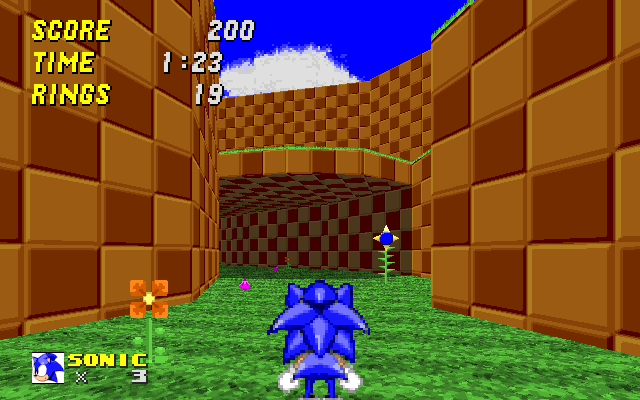
If you look at the THZ1 screenshot again, you immediately see that apart from the exit to the next room, there are also those ledges with spring shells in front of you (and there's more stuff in the room that you can't see from that screenshot). They immediately catch the player's eye and make him curious. You can already see from the position where I took the screenshot that this is not the path forward. The star post is in plain sight, and it's somewhere else. But ideally, what you want as a level designer is for the player to make the conscious choice: "Okay, I know the star post is over there, but first I want to see what's up here." If you can get the player to postpone his progress for a while out of sheer curiosity, that's one way (and a particularly good way) to engage him.

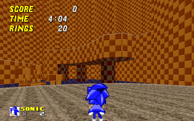
Most parts of your levels aren't like that. You come into the room, you can see the exit, and there's a bunch of platforms between you and the exit. It's a matter of logistics, of getting from A to B. From the player's standpoint, that's totally uninteresting. He can already see everything that's ahead of him, so he's not curious. And since the challenge itself is so rudimentary, it winds up being boring. If you have challenges that are intrinsically interesting, you can get away with "obstacle course" design like this, but if you don't, you need to find other ways to engage the player. One way to do that is once course through hidden power-ups and the likes, another is to design the room in such a way that the player can't see all of it at once and feels like he has to "explore" the room to make progress.

Getting back to the specifics, there are some other sections in your levels I want to comment on in particular:

The opening room of act 2 has a very good underlying idea: The second bridge is immediately visible, but obviously way too high to be accessible. Immediately this makes the player interested. Later on when he crosses that room again, there's a sense of recognition and, again, accomplishment (although with how wide and high up the second bridge is, it's easy for the player to miss that this in fact the same room - the lower level isn't easily visible from up there). The problem? A room as large and empty as this absolutely SCREAMS "exploration!", yet you hardly put anything in it. The advantage of having large setpieces like this is that you can go absolutely nuts with hidden items and other additional content. The second bridge immediately catches the player's attention and, if that player is anything like me, he will be inclined to stay around a little while longer and explore that room. You should take advantage of that.

attachment.php


On the surface, this room is the same rudimentary platforming as everything else, but what makes it stands is the unusual architecture. Things like that, too, can engage the player. Other neat touches include the broken bridges in the latter part of act 2 and the weird bustable blocks that lead into the underwater part in act 1. The underwater part itself was sadly one of the weakest part of the level, just a bunch of empty corridors (except for the hidden emblem, which was easily the most fun thing in the map). It was also one of the few parts that still suffered from a lack of direction, mainly because a certain part of it goes in a circle for no good reason and has a tendency to naturally point me in the wrong direction.

So overall? There are some good ideas in your levels, but if you want to make something truly enjoyable, you need more than "some" good ideas. A truly enjoyable level must have something engaging in every single room, and a truly enjoyable level doesn't have rudimentary "filler" platforming. If you want to keep working on these levels in particular, I would advise you to go through the level, look at everything with a very critical eye and outright delete everything that you don't think is interesting for the player (unless you have a concrete idea on how to make it interesting, in which case go ahead and rework it). It's incredibly important not to allow any subpar content to remain in your map. I know it's hard to delete something that you spent so much time working on, but it will massively improve the quality of your mapping, and too many promising mappers fail because they hesitate to delete the bad parts of their levels.

And when it comes to filling the gaps that will inevitably result, some of the things you should always have in mind are: "How can I engage the player? If the player is performing some action, is that action interesting enough on its own, and if not, how can I design the room to make it interesting anyway? Does my part of the level make the player curious when he sees it for the first time? If not, what can I add to it to make him curious? Do I give the player enough choices to make? If not, what can I add to give the player a choice, and how do I draw his attention to it?" You definitely have interesting ideas, and I think if you design an entire level with the conscious thought to make everything as interesting as possible, you can come up with something great.
 

Attachments

  • srb20000.png
    srb20000.png
    142.9 KB · Views: 5,331
  • srb20001.png
    srb20001.png
    32.2 KB · Views: 5,290
  • srb20002.png
    srb20002.png
    45.8 KB · Views: 5,263
Well, thats for the wall of text review there spiritcrusher, honestly, feedback's crucial and there's LOTS in there.

For SFZ1's water room, I'm considering draining most of the water from that room, mostly because I fear that the bustable blocks in the roof are something the player will miss given their size, so at least if there isnt a constant drowning risk, they will have time to understand it before going 'glub glub die'

My main problem with SFZ1 and ARZ1 is my own design for them, they're wrapped very close together, so to remove or expand rooms, i would have to restructure a large other portion, possibly even the whole level in a chain reaction, and (at least in the case of SFZ1) I really think i'd be better leaving them a bit 'meh' for now and focusing on zones I actually have gimmick ideas for. (honestly, SFZ was always meant to be a pretty simple grassy zone, so im unsure what kind of gimmicks the zone would really do well to incorporate, and as the only complete zone in the level pack thus far... im unwilling to fully part with it until it has something else in its stead).

So im short, I'll take on the idea of working on the weaker aspects of the zone, but I could use a few ideas for gimmicks that would really benefit the zone's nature instead of feeling crammed in simply so the level wasn't pure platforming.
 
So here I beging...

SZF1: The level was quite nice for another GFZ themed one.
My only problem with it was the underwater section nerar to the end of the level were we had to break the ceilling to get out. I had no idea how to get out of there the first time so I drowned, that's at my 2nd try that I realised that.

SFZ2: Then it's impressive and has an open level design, but unlike the 1st act, it was very short. I do not have to complain the design of this level tough.

SFZ3: An ordinary boss fight, nothing to say here.

ARZ1: Here's a pretty but cramped in some places level. I didn't have any problem with direction, my only problem were these tiny platforms near to a 10000 meters pools next to them, there was also a crumbling platform which falled during more than 5 seconds in this level.

ARZ3: An ordinary boss fight that reminded me Tortured Planet.
But the design is empty, really empty.

Overhall: In overhall it's quite nicely done for a start, the MIDI musics from BlueWarrior fit pretty well in there. I'm looking forward to see what that will become.
 
In this boss fight, eggman exits the arena by flying through the wall when there's a hole in the ceiling for him already.
%5Bbug-wad%5D%20silver%20boss.gif
Also, I'm not sure if you put this in here so you could speedrun the level, but anybody who can spindash can completely skip this sector.
%5Bwad%5D%20skip%20this%20section.gif
I aint trying to bash you at all. I seriously love this level pack, and I can't wait for the next update! Hope these help! :D
 
Last edited:
Zubat: Yeah, your meant to be able to do that, as for eggman escaping through the wall, the escape point is actually in the middle, as you'll notice he always heads through the center point as he escapes, I dunno why he doesn't go up enough, but since he's already defeated i was never too concerned with it.

Tonic: can you tell me what about ARZ1 got you lost?
 
This has nothing to do with actual gameplay (unless you incorporate some environmental gimmicks), but have you thought about maybe making the theme of the first zone more original? Not to call you a ripoff or anything, but we already have tons of GFZ-like zones for first zones and this could be your chance to do something different. Like, maybe make it swamp themed, or add some sand and call it a beach, or even add some sector-based cloud platforms to make the stage more dream-like.
 
I didn't get too much time to explore, so my review will be generalized significantly:

Honestly I thought a lot of the level design was circular. There were many places in all three levels where I ended up in the same place as I just was--and sometimes the confusing paths looked purposefully placed, with springs leading on and ring lines that looked nothing like a path merge but rather a split. Please clean these up, they're REALLY obnoxious. In fact, a solid example is the one at the beginning of Zone 2 Act 1 (yay names), where if you take the springs to the upper paths, the left split takes you right back to the beginning.

Secondly, a lot of the level design was honestly pretty bland. There were no gimmicks or anything--just lots of drawn-out basic platforming. Try to incorporate more exciting or original material into the maps--it feels like stripped-down GFZ acts 1, 2, and 3 featuring water.

Thirdly, try to work on your music a bit more. It sounds like you just took the MIDIs from music.dta, changed the chord progression in a few places, slapped some different, fairly grating instruments on the whole thing, and called it a remix. For leads, especially with the sax in the GFZ, see if you can get yourself a VSTi with expression controls, rather than just a wimpy soundfont. MIDI CC 1 (mod wheel) will probably be mapped to expression (at least it is on my plugins) and then you can use that to fully naturalize the leads.

Ok, those are my suggestions. Keep up the good work and fully realize these maps!
 
I only had a chance to play the first zone. I liked a lot of it, but there were some very glaring flaws.

The multiple pathways are nice, but a lot of the time they can confuse the player and lead them into circles. The rooms are well designed, but they look really similar. When a room looks the same as a previous one, it makes me think that I went backwards. With the multiple path problems this can cause a lot of people to get lost in the level. Try mixing things up and adding in different structures and such.

The badniks were crawlas, which is to be expected of a first level. There is very little variation though, and it gets really boring. At least add in some sdurfs or something to spice stuff up. The Eggman boss was the same as always, which is nothing bad.

The levels felt very empty and void. There was hardly any scenery or aesthetic value. The underwater sections were the worst. They felt like big empty boxes. The hole you breakthrough to get out of the underwater section is really hard (actually impossible) for the player to see. This can cause minor issues. The Eggman boss room was really large. Eggman isn't always the easiest to keep track of when there is multiple cliffs and corners and such. The only other issue graphic wise was slight texture misalignment, which is an easy fix.

I liked the pack so far, there are just some issues. I hope this will help you improve. 6/10
 
Status
Not open for further replies.

Who is viewing this thread (Total: 1, Members: 0, Guests: 1)

Back
Top