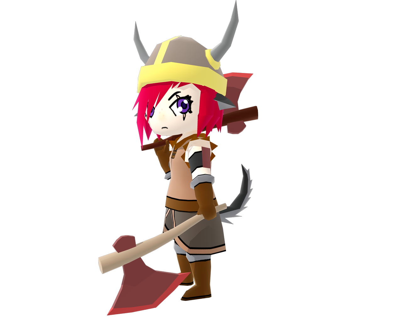
Post your pics/art here!

It's actually just normal diffuse shading, but the way I've set it up is that there's 90% ambient light and only 30% from the actual light source to give it a slight shadow, and the combination of the two adding up to over 100% makes the colours all bloomy like that. I just set the intensity per scene depending on what I think suits it best at the time.

I used the same lighting technique with this render of my Spike model (with 75 and 50 for the intensities), but I also added an outline that follows the camera to make it look more fitting with the show as well as fitting with KP-SS's renders of his own MLP models. I guess you could sorta consider that cel shading in a sense.

The outline on Joan was actually an accident, probably something to do with me rendering the image really big and scaling it down while keeping it transparent.
Ok, I understand. It also reminds me of the "Zelda: Wind Waker" design for the character Link.
 
Work-in-progress music:

Lightning Spire Zone
"A heavily-guarded prison facility in the middle of the desert."

Shimmer Cavern Zone
"Brilliant crystals of all colors are plentiful in this underground tunnel system."

Dark Festival Zone
"An abandoned fairground that continues to run on supernatural power."

Digitized Domain Zone
"A virtual reality within a massive supercomputer. Different environments may "leak" into each other due to glitches."

Eggman Boss

Metal Sonic Boss

Hopefully, I'll end up finishing these soon. Hopefully.
 
chess_scene.png

I just made a few more chess models alongside a new wood texture. Please rate 1-10
 
Iphone_commercial.png

This is my advertisement for the Iphone 5. I made Everything. (including the texture) Please rate 1 to 10
 
Drew this late last night out of boredom. I'm actually pretty happy with how it turned out, although I could definitely do more with it:
Prarie.jpg

Unfortunately, the internet doesn't do well with mostly 2-tone images, so much of the original's "crispness" is lost D:
 
No, the Internet does just fine with sharp images, frankly. It's just either you or postimg changed it to a JPG, which is the last image compression format you want to use if you're trying to preserve sharpness. Use PNG or GIF instead (although in the case of the former, use something like OptiPNG to shrink the filesize, and in the case of the latter, bear in mind you're limited to 256 colors total).
 
Hmm.... I thought it WAS a PNG. Turns out I had a BMP. Here's the other version:
Prarie.png

Huh. A LOT better! But like, there's no apparent difference between the BMP and PNG files on my computer, of course, so why does uploading them make them look different?
 
BMP files are extremely large in filesize because they're completely uncompressed. What's going on is that the site you're uploading your pictures to is seeing the file format is a BMP, going "it would take forever for someone to download that", and changing the format on you, likely to JPEG. Since PNG is already a compressed format, there wouldn't be any benefit to changing the format, and it leaves your file alone in that case.
 
1 Because the image isn't even working.
It can work by clicking on the broken image (a new tab should open just showing you the full size of the picture).

Also, why do you keep asking us to rate your pics when nobody ever does?
I don't see the problem with him asking although I never rated the previous ones because my attention was drawn to "Hinote's" and "I'll Begin's" art. Some of the images that Wizeman did put up seemed a bit bland (I'm not sure if that's the word I'm looking for but), it just looked like the images were just there for the sake of it. To me they weren't really eye catching but I'm no artist (though I do some spriting) so all I can give is "an opinion of empty experience".

Because I like Zelda I'll rate it. I'd rate it 3-10, I don't remember a modern built window being in Ocarina of Time, the image is quite blurry and I was hoping that the sword would be more focused on than the modern window (which really has no place to be in that game).

Try looking at the theme in this:
images

(Ignore Link's presence) The Master Sword seems to be the centre of the image, you can still make light come from the temple's window: shining on the sword.
 
Last edited:
It can work by clicking on the broken image (a new tab should open just showing you the full size of the picture).

Nope, doesn't work.

I don't see the problem with him asking although I never rated the previous ones because my attention was drawn to "Hinote's" and "I'll Begin's" art.

I don't have a problem with it, I'm honestly curious. It seems impractical constantly asking people that aren't particularly well-versed in art in general (specific people like Hinote are probably well-versed in art since they're artist, but this isn't really an art forum), especially since people aren't really responding.
 
I don't remember a modern built window being in Ocarina of Time,
It's not modern, just REALLY basic. If you look in the reflection of the marble on the wall you can see the reflection of another window that's really big and has a tip at the top, unlike modern windows.
the image is quite blurry
I don't know why it's blurry; it could just be post image.
and I was hoping that the sword would be more focused on than the modern window
I didn't try to make it focused on the window, but more of the volumetric lighting coming from the window shining on the sword.
(Also yes, I'll stop asking for ratings on a scale of 1-10)
 
TheWaterfall-TimelessValley.png

GreatTreeVillage-TimelessValley.png


So, I've been messing around in UDK getting used to working with it, thought I'd show you a few pics of a level I am making with it. The level is called "Timeless Valley", and currently has 2 key locations shown above.
 
Woah, CoatRack, how much of that stuff is yours? Like, did you model any of that or were are you mainly just playing with the landscape design?
Anyway, I just drew this creature thing in paint and I'm wondering what you guys think I should add background-wise. I was thinking like a frosty snowy background not unlike Ice Cap zone's... but that may be unfitting. Maybe more of a cave, considering the spider-ish eyes? I can't decide.
o4k4gxuu5

o4k4gxuu5
Creatura.png


What do you guys think?
 

Who is viewing this thread (Total: 1, Members: 0, Guests: 1)

Back
Top