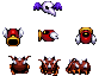
Post your pics/art here!

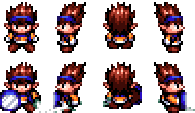
I think the bottom one works best. (Oh wow, brown Sonic recolor, lol)

paper_jam_main_menu___gear_menu_by_fieryexplosion-d9uzl9r.png


I spent over eight days working on this, and I'm proud of it. It has basically all you need for a Paper Jam-like Gear Menu. (I just wish it didn't take me forever to do so.)
 
I prefer the top. The solid blue draws my eye to the center logo, whereas in the bottom, it's a bit harder to tell where the main focus is.
 
Wow. That's absolutely beautiful.

If you match that with an equally beautiful scrolling background, the title screen might make me cry.
 
I just noticed the bolts on the top of the "Robo Blast" letters... and personally, I'm not particularly fond of them. Also the sparkle/shine on the "2" (if not animated). But the rest of it looks really nice.
 
awVWMUC.jpg


Getting better at buttonholes. Added buttons and corresponding holes to these deerskin gloves so that they can close over my wrists.
 
Gekiatsu Diesel Oh!
2016-03-23-013011.jpg
2016-03-23-013030.jpg


Battle suit Megazord! (Shurikengin as a battle suit)
2016-02-23-133545.jpg

King Battle Suit Megazord!
2016-03-23-013050.jpg


Green Flower act 2 Gmod
20160324215121_1.jpg

20160324220525_1.jpg
 
pEDgf9m.gif
test animation i started working on outta boredom. It's supposed to be how I think Water Stream Rock Smashing Fist would look animated (from One Punch Man)
 

Redesign of an old fancharacter.

Also, really nice work icycoldlava. love that animation. :)
 
Last edited:

Who is viewing this thread (Total: 1, Members: 0, Guests: 1)

Back
Top